View current page
...more recent posts
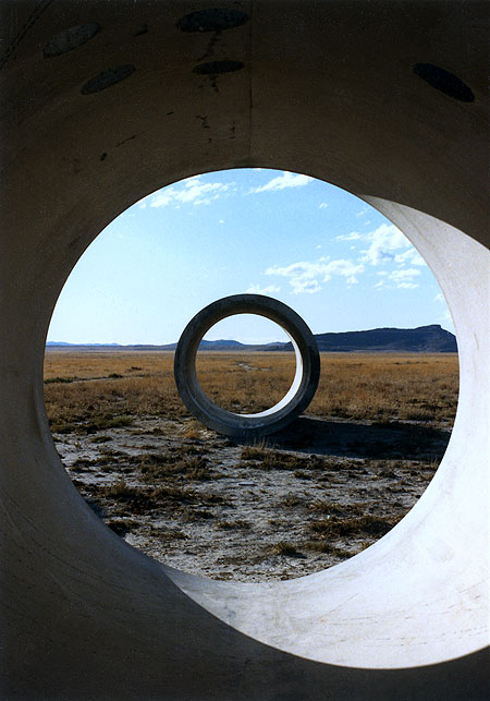
Tyler Green of Modern Art Notes recently reported on his trip to Sun Tunnels, Nancy Holt's earthwork in northern Utah. Sounds like he had a so-so time. Green thinks the work hasn't aged well, and I can't comment on that but am posting these snapshots from a trip my brother and I took there in the '80s, to show the magic Holt's piece is (or was) capable of. I'd be surprised if you couldn't get similar views now, but here's what Green says: "They never came to life, they never became exciting. They seemed too self-consciously monumental, too interested in being pagan totems to artisanal existence. Sun Tunnels is too much a post-industrial Stonehenge-like gesture to succeed as an engaging artwork. While the greatest pieces of land art exist within nature and bring their environment into the artwork--think how the Jetty and the Great Salt Lake co-exist or how Lightning Field is placed within its space--Sun Tunnels rejects its own landscape. Each tunnel looks like it had started to erode (Sun Tunnels was built in 1976) and was later patched so as to maintain its shape. While the Jetty basks in its location, Sun Tunnels seems to fight its off. The Tunnels' roundness is just too jarring, too inappropriate for this landscape. Sun Tunnels is funky cool in an I-was-there kind of way. But that's as far as they get."

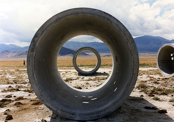
Turning to my pics from the '80s, that's me in the middle photo, wearing my high desert button-down shirt, with my brother holding the camera. That's him off in the distance in the third shot. The bottom pic also shows some unfortunate cow pies around the piece at that time. I wrote Holt a letter after our visit and she wasn't too happy to hear about the cattle, but said that unless she fenced the area there was no guarantee the livestock would stay out. In the middle photo, you can see ricochet marks of bullets fired off by local art lovers inside the tubes. ("It blowed up good." "It blowed up real good.") Small wonder Holt has to keep them patched.
Some earthworks, notably Michael Heizer's, are jarring interventions in the landscape, and I'm really not sure what Green means when he says Sun Tunnels fails to "bring the environment within the artwork." Holt positioned the tunnels on the desert flatness so that one sees a different, exquisite mountain vista from each of the four possible vantage points. These distant geologic bulges are framed within the near-mystical concentric circles that appear when you view the tunnels head on--the top photo conveys some of the Magrittean effect. The choice of where to place them wasn't arbitrarily aesthetic, though: the cylinders are aligned with the positions where the sun rises and sets at the solstices (hence the piece's name). She cut smaller rounded holes in the tunnel walls, corresponding to the shapes of stellar constellations, which cast circles of sunlight or moonlight within the darkened tubes. Much like the work of Holt's husband Robert Smithson (this was her first piece after his death, I believe) Sun Tunnels combines analytical modernism--a costly desert construction project the purpose of which is to optically slice and contain the landscape--and pre-scientific, ritual channeling of light from heavenly bodies. Green's phrase "post-industrial Stonehenge" captures the essence but not the excitement. We spent about fourteen hours at the tunnel site, and watched the landscape (and skyscapes) change from afternoon to dusk to darkest night, leaving about 3 am to catch an early morning flight from Salt Lake City. The experience was rich and unforgettable.

An earlier post here rashly declared the Dennis Muren/Jack Woods trash horror classic Equinox, 1970, the "best film ever made." The new Criterion Collection double-disc reissue only makes that assessment more sound. If I ever taught a film course I'd skip Alexander Nevsky and the films of Ernst Lubitsch and start with this. The DVD includes the 1967 original, made by a group of teenagers on a $6500 budget over several years, plus the Jack Harris/Jack Woods theatrical (drive-in) version, which recut the kids' movie and added scenes with the same (but noticeably older) actors. It'd be a great way to show students what can be done with no money and then to demonstrate, shot by shot, how a more experienced filmmaker tightens it up, splices in new dialogue, and even adds a character not in the original. Why is it superb? It has jaw-dropping bad, Plan 9 moments, Night of the Living Dead creepy moments, unexpectedly striking, Ray Harryhausen-style special effects (Muren went on to do Star Wars, Dragonslayer, The Hulk, and many other films not as good as this one), but mostly because it never stops surprising you. The motivation of the characters is baffling throughout, but the plot never loses forward momentum. On the commentary track you hear one of the now-grown-up makers of the original ask, about one of the protagonists in his own movie, "Why did he do that?" and another replies "I don't know--it's one of the mysteries that is Equinox."
As the essay accompanying the DVD notes, the "kids who go in the woods, find a weird book, unleash demons from Hell" plot prefigured Evil Dead by 10 years. Equinox marks the beginning of the modern, Chainsaw type horror film simply because the makers lacked the budget to establish Gothic, haunted house suspense with lavish sets and camera work. Yet the evil is all the more disconcerting for occurring in the absolutely banal context of teenagers having a picnic in the country with a bucket of Kentucky Fried. Much of the dread (and humor) springs from, as someone once described Dario Argento's films, "people behaving strangely for no reason." The characters may have been babes in the woods but the filmmakers weren't: although young, they were movie geeks and in the commentary talk about how they obsessively analyzed films such as Don Siegel's Invasion of the Body Snatchers. Their love of film can be felt in the finished product, which has many edgy and precocious shots.
(Science fiction/fantasy fans should watch for cameos by novelist Fritz Leiber as the elusive "Dr. Waterman.")
Trailer on YouTube.

A few posts back I said the Oskar Fischinger estate wasn't smart to ban the artist's work from YouTube. I said it in a snotty way because it bugs me that finally we have a tool to disseminate "moving thumbnails" of lesser known artists' work, but people won't use it. I can only think it's because they mistake the thumbnails for content and think they're entitled to profit from every sliver of anything connected to an artist's work, to the detriment of "getting the word out." I woke up today and found this comment:
what an incredibly demeaning and rude post. i used to think your blog was cool, but you're getting nasty and rude. i don't think you are very smart anymoreThe commenter doesn't respond to the argument on the table but that's partly my fault. By giving in to the need to vent I handed anyone who might disagree an "out"--they could attack my tone and not the argument. Offered as a cautionary to other bloggers: we are human, we have emotions, but not everything needs to be expressed.
It's been almost impossible to escape the images of Banksy's street-graffiti cartoons on the Net, for the past couple of years. As Paddy suggests, "Internet nerds" have much to do with elevating this artist to the level where he can be collected by Brad Pitt. This post is a mea culpa for reBlogging an image of the work as an Eyebeam reBlogger in '04. I suppose I was impressed by the scale of some of the pieces sprayed on buildings in rundown neighborhoods--as I recall, I reBlogged a giant rat--but I've never really liked the clip-art-cutesy style and dislike the artist's faux-Dickensian handle. One-word artist names are inherently pretentious! As Banksy gets more and more hyped, the ideas get worse and worse.
Update, from the comments:
tim: i disagree on your take on the one-word artist-name. it comes out of the graffiti/street art culture -- the farthest thing from pretentious. it's a way to preserve anonymity.
tom: I've never thought of him as a street artist, but rather a Young British Artist using street vernacular and every other means of sophisticated self-hype to become as famous as Jesus Christ.

Janice Caswell at Schroeder Romero
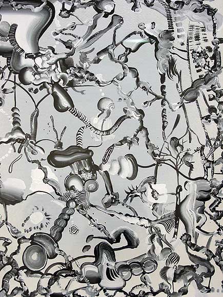
Tomoo Gokita at ATM
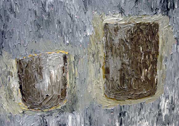
Fox Grimshaw at Marvelli

Padraig Timoney at Andrew Kreps
Walking around Chelsea with my camera today--took these shots of artists' work. The Caswell and Grimshaw images are details and the Gokita is heavily cropped. Timoney's materials consist of prepaid electricity cards glued edge to edge on aluminum. Yayoi Kusama did this about 40 years ago with airmail stickers, but still, nice--the fore-and-aft diptych appeals.
Paddy Johnson provided the impetus for the trip today with her slam of Greg Bogin's work as "hopelessly stale." The images of his auto-lacquer-on-canvas paintings looked fine to me but I wanted to see the work in person. It's actually a satisfying combination of videogame-cute, corporate logo-esque designs rendered with California "finish fetish" care (as in John McCracken, surfboards). Definitely a few nods to Stella protractors but only nods--they have rainbows in them, for cryin' out loud. The metal flake paint and airbrush color segues are echt '70s but completely conscious and quietly ironic. And corporate logos, yes, but too eccentric to be real corporate logos--the Bogins wouldn't sit easily in a lobby because they would draw attention away from bland, inferior company signage. And I don't see why Brian Sholis has any obligation to mention Fred Tomaselli in this context. Tomaselli doesn't "own" urethane and in fact, the plastic coating on his paintings has always rung false to me--a way of "bodying up" fragile papier colle for the collectors. Bogin isn't coating collages of Adam and Eve in the garden made out of porn mag cut outs (Tomaselli's most recent content)--thankfully!
If you don't think Bush is planning to start a war with Iran, you don't know Junior. According to a Time cover story, which is greasing the skids for another subscription boostin' war, duking it out with the Iranians "is no longer unthinkable." With breathless excitement, the lapdogs tell us that minesweepers have been put on ready to be sent to the Straits of Hormuz. Folks, before you even have a chance to punish Bush's party in November, the little man is about to let fly. The eagle is about to soar again. So, in the spirit of angry punk impotence which was the only possible political posture in the nightmare Reagan years, I offer this video of Lance Blisters on MIDI guitar, with visuals by Ilan Katin, re-performing John Ashcroft's version of that ridiculous "eagle" song: [15 MB Quicktime .mov]
