View current page
...more recent posts
"Two Note Lead" [mp3 removed]
An exercise in musical minimalism using the Electribe RmkII, an instrument I've been neglecting as I learned my way around the Vermona analog drum machine. The Electribe, being an analog-modeling digital synth, has a more brittle, metallic sound, but that's not without its pleasures. I only used the machine's onboard sequencer for the "break" or second theme in the middle--everything else was performed in my computer's host sequencer, which plays the Electribe via MIDI. The played and internally sequenced parts were then sampled and overlayed inside the host; you can hear some phasing and detuning when two like parts are played simultaneously and crossfaded. The most time was spent on changing the settings of the Electribe's rhythm synthesizer voices, away from some fairly awful presets. The resulting piece has an "Assault on Precinct 13" feel--if I can be so presumptuous--but clangy and jangly (and more upbeat than the Carpenter).
Update: snipped out four bars in the middle.
"Entropic Funk" [mp3 removed]
A sequence I wrote is played with four Sidstation patches--Sharp Interval Lead, PWM1, Subloop, and Moonmachine (the last is the crunchy, high pitched one)--all run through the Mutator filter using a gate setting to shorten the envelope. These segments are recorded into the sequencer one at a time and overlapped with each other to create a kind of round and/or counterpoint. Also in the musical staff is a marimba sequence using the same notes phased and "fattened" in a sampler, and a drum pattern that comes and goes. As the title suggests, the piece starts off energetic and urban and gets more Subotnick-abstract but without losing the spine of a perky melody.
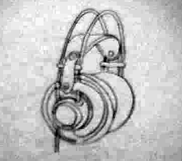
Headphone drawing by Marisa Olson - my remix.
The following exchange appeared in Houston's online magazine GlassTire back in 2001:
Tire Iron #6 3/15/2001
Inman Gallery
by Bill Davenport
I confess: I myself show at Inman Gallery, so if you feel that this invalidates my opinion of other work shown there, you can stop reading now.
John Pomara's glossy enameled panels are competent, affectless, impersonal. In the past I have used the phrase "toxic pond sludge" (I meant that in a good way) to describe Pomara's abstractions, but these new works at Inman gallery are cleaner. The panels are either black or white; the black ones suggesting nighttime landscapes, time-lapse photographs of headlights on a rain-slick city street. The proportions of the white panels suggest sheets of milky paper, squeegeed into horizontal zips like writing.
In both cases, the vertical orientation of the panel counteracts the horizontal stretch of the painting. Compare these works to Barnet Newman's: if Newman's vertical zips are the figure reduced to its essential gravity-defying assertion of existence, Pomara's horizontal streaks are the equivalent distillation of landscape, stretching flat and sliding sideways at high speed.
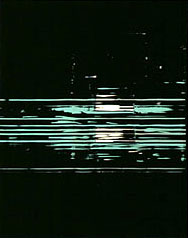
John Pomara, Pipeline, 2000
oil enamel on aluminum, 30 x 24 inches
Although they are emphatically about the glossy deliciousness of industrial paint, Pomara's works don't feel like paintings. Their exposed edges show that each is a thin sheet of aluminum laminated to birch plywood. The panels seem manufactured, not painted: the result of the impersonal operation of chance and technique.
The odd, syncopated hanging of the show does a lot for the work; irregular intervals between the panels make them into a sort of Morse code: intermittent, static-laden signals on the information superhighway. In the entranceway, a large black panel is hung next to a similar small one, upsetting one's expectations of typical gallery-style installation. The two panels have an odd relationship: a large and small version of the same thing, or possibly one close-up and one far away.
A discussion of Pomara's work is incomplete without referencing the very similar works of Houston artist Tad Griffin, Pomara's former student. Their co-existence is an opportunity to make subtle comparisons that highlight nuances of both artists' works, which are usually submerged. Here we are comparing, not pears and oranges, but Bosc vs. Bartlett. Both Griffin and Pomara swipe intermittent stripes of black and white paint across aluminum panels. Pomara's recent works are more pictorial: his streaks condense at the middle of the panel to imply depth, demarcating foreground, middle, and background; Griffin's all-over patterns are a depthless skin stretched across the surface of his paintings. Griffin's intervals are regular, but not mechanical; he is a man imitating a machine. Pomara's irregular compositions of stripes and gaps are the opposite: a painter using mechanical techniques to depersonalize his pictures. If we can collect one or two more Texas squeegee painters we'd have a school!
Response to Tire Iron #6 3/15/2001 [Update: this comment has gone missing from Glasstire but I saved it here]
Bill Davenport makes some good points about John Pomara's work. I have a couple of quibbles, and a thing or two to add. First, when I read that something is "competent, affectless, and impersonal," my first question is, why? I wish Davenport had gone more into the reasons a painter might deliberately work that way. My own theory is that many painters are still drawn to "the gesture," an unplanned, frequently exhilirating way of generating visual information, but are sick of the romantic action-painter myth left over from the '50s. The use of squeegees — or in Pomara's case, customized painter's shields — to blur and scrape away paint is a way of literally eradicating the gesture, but also adding another exciting, randomizing variable in the creation of a picture.
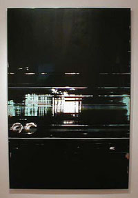
John Pomara, On Line, 2000
oil enamel on aluminum, 72 x 48 inches
This new variable suggests fresh content: the "impersonality" and "affectlessness" of the times, yes, but also a reference to the new visual landscape given to us by technology — "intermittent, static-laden signals on the information superhighway," as Davenport nicely puts it. There are plenty of interesting artists working in this territory: Stephen Ellis, John Zinsser, Bill Komoski, Shirley Kaneda, Mark Sheinkman, William Wood, Carl Fudge, Rochelle Feinstein, to name a few. Instead of the somewhat belittling "squeegee school," a better term would be mediated abstraction, referring to media in both the material and communications sense. This is an international tendency among painters, which both Pomara and Griffin are aware of and plugged into. And which, I might add, Pomara continues to work and evolve in. If we must compare Pomara and Griffin, a better job could be done. "Griffin is a man imitating a machine," Davenport says, while Pomara is "a painter using mechanical techniques to depersonalize his pictures." Isn't that a distinction without a difference? I'd say Pomara, with his succulent surfaces and all-too-human imperfections, is a man imitating a machine, while Griffin, with his high-polished control of every millimeter of a picture, is more like a machine imitating a man. (And I mean that in a good way.) - Tom Moody, New York
My reply has been edited slightly for punctuation and syntax. Some newer work by Pomara is referenced here. Earlier posts on him are here and here. With five and a half years' hindsight, I'd say that almost none of the painters mentioned in my reply represents much of a viable school any longer, except Pomara, who is busy morphing it into something else. Those *were* artists imitating machines, or a machine look, and little besides--that was probably not a good phrase to apply to him, because he's actually thinking below the surface of the computer, using processes of creative decomposition with imaging software to develop a new "pixelesque" iconography. His work belongs in the new media dialogue--painting is just a part of it.
Commodity fantasy:
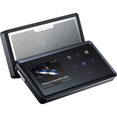
Purely hypothetically, this Samsung .mp3 player could be loaded with the 190-some songs I have produced in the last two years, turning it into a kind of artist music box. Owners could delete the songs they don't like, or just use the player for as much other material as they wanted to add to it. This would save me having to issue multiple CDs, or prioritize my work when I may not be the best judge of my own prolific output. Send me $200 plus S&H and the 2GB Moody Music Box is yours.
Some recent paintings by John Pomara:
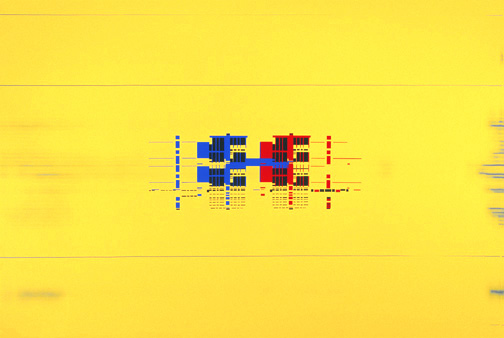


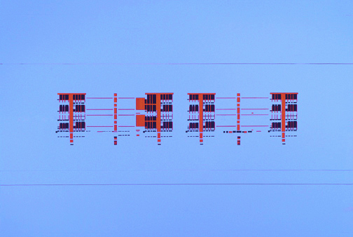


Titles are, top to bottom, Luv Connection, Corporate File, Digital Dating, Double Dating, Jailhouse Rock, and Jetsons (all oil enamel on aluminum). Earlier posts on Pomara's work, expaining a bit about the process are here and here. The current, stylish group handles digital content in a thoughtful, oblique way. These appear to have architectural subjects, but it's wholly invented or aleatoric architecture--emerging out of the process of deforming imagery at the pixel level. What look like "wrecked scans" a la Karl Klomp's "glitch video" work are just a starting point--the logic of messy revision and chance is continued into the painting realm, which is already very much about significant accidents, since the AbEx days. Pomara also makes photos and ink jet works in this vein, and there is much back and forth among media in his studio process.
Update: Some links to writing on Pomara in Houston's GlassTire online magazine weren't working in my April 2001 post but those pieces have now been located: Bill Davenport's review and my reply. The reply is unfortunately captioned "Responses to Tire Iron #6 by Jeff Dalton" but my name is in there somewhere.
Update: The text of Davenport's review and my reply are here.
Update, May 5, 2009: Those links were broken again. I'm linking to the barely formatted "print" pages as there is no way to permalink the articles. Get it together, Glasstire! Oh well, at least the writing hasn't disappeared completely. Rather amazing after 8 years on the web.
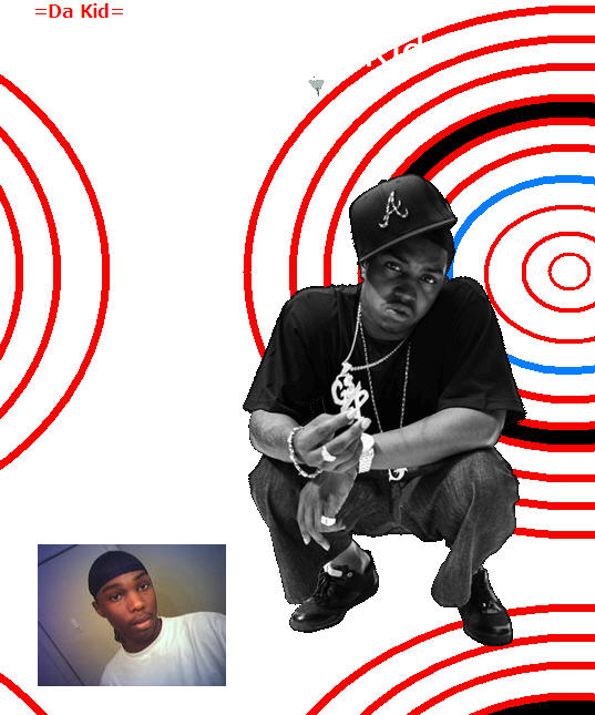
I've been making screenshots of my OptiDisc GIF when it appears as as a background image or avatar on MySpace, LiveJournal, or other blogs or message boards. Not because I care about the hotlinking (which is how I find it--any use of the bandwidth of the image shows up in stats--the hit is pretty minimal) but as kind of a sociological project. As in, how many different contexts is this artwork applicable in? Besides homepages, it seems to be very popular as an avatar on automobile forums (!). About a third of the time there is some caption like "Your eyes are getting heavy..." I have over 30 uses of the GIF preserved, from around the Net--unfortunately the screen grabs are only stills and don't show it in its full pulsating glory. Eventually I'll put them up on a separate blog page. The sameness-in-diversity aspect is pretty intriguing. (Or diversity-in-sameness?) Not all of them are as good as Da Kid's:
"Aruba '85 (Screwed)" [mp3 removed]
I suppose this could be called wormhole ambient electro lounge. I am adding percussion to this track and otherwise recuperating it from being a mere slowed-down song, so this is work in process. The Mutated snares sound like whipcracks at this speed--and there are other interesting sounds I hadn't considered.
I have been spending the past few days trying to "master" some recent songs. Basically just get'em up near CD volume. I am very leery of ruining songs with EQ that took a long time to mix, but I'm getting more confident. Yesterday I even learned how to create an "automated parameter" that gently rolled off the bass on a track that started out too "thin" but got louder at the bottom. It was kind of a thrill to watch that EQ curve moving as if by itself in real time. [/music diary]
Update: Added the percussion and chopped about a minute out of it. It's "dubbier" now.
