View current page
...more recent posts
Rest in Peace, Jean Baudrillard. Without you the art world since 1982 or so would have lost all meaning and purpose. Let the inevitable hyperrealization of your life and work begin.
text buffer from wikischmedia:
Much of Baudrillard's notoriety as an academic and political commentator comes from his deliberately provocative claim in 1991 that the first Gulf War 'did not take place.' His argument which sparked heavy criticism from the likes of Chris Norris ... who perceived, in Baudrillard, a denial of empirical events described the war as the inverse of the Clausewitzian formula: not 'the continuation of politics by other means', but 'the continuation of the absence of politics by other means.' According to Baudrillard, Saddam Hussein was not fighting the Allied Forces, but using the lives of his troops as a form of sacrifice to preserve his power (p. 72 in the 2004 edition); and neither were the Allied Forces fighting Saddam, they were merely dropping 10,000 tonnes of bombs a day as if to prove to themselves there was an enemy to fight (p. 61). So too were the Western media complicit, presenting the war in 'real time' and recycling images of war to propagate the notion that the two enemies were in actual conflict. But, Baudrillard followed, this was not the case: Saddam did not use what military capacity he had (his air force); nor was his power eventually weakened (as he managed to put down the insurgency against him after the war ended). And so, Baudrillard concluded, little politically changed in Iraq: the enemy was not defeated, the victors were not victorious. Ergo, there was no war: the Gulf War did not take place.
hat tip to steve
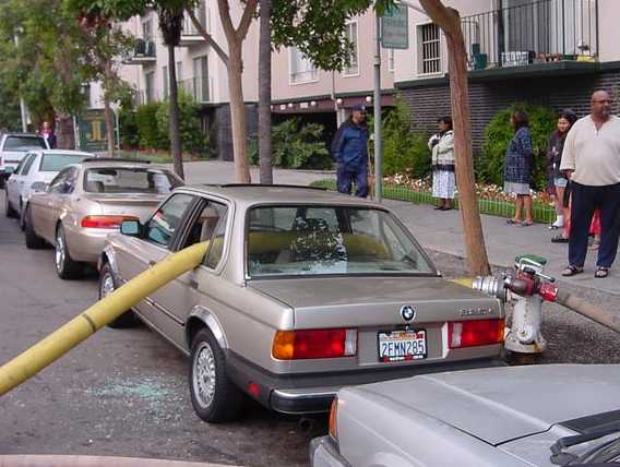
Update: the text originally published here had little to do with the above image. The picture is complete unto itself, a visual one-liner, not requiring a word of explanation or elucidation. (Except that it's a great bit of real-life performance art.) Unfortunately the photo was "vibrating badly" with the one below it on the page, to use curator Walter Hopps' term for two unharmonious paintings in an exhibition hanging. He would sometimes substitute a lesser picture next to the one he considered the masterpiece to remedy this. On the blog another solution is to have a "text buffer"--some random snippet that insulates the two images from each other. Unfortunately including text in the same blog post (out of sheer laziness of not wanting to create an intervening buffer post, which is an involved process) inevitably invites relating such text to the image above it. It was hoped that Paul Virilio's thoughts about "the accident" (yanked from Wikipedia and now moved to the comments) could be read ironically in tandem with the firehose picture, since what it depicts is not an accident--but that's asking a lot in a fast-reading blog scenario. Thanks to K for noting the problem. This meta type text now serves as the buffer. blah blah
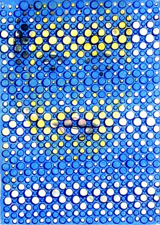
DAVID MORENO
Untitled, 2002; ink on paper; 12.75 x 9.25"
#6 of a suite of 6 (image from Feature Gallery website)
Never seen this piece in person. It might well work better as a web graphic than an object. "Graphic" meaning art, it should be added, but having a particular punch or "read" in the concise, compressed format of a web page. "Accidental enhancement" or "second-level improvement" should be added to the criteria art historians consider in evaluating work.
A breakthrough moment on this score occurred a few years ago when the Museum of Modern Art collected several of Van Gogh's "postman of Arles" paintings for a small group show. The museum couldn't get loans for all of them, so one was represented by a digital reproduction, mounted on a panel so it read like a painting. With its bright, saturated colors, crisp "sharpened" resolution, and excellent lighting, it stole the show--making the others appear dingy, old, and fussed-over.
Addendum to an earlier post: In addition to VVork Annotated, we also need the Anti-VVork. The latter consisting of art projects with no explanation, purpose, socially conscious rationale, tag line, or associated sound bite. It would be art not reducible to or reproducible as photography. It would be private jokes, arcane abstractions, and/or noise with no discernible or announced organizing system. It would be bad art, failed art, non-art (i.e. found things with no original purpose as art), and "embarrassing" art (i.e., too personal, too self-revelatory, too unhip or "square"). It would be expressionistic as opposed to ironic, not the faux expressionism of the current New York painting world but some kind of atavistic, unassimilable emotion. Just trying to think of everything VVork is not. More items will possibly be added.



more eyekhan vs moody vs eyekhan / bigger
not intended for RSS readers; no guarantees with Safari
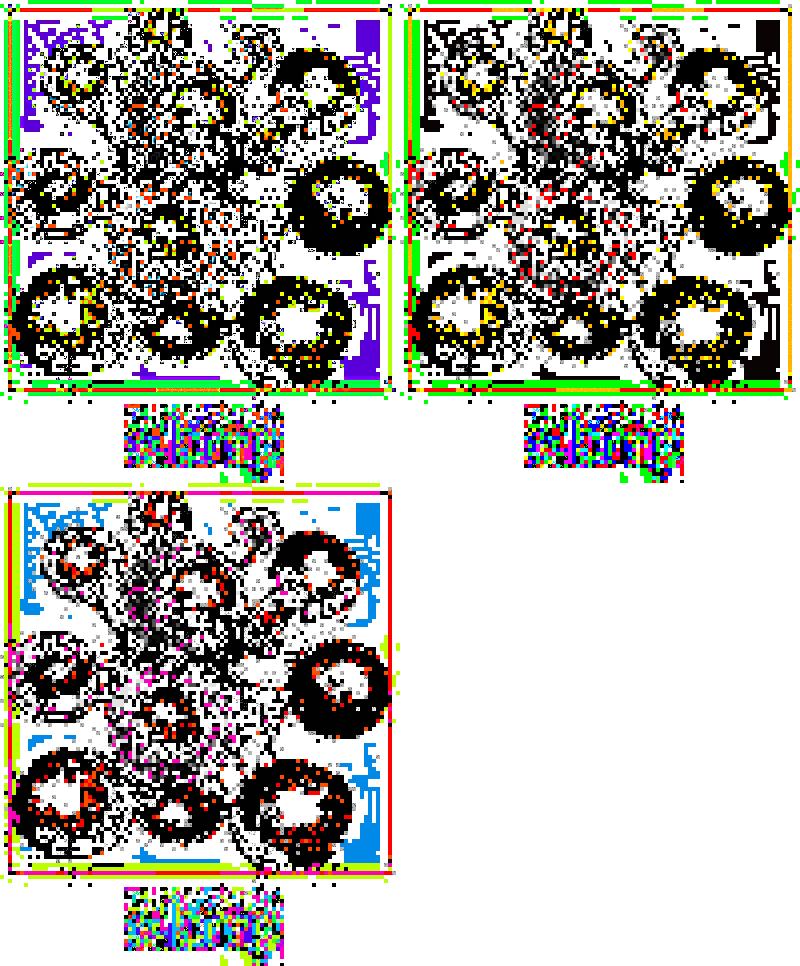
extensible cluster frame e remix by eyekhan
The New York Times vs Triple Candie Part 2.
The following correction appears in today's Times, concerning a Martha Schwendener hit piece on Harlem's Triple Candie gallery. How is possible to get so many things wrong in a review? The correction doesn't even address Schwendener's imputation of a revenge motive for the show--which is the official script for critics from the New York media writing about the gallery. (For those who haven't been following, the media keeps claiming that the gallery shows facsimiles or photocopies after being turned down for originals, with David Hammons, Cady Noland, and now George Eastman House, none of which is true. See The New York Times vs Triple Candie Part 1 and this post.)
Correction: March 3, 2007Here is the semi-corrected Schwendener review, which still includes the errors about the gallery's mission and the "revenge against Hammons" canard that the Times apparently forgot it already corrected:
A brief art review in Weekend yesterday about Limelight, an exhibition at the Triple Candie gallery in Harlem based on a 1959 show at the Limelight coffeehouse and gallery in the West Village, misidentified the content of the original show. It included reprints of photographs by major artists lent by the George Eastman House in Rochester, not originals.
The review also misstated Triple Candies dealings with Eastman on the current show; it did not request a similar loan from that institution and thus was not denied one. And it referred imprecisely to the history of the gallery. Triple Candie says that its goal is to provide Harlem with a site for contemporary art and artists with opportunities unavailable in commercial galleries; its original mission was not to show the work of Harlem artists.
LIMELIGHT
Gallery and Coffee House,
1954-61
Triple Candie
461 West 126th Street, Harlem
Through March 18
From 1954 to 1961, Helen Gee, photography maven and skilled photographic retoucher, ran the Limelight, a coffeehouse at 91 Seventh Avenue in Greenwich Village that became a gathering place for writers, editors and photographers. It also housed New Yorks first gallery devoted to postwar photography. In seven years, Ms. Gee mounted an impressive roster of solo shows: Berenice Abbott, Ansel Adams, Gordon Parks, Edward Weston, Minor White and others.
Drawing from Ms. Gees 1997 book, Limelight: A Memoir, Shelly Bancroft and Peter Nesbett, founders and curators at Triple Candie, have constructed a homage in the form of a plywood-walled space inside the gallery with cafe tables and chairs and self-service coffee, available at a 1950s price of 25 cents a cup.
A cub1cle inside the structure recreates, roughly, a 1959 Limelight show titled The History of Photography, which included artists like Lisette Model (with whom Ms. Gee studied briefly), Alfred Stieglitz, Edward Steichen and Robert Frank.
Ms. Gees 1959 show consisted of reprints lent by the George Eastman House in Rochester; Triple Candie has resorted instead to photocopies mounted on cardboard.
A similar situation arose last year when Ms. Bancroft and Mr. Nesbett set out to mount a retrospective of the work of David Hammons. According to the gallery, the artist wouldnt cooperate, so they installed David Hammons: The Unauthorized Retrospective, an exhibition consisting solely of black-and-white reproductions of his work. The unorthodox show was oddly in sync with Mr. Hammonss own oeuvre, raising interesting questions about art and representation, reproduction and authorship.
Limelight doesnt rise similarly to the occasion. The cafe is a light exercise in nostalgia (and not the first tribute: Sarah Morthland mounted a Limelight show in 2002), and the photocopies, unlabeled and unaccompanied by a checklist, impose the organizers frustration with George Eastman House on the viewer.
It all makes you wish that Triple Candie would return to its original mission, to show the work of Harlem artists, many of whom would be thrilled to exhibit their work in this scrappy, cavernous nonprofit space. MARTHA SCHWENDENER
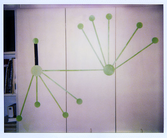
studio view - early '90s
