View current page
...more recent posts
The Sunday NY Times had a report about a musician who quit his job and posted a song a day on his blog. One minute journalists are hissing and spitting about "people in their bathrobes" presuming to usurp them and the next they're glorifying the new lifestyle mythos. Didn't read past the first page but it sounded like it was about an individual trying to cope not just with creativity but the stresses of fan adoration, frequent commenters, people music-animating and -remixing his work--in other words, being a one man band of self promotion. Yawn. Not too interested in the problems of someone replicating how the record industry promotes an artist: that is, via behind the scenes stories and a cult of personality. Every musician his own Tigerbeat. As artists using blogs we want transparency but on some level our projects should still be difficult for journalists, not spoonfeeding them stories in terms they already understand. To adapt a favorite quote about art from AbEx painter Adolf Gottlieb: "I'd like more status than I have now, but not at the cost of closing the gap between blogging and the public. I'd like to widen it!"
An earlier post incorrectly stated that Minus Space ("Reductive Art") had added a blog to its website; in fact it has a page of texts in reverse chronological order that it's calling a "log". The page has no permalinks, no comments, no RSS feed, no content management system that I can see (a la Word Press or Blogger). It appears to just be a list.
Yet Minus Space was included by ArtKrush in a recent article on "Art Blogs" and appears on the ArtKrush link list as an "art blog." Maybe ArtKrush can correct that Minus Space is not a "blog" but a "site" a la the dot com era.
Update: The more closely one looks at Minus Space, the more unclear what it is. Not only is it not a "blog," it appears to be a gallery that is repping "reductive artists." Or was, because now the site says "MINUS SPACE IS NOT ACCEPTING SUBMISSIONS AT THIS TIME." Submissions for what? They appear to have a physical "project space" that is intermittently open, which may or may not be the same as the online project space. In the past they sent out email notices of online exhibitions but those are not maintained in any kind of archive. They have a page of "Minus Space Artists" consisting mostly of links to the artists' personal websites (some don't link to anything). If it's a real space gallery it's not much of one and if it's a virtual gallery it's not much of one either. And it's not a blog. So, what is Minus Space?
Update 2: Also this bit of dubious puffery from the site. The end of the ArtKrush article reads: "Check out the complete list of our favorite art, architecture, design, photography, and new media blogs" with a link to over a 100 blogs. The Minus Space press page presents this citation as a quote: "'Favorite Art Blog' --artkrush.com." Bit of a stretch, that.
Josh Marshall on the Fort Dix Six, the US government's latest attempt to say "Look! Over there!":
The Fort Dix Six?
Well, seems they made a jihad training film featuring themselves. But they couldn't figure out how to burn it to a DVD. So they went to a Circuit City and asked the clerk on duty if he could do it for them.
D'oh!
I guess that means these guys probably needed remedial terrorist training.
There also seems to be more than a hint of entrapment in the role the government informant played in helping arrange the planned attack. Back in November one of the plotters called a Philly police officer and told him that he'd been approached by someone [i.e., the government informant] "who was pressuring him to obtain a map of Fort Dix, and that he feared the incident was terrorist-related."
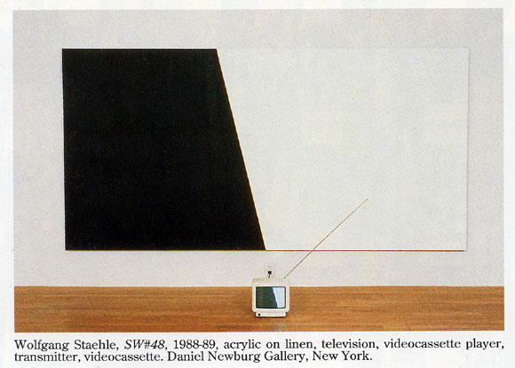
Televised Abstraction, 1988-2007
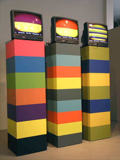
Lorna Mills, L to R: Bletchingly, Infomint, Lucky Hubble 2007, MFD, latex, video (at akau inc., Toronto)
Mills' piece (see this Digital Media Tree page, where we are fortunate to have her posting as L.M.) differs from the Staehle in the choice of "formalist forms" used, a sense of heightened artificiality, the oval masking on the screen, and most significantly the real world content: names of racehorses scrolling across the bottoms of her screens, defamiliarized and exoticized in this context. Also, not sure why Staehle was "broadcasting" to his TV--maybe VCRs on the floor were not the norm in 1988.
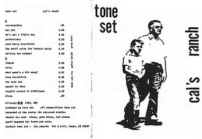
More cassette madness: Tone Set, where have you been all my life? Found out about this Tempe Arizona duo from Mutant Sounds. John Carpenter-esque minimal moog meets Negativland sound collage, only it was '81-'82 so the sampling is all done with tape. "Synthpunk" probably is the best term, as it's in the DEVO/Wall of Voodoo camp melodically. The title "Cal's Ranch" refers to Cal Farley's Boys Ranch outside Amarillo TX, and some of the samples have ironically appropriated fundamentalist Christian themes. Also bad movies from late night TV, call-in shows, snippets from Rocky and Bullwinkle, all that stuff you get sued for now. My favorite tracks so far are "The Devil Makes the Loudest Noise" [mp3 removed] and "Out! Out!" but it's all pretty amazing.
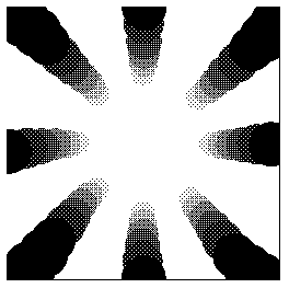
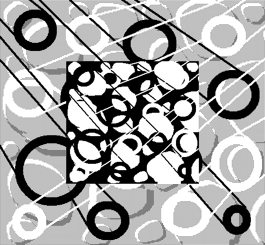
Thanks to Rhizome for reblogging* this recent sketch. I like what happened when the image resized--the center got white hot and edges became black holes. It's more of a graphic this way, but a mysterious one, I think.
Someone asked if the recent uptick here in drawings and animations was because I was showing the blog in the gallery. That hasn't started yet--end of next week. This blog is a place for my artwork and if I had more discipline I would just draw and post sound files. I post text because (a) some images don't look good adjacent to each other and it helps to have a buffer of some kind, but the buffer can't just be filler so I have to write something cogent, and (b) I'm verbose and have to talk about things (even though it means sometimes people get "insulted.") The writing helps me think through what I'm doing and ties it into a larger context of stuff I like and don't like. [/pure egotism]
Update, 2011: The Rhizome link has been changed to http://rhizome.org/editorial/2007/may/9/sketch-monochrome-gradient/.
Irritants of the Day.
1. Jonathan Lethem's descriptions of art in Fortress of Solitude. Don't know if the Abraham Ebdus character is based on Lethem's father, or if Lethem's father is an artist, but the book feels like an elaborate revenge by a son who essentially hates art against a father wholly dedicated to it. Lethem knows just enough about his subjects to be dangerous. He can imitate the style of an Artforum review, describe an avant garde film screening, or string together a narrative of what is happening in an abstract painting or film well enough to make these things sound completely pointless and ridiculous. The book is filled with fake reviews, of art, music, etc--no one can respond to these because they are pure fiction, straw men for the writer's contempt. Lethem has a vicious wit--one wishes it could be turned on people and things that deserve it (Republican politicians, Judith Miller, etc)
2. Minus Space. If Lethem's imagined world of form-only art existed it might be found on this space. A website devoted to "reductive art"? Surely "reduction" is just one technique or strategy an artist might use to get at some significant content--not an end in itself. One might as well create a blog called Blue and only blog blue things. Yet in fact a longstanding cult persists around this "reduction," which has little to do with minimal art practices as described by Robert Smithson or Sol LeWitt (or even Peter Halley) but instead provides a safe haven for late Greenberg disciples proudly entrenched in painting's own greatest area of competence--itself--while the world changes all around them. Not everything on Minus Space is that simplistic, they've added a fair amount of "painting as architectural critique" since the site's inception, but one yearns to pluck the better things one sees there out of the limited context. Many pieces are succulent but the photos are too small; half the time you're not sure what you're looking at and the pleasures you could get from staring at monochrome and shaped canvases are stanched.
Afterthought: Minus Space has changed in the last year or so. It added a blog [wrong--see here] but no longer hosts a deep archive of its past online exhibits. Instead it features links to artists' websites (some of which are Flash--yech.) A link I made to a show they put up online last year (Daniel Gottin) is now dead. Also, the site says it is no longer taking submissions. Perhaps "reductive art" as an organizing principle is petering out. Or Petering to the extent Halley is a mentor for any of these artists.
Update: This quote from Salon's Laura Miller, writing about Don DeLillo, also applies to Lethem: "The weaknesses of Falling Man are DeLillo's long-standing ones. Most of them spring from the fact that he is an essayist at heart, who presumably chose the novel because it is the most exalted and revered literary form of our time -- and DeLillo is not the sort of writer willing to risk being insufficiently exalted and revered." It's so stupid. But it does work. Lethem's Fortress was lauded as the Great American Novel because we need such novels and young writers to write them. Whether or not the form is outmoded or the best vehicle there is a myth machine, an industry, behind it. The art world equivalent is painting, which you have to do, no matter how bad or irrelevant, to be a playa.
