View current page
...more recent posts
Another recycled reBlog post:
Matt Pyke recently left tDR [The Designers Republic --TM] to join Transistor Studios - the most excellent demo reel of his is here, and his latest project, a music video for Nuno Felipe, can be seen here. Good stuff!The Designers Republic was the vanguard of the graphics revolution (or what might be called the "vector revolution" for its use of Illustrator, Flash, and the like), most conspicuous in electronic dance music packaging but also embraced by Globo Youth Marketing Capitalism. It's nice to put a name to a product, even if tDR was supposed to be about anonymity and collectivity. I didn't watch the music video but the demo reel is pretty mind-blowing. Sorry to always keep harping on Jeremy Blake, but this is better, innit? I liked Blake during his Morris Louis phase (which PT Anderson picked up on and then Blake abruptly dropped) but for a full-service digital collage artist, Pike is doing more tricky and I would say paradigmatic stuff. It's just that one is "high art" and was in the Whitney three times in as many years and the other is "low art" that is probably making the producer oodles of money--as clear an argument as I've seen for the need to rethink the distinction, at least where digital media are concerned.
via KALIBER1000

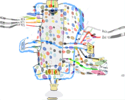
jimpunk did a nice animated .GIF of my "logo" morphing into the wiring diagram from my reBlog post "How to make a Nintendo controller into a PC joystick."

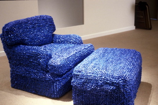
Sarah Hollis Perry, At Home (blue chair), chair upholstered with New York Times bags
Opening Friday, Sept 10th, 8pm, at Flux Factory, Long Island City, NY, running from September 10 - 25, 2004:
REFUSE: functional art objects and music made from waste.
Project statement
There is an alchemical process that takes place when waste is converted into something useful. REFUSE is a collection of work by artists who apply this process to castaway raw materials reshaped into functional art objects and sound sculptures. The exhibit will include pieces whose emphasis is on form and function, making scavenged material an integral, possibly unapparent element of the work through skilled transmutation. An apparent dwelling space within the gallery will be assembled with pieces ranging from dresses woven from cassette tape ribbon (Alyce Santoro), a chair reupholstered with woven blue new york times bags (Sarah Hollis Perry), chairs fashioned from recycled road signs (Boris Bally) and tables crafted from scrap wood (Scrapile). Several Interactive sound sculptures and musical instruments made from waste will be placed throughout the gallery providing a sonic backdrop for the space.
Featuring works by Boris Bally (borisbally.com), Lea Bogdan, Ken Butler, Peggy Diggs, Joy Halsted, Nikolai Moderbacher (nikolaim.com), Cynthia Norton, John Parker (eyekhan.com), Sarah Hollis Perry, Philadelphia Dumpster Divers Neil Benson and Steve Thompson, Alyce Santoro (alycesantoro.com), SCRAPILE (bettencourtwood.com), Colleen Smiley, Meghan Trainor, Crispin Webb (crispinwebb.com), Peter Whitehead (healthyarts.com), Isac Zal (isaczal.com), and more.
[Just a few thoughts, based on surfing around some of the websites: working with landfill material is tricky; it can be politically edgy but it can also get bogged down in the sentimentality of "old stuff." There are a million undistinguished artists all over the world making assemblage type works with discarded junk; what separates them from a Yayoi Kusama or a Robert Rauschenberg is a question curators should be asking. Sarah Hollis Perry, maker of the blue chair above, appears to have swallowed Kusama whole but the cheekiness of using Times bags--the discarded wrapper or "invisible brand" of the "intellectual paper"--makes the work seem up to date. (I say seem because I'm only looking at the jpeg.) Other participants in the show might be veering dangerously close to the sentimental school, and there appears to be at least one designer making a straight commercial product out of post-consumer materials. Nothing wrong with that as long as the curation takes these distinctions into account. Yeah, I know, no one asked me to criticize the show, I'm just covering my ass because I haven't seen it. --TM)
The American Dream

This is my downstairs neighbor standing on what used to be his patio deck. The property owner next door decided to squeeze a few more rental dollars out of his 3-story building by lowering the level of his back yard ten feet and adding a fourth apartment in the basement. Construction has been slow: he did the digging a year ago and never shored up the excavated pit with concrete, as the city required him to do. Consequently my neighbor's yard is slowly sliding into the hole.

Here's another view: you can see the lake of water from a recent rain through the gap under the fence. It's amazing the fence is still standing.

And here's the view of the fence on the other side of the pit, two doors over from our building. Isn't America great? It's a place where you're free to be a business failure and there are always others to take up the slack--that's how much we value entrepreneurship. It wasn't always thus: in days of yore a posse of strong men from the neighborhood would have paid a visit on Mr. Budding Capitalist and stood there with arms folded till he filled in the hole with his own labor. But that would be fascistic, so we rely on the court system to do...nothing.
What is an art blog? 3
Chris Ashley has some questions/comments addressing the previous post. Taking them in order (now it reads like an interview):
Is it just me or did you rewrite th[e] post, and include more quotes?
I did a slight rewrite (I often tinker with posts after they're up; if it's substantive I put an UPDATE notice at the bottom).
Now that I look closer, it's funny to notice that the staples [in your piece] aren't big heavy staplegun-type staples used for stretching canvas; they look thin, like from an office stapler. Am I wrong? If I'm right, it's a sign, along with the office-standard colored copy paper, telling me that this "painting" has white collar origins. Did you photocopy this on the job? [...]
When I showed this body of work in the late 90s I used the phrase "corporate tramp art" in the press release but none of the writing picked up on that. Let's just say the work was an attempt to make lemonade, psychologically, out of an astringently toxic permatemp gig that has since mercifully ended. I'm doing similar work elsewhere (which is more enjoyable), so I feel I must add, "Of course no company supplies or materials were used." (The staples are actually light duty staples from an old Swingline gun.)
I'm interested in this quote from [yester]day: "...I do value the physical work (too)..." You've said in the past (Nov. 30, 03), "I like painting OK but I'm sick of the 'romance of paint.'" I'm curious, then, about this comment from a few days ago,"The only reason I'm pulling this out now is I reached a point with the computer-painting where I want to see more real world grit, and this older work is all about grit." I guess I'm wondering about what is the difference between the grit and romance, is paint always romantic, and what would paint add or detract from your recent work?
By "real world grit" I was referring to the legal pad, office paper, product boxes and such that I've incorporated into the work. For a while I've been working solely with computer-printed inkjet imagery and started thinking I needed to mix it up more with found stuff. The older work did a lot of layering between found and not-found.
[A]s I get back into painting after a hiatus (a long story), I am (and yes, I'm a "he") trying to figure out what I'm doing, what I want, where I'm going, and what I'm doing in the HTML drawings that is generalizable to other work. What I'm taking first from the HTML work is an approach to subject matter, a serial or a series approach, intentional transparency and overlay, a kind of gesture, and the notion of figure vs. field. And in my trying to figure this out I'm finding that it's really useful to post the drawings that I'm doing, to put them out for me to see, and for others, too. My weblog is, for me, a studio, a wall on which to post the work and reflect on it, a place for feedback, if I'm lucky, as well as a place to archive the work, write about art, link to interesting things, build arguments and interests over time.
This is the same thing I value in [your] weblog. I've also been paying attention to Dennis Hollingsworth's weblog, which I first found out about here, as well. I'm surprised that more artists don't use their weblogs as real workspaces for their art; most that I've seen are in the classic mold of a place to write, link, and gossip- journal-like spaces. What I don't see often enough are webloggers who mine their past posts, reflect on where they've been and where they are now, connect dots, and build a corpus of work. Am I missing others who are doing this?
As for painting, I have no plans to do it--I'm more interested in the problem-solving of how to make interesting, resonant, stand-alone objects with the computer, printers, photocopiers, etc., and intertwining that practice with purely online things like animated GIFs. There's more than enough there for a career. And for what it's worth, I much prefer your HTML drawings to the scanned sketches: the latter are "one step removed," but even more than that, having to work within the rigid cyber-parameters really toughens up and enlivens your output, for me. The online drawings seem very "now," whereas the sketches seem like a step back, even when I like the imagery. (Just so you know, I'm as bad as an ex-smoker about trying to talk people out of painting.)
As for art blogging, we discussed this issue a while back but I didn't address your comments specifically. I'll give my thoughts and then I'll post someone's slightly cynical (but thought-provoking) formulation from the previous round. First, the web is strewn with the carcasses of dead weblogs; it takes a particular kind of personality to keep posting, artist or no. Secondly, the web will mirror life: some artists will treat the contents of their studios like precious trade secrets and won't let anyone in while others will be very open.
In the previous round, artist and blogger twhid sent around a batch of questions about artists' blogging from someone researching the issue in Europe. In an email sent around to the group of initial respondents (which I'm publishing without permission and will remove if asked), Dyske Suematsu wrote:
There are probably many reasons contributing to the lack of interest in blogs in the art world. Here are some I can think of.I agree with some parts of this and disagree with others. It sounds a bit bitter, but there's a lot of truth there, there are definitely class things about the art world worth despising. I'm amused by the collectors who made piles in the tech sector seeking refuge in the art world as "the place of the sacred handmade."
1. Blog is a product of popular culture, and fine art is a product of high culture. Using blogs would devalue or take away this mystique of fine arts.
2. Many fine artists are not so computer savvy, and many among them are deliberately that way in order to distinguish themselves from the ordinary people who have to sit in front of computers all day at work. Artists need to keep the facade of being special and exceptional. They can't be doing what everyone else is doing.
3. Blatant self-promotion is looked down on in fine arts. Although the success in fine arts is largely defined by your skills for self-promotion, you must do so covertly. The Web in general is now seen as a marketing tool, and because of this, many artists, especially famous ones, do not bother building websites, much less Weblogs.
4. Artists could devalue their own work by speaking or verbalizing. Good artists are not necessarily good critical thinkers. If they were good at writing, and if writing is conducive to what they want to say, they probably would just write, instead of making something visual.
5. Fine art mainly caters to the taste of the upper class. The people of the upper class do not read weblogs. They are not so computer savvy either, because they can afford not to learn anything about computers; they just hire people to take care of computer-related tasks. In their homes, they often hide computers using elaborate pieces of furniture. They find them distasteful.
Later he added:
6. Fine arts is an interest of the privileged upper class. The rich and powerful do not like anything in which money cannot give them an advantage. Even for something as common as movies, they can arrange private, advanced screenings. For music, they can get prime seats at live concerts. Purchasing fine arts is the ultimate exercise of their privileges. For web-based art, however, they have no advantage. Absolutely anyone can view Net art from any computers. Digital art does not allow them to feel special and privileged, which is the main reason why they buy art in the first place. So, if you want to be a successful gallery-based artist, you need to address these upper-class concerns, and stay away from the interests of Philistines.
In the comments to an earlier post, a couple of people have been nice enough to help me with the ongoing issue of how to present work on the web. Sally (if I can paraphrase her) thinks a piece I posted earlier

should be shown cropped and sharpened, so that it reads more as a web-friendly graphic,

while Chris (if I can paraphrase him) was interested in what more documentation told him about the actual physical object. (The example below is the back of a different but similarly made piece.) "I like the simple use of materials- paper the colors found near a photocopier of any medium-sized office, and the linen tape, the bit of puckering. And what do you know?- it's a painting: a wooden stretcher and staples."

I'm actually not as intrigued as Sally by the grey zone between documentation of work and making some new, cyber-active form of it (again, paraphrasing)--in fact, I think the grey zone is a pain in the ass. You can choose to make things that demonstrably work best on the web (animated .GIFs, for example, or Chris's HTML drawings) but documenting physical work is basically a mundane, practical problem. Of course, new work ideas can be spun off from the process of documentation (and I like Sally's redo quite a bit), but I do value the physical work (too) and if the goal is to use the Web to make an end run around the gallery system, we really can't have the Web changing the meaning, or reading, of the objects on us.
Here's some straight-up re-reBlogging from yesterday. This is work by Gebhard Sengmuller (umlaut over the u, but it screws up my RSS feed), from Austria, as described on the we make money not art site. I wrote about an earlier Sengmuller project here. The image at the bottom I find incredibly compelling, even with (or maybe including) the glare.
VSSTV (Very Slow Scan Television) uses broadcasts from the historic public domain TV system --available anytime over freely accessible frequencies-- and regular bubble wrap to construct an analogous system in which the packing material works as the aperture mask.

A plotter-like device fills a sheet of bubble wrap with pigments in the 3 primary CRT colors (red, blue, green), turning them into pixels on the VSSTV "screen." Observed from a distance, the cluster of pixels/bubbles will merge into the transmitted image.

A patient observer can witness the extremely slow transformation of the "blank" bubble wrap into an image over the course of 10 hours.


These are details of much larger works from the site depthCORE, which I came cross reBlogging. Later I'll post artist names and some critical thoughts; I just want to get them up. I wish I had a reBlog feed back to my own page, so I could keep a record here of what I'm finding while moonlighting. Suffice it to say, I'm the low tech guy and these are high tech: I'm actually opposed to what looks like obedience to one particular high-end program to make work (no idea which one). But the part of me that likes Moebius and Tron (and Tanguy, and Charles Sheeler) finds these pretty tasty. (Obviously they owe more allegiance to the gaming world and club graphics than the latter two names.) From the depthCORE mission statement:
depthCORE is an international digital art group, focusing on three dimensional and abstract art. Our members come from a wide demographic, united in their love for their art. We have a strong focus on collaborative works, as well as individual pieces. We are a non-profitable group.For the polar opposite of this work, see the next post.depthCORE was established in March of 2002 by ekud and altermind. Noticing an extreme lack of focus on 3D and abstract in the existing art groups within our community, they decided to form their own. Thus, depthCORE was born.
UPDATE: The top image is primitive robo facility by adesignprimitive; the bottom is Drone by shapero. Both are details.
