View current page
...more recent posts
In a comment to the previous post, Brent questions whether Chris Ashley's stationary HTML drawing and jimpunk's moving .GIF are comparable or compatible on the same page. My usual quip about showing video next to paintings in a gallery setting is that it's like bringing a baby to a wedding, but the browser is the great equalizer. A few more line breaks were added to the post so the pieces aren't quite so close together, but otherwise, yeah, I think they have more in common than not as art non-objects. Although neither artist is an Op artist in the old '60s sense, the pieces exploit optical tricks over and above their plain formal appeal: illusory depth in the Ashley and quite literal vibration in the jp. Moreover, they are fresh takes on the grid and opticality, which the New York Times and the Village Voice love to dismiss as the concerns of a bygone generation, in spite of all evidence to the contrary (e.g., the Infinite Fill show.)
Chris Ashley - Untitled (Blue and Green) 18, 2004, HTML, 320 x 240 pixels:
jimpunk, ( [ ] ), 2004 animated .GIF and HTML:
   |
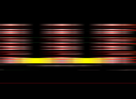
Re-reBlogging a couple of items from yesterday. More commentary will eventually be added, perhaps when I return to decelerated blogging life a few days hence. Ashley's drawing is straight-up HTML, and jimpunk's piece uses HTML to vertically stretch this gif (
UPDATE: This "website bricabrac" is some Apple "loading--please wait" icon thingy that's been turned from pale blue to black and white. I'm surprised no one told me I was revealing my Apple-ignorance (again).
Official website
Spoiler-ridden interview with director Mamoru Oshii:
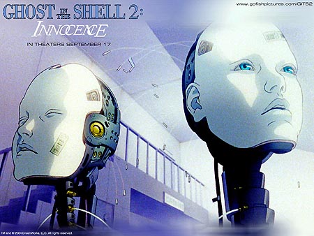
From the trailer it looks like a lot of CGI machinery awkwardly mixed in with character drawing. The story idea seems lifted straight from Armitage III, only with more of that heavy out-of-body stuff (and melancholy) that is Oshii's specialty. I mean, the man didn't look the interviewer in the eye once! (Thanks to del.icio.us/moth23 for the link).The original Ghost in the Shell, adapted from a manga (Japanese novel in comic-book form) by Shirow Masamune, inspired Andy and Larry Wachowski to make The Matrix [what didn't? --TM] and topped stateside video sales in 1996. Innocence, which premiered at Cannes last spring, catches up with Batou, a cyborg detective who journeys through a futuristic cityscape to crack the case of the killer gynoids (a term coined by Oshii). The prostitute ring of robotic Geisha-like sex-toys turns out to be masterminded by Kim, a crafty doll who fends off the investigation by implanting false experiences into Batou's "e-brain."
The sleuth eventually reunites with the Major, who exited her "shell" to become pure soul -- a ghost -- at the end of the first installment. Together they rescue hapless gynoids who become animated by having the ghosts of real girls "dubbed" into their bisque-coated physiques. In between his battles with Yakuza thugs, toxic firewalls and homicidally programmed assassins, Batou, Oshii's self-proclaimed alter ego, discusses Descartes, quotes Shelley and cites biblical passages.
UPDATE: Saw this on Sept. 21. It's beautiful to look at, like Peter Greenaway's Prospero's Books, which I also fell asleep in. Really don't like the combination of CGI (with obvious photoshop textures) and cartoon anime.
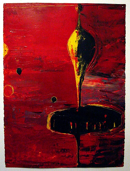
Above: John Pomara, oil on paper, ca. 1987. Speaking of painters braving the switch to 1s and 0s, the piece above is what Pomara was doing in '86 and '87 (gorgeously painted semi-abstractions with roots in AbEx, the east village, and '60s sci fi book covers) and below is a detail of a recent piece:
Pomara starts with a pixelated blow up detail of an image such as a face and gets busy crunching in an imaging program, refining and deforming and refining until something that looks like modernist architecture emerges. He does still paint, and these images are used as stencils in that process and also printed out as stand-alone photo-works. I maintain that a painterly eye transcends media and we're too fixated on the physical stuff: obviously output is important, and that's something we're all wrestling with. I'm confident that solutions will continue to be found that will save us from the dreaded fate of becoming printmakers. Calling the output "photography" is one conceptual end-run around the problem.
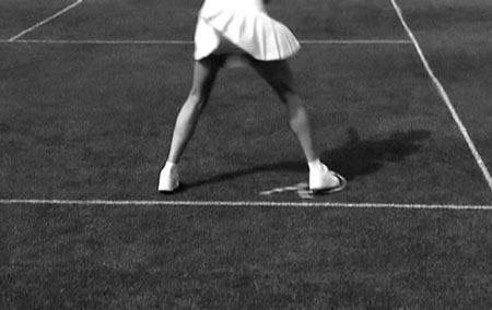
Diana Kingsley, Court Disaster, 2000-04, still from 2.5 min. loop, DVD on video monitor
New York artist Diana Kingsley, who I've I've written about a few times, just concluded a show at Leo Castelli, after earlier appearances at Derek Eller and Bellwether. The New Yorker reviewed it during its July/August run, and this week, Artnet observes: "With its visual reductiveness, Kingsley's work has the starkness of pulp fiction, where bare facts and descriptions set a mood more than they add up to a story. Her video narratives are tenuous, threatening to wink out and leave us with still imagery." To which I would add that the videos, like her still imagery, seem calm and innocuous at first but each contains some hint of the ominous, a mini-disaster waiting to happen.
More of the conversation Chris Ashley and I are having on painting and technology, from comments to an earlier post:
Chris: You say, "As for painting, I have no plans to do it--I'm more interested in the problem-solving of how to make interesting, resonant, stand-alone objects with the computer, printers, photocopiers, etc., and intertwining that practice with purely online things like animated GIFs." So, you're not exactly saying that you'll never paint. And I'm not trying to make you. I guess I'm wondering if you're leaving the option open so that if, at some point, a situation presents itself that tells you that the meaning you're working on requires the use of paint, whether, say, as enhancement or contrast, or for expression or irony, would you recognize that and not just follow a rule that says no paint, but instead follow the work and use paint?
And when I read your thoughts, "By 'real world grit' I was referring to the legal pad, office paper, product boxes and such that I've incorporated into the work," you're referring to materials that have in themselves a whole load of received meaning, and that could have, for some viewers, a kind of grit, or romance, or revulsion. You know, is it possible that at some point the viewer says, "Oh, the use of office materials in art is dead," as has been said about painting, as will be said about installations, and large photos mounted on aluminum panels, and the creation of characters for video or performance, and whatever else you're going to find in all of the galleries everywhere this "season."
I'm just trying to make the obvious point that probably no one is arguing against anyway that paint, in the many ways it's possible to use it, is, and will continue to be, a viable technology, whereas someday my HTML drawings will no longer be viewed in their native environment. The technology will fade. And I'll have no control over that. In 25 years using MacPaint will probably be pretty hard, but you'll always be able to buy a ten-color watercolor set at a stationary or educational supply store.
Tom:"Oh, the use of office materials in art is dead,"
My use of those materials died around 2000, with my permatemp gig. (Which is not say I might not use them again if I got a similar gig, but right now I'm working with "home consumer technology.") The criterion shouldn't be hipness so much as relevance: there's a history of artists working with the newest technologies (e.g., ground pigment) with a concomitant falling off of interest in older technologies (smearing roots on the cave wall). I'm more interested in applying what I would call a "painterly" approach to tech than painting itself (the physical side of which I never liked that much anyway). I would say HTML drawings have as good a chance of surviving (via being saved on hard drives, etc.) as physical art objects (many of which end up in landfills and moldering in relatives' basements). And as for media surviving, who cares what happens to art in 25 years?
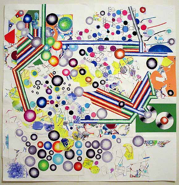
Expanded version of a piece I did last year; I added about 8 inches to the what used to be the top and turned the format from a rectangle to a square. I'm calling it Van Der Graaf Flux; the whole thing is meandering conceptually and may not be finished (meandering being, I think, the subject matter). It has some Russian constructivist elements. Those spinning disc things over on the right are a design I saw years ago in a Popova (?) painting depicting rolls of silk in a silk mill, seen end-on; I've recycled it quite a bit. All the imagery is drawn in MSPaintbrush and MSPaint; the paper is repeatedly run through the printer, cut apart with scissors, and taped back together; the back of the piece is a dense network of linen tape holding the whole thing together. See? Kind of ugly, but here it is (flipped).
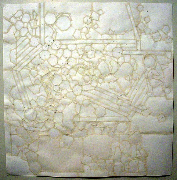
Here's a macro detail, which should banish any remaining illusions that this piece is "computer-slick":

Towers of Light vs The Birds
James Wagner asks about the flecks in the light beams in this photo he took of yesterday's Tribute in Light 9/11 memorial. Via alex (scroll down): "This is what birders were afraid of: this year's Tribute in Light display coincided with a big migrant flight. Too bad for the birds. Here's a report received from bird advocate Rebekah Creshkoff (a non-birder friend who saw the display thought that there was "glitter" in the light beams; that was birds.)"
I was at the Tribute in Light briefly tonight, from about 10:30 to 11. I didn't see our volunteer Brooke, but I sure hope she or Eileen or Denise had/have a camera. I didn't, but what's going on down there should be documented.Just wait till they fire up those big wind turbines in the Freedom Tower.THOUSANDS of birds were behaviorally trapped in the columns of light. The beams were visibly filled with birds for their entire height, looking like clouds of bugs. Their twittering was audible.
Their brightly illuminated bodies were reflected in the windows of nearby buildings -- 3 World Financial Center and the movie theatre. The light was so bright, some birds looked as though they were on fire.
There were so many birds, it was impossible to track any one individual for any length of time. I did see one bird that circled in and out of the uptown beam six times before I lost track. Each time, the bird stayed in the light for from 3 to 9 seconds.
The lowest 30 feet or so of light had moths instead of birds. Fantastic numbers of moths were attracted to surface of the big lamps. Assistants (wearing sunglasses) frequently wiped the surface of the lights with a cloth; even so, there would be smoke from all the moth bodies just moments later. I saw one bird lower down (apparently) escape the beams.
The birds were visible to the naked eye as sparkling motes floating in the light from Barrow St., about a mile or so uptown.
I found all this extremely disturbing. It takes a songbird about a week to lay down a gram of fat -- fuel for its long-distance migration. That fat will carry it about 120 miles. How much fat are they wasting flying around in those beams, only to have to (best case) spend the next several days refueling in food- and habitat-poor lower Manhattan?
The beams put me in mind of the old-time ceilometers -- beams of light formerly used at airports to measure the height of the cloud cover. Many significant birds kills were documented at ceilometers. I am attaching a paper I wrote for the organizers of the first Tribute in Light, which references ceilometer data.
The good news is, the lights will be off tomorrow. But is the human value of the Tribute in Light really worth imperiling thousands of birds -- and incinerating God knows how many moths?
Rebekah
