View current page
...more recent posts
Blog Spotlight: Loretta Lux
"They are imaginary portraits dealing with the idea of Childhood. Childhood has been idealized as a lost garden paradise to which we can never return. We are excluded from this world of carelessness, innocence and unity. But the imaginary kingdom is nothing more than a projection of adult ideas and concerns onto the image, an expression of our own yearnings." - Loretta Lux.
According to her press page, Lux's "images are created using photography, painting and digital tinkering. She photographs the child then places the resulting image on a backdrop that she has painted or photographed separately. On most of Lux's images the colours, and sometimes the children's features, are digitally altered."





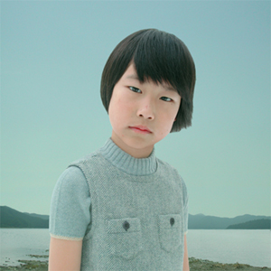



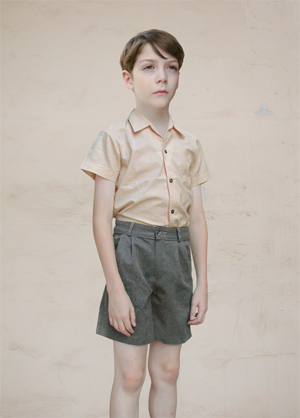
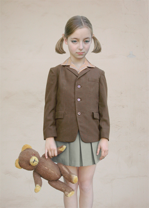
This is startlingly good work, a little scary because we're not used to seeing our cultural fetishization of children carried to quite this degree of care and craft. Also noteworthy is the hybrid nature of these images. Would they have been possible were Lux not equally skilled as a painter, photographer and digital artist? I don't think so. A prediction: this will emerge as more important work than John Currin's similarly polished but differently odd paintings, in that Lux has mastered a new technology in order to invent a medium to go along with her imagery, whereas Currin is just the latest in an unbroken cycle of "getting back in touch with the lost master painting techniques of yesteryear, blah blah."
UPDATE: Speaking of cycles, a friend asked why I'm just writing about this work now when tout le art world already chewed it up and spat it out (favorably) last spring. I replied that this blog isn't a slave to the usual rhythms of capitalist marketing hype--that it's impulsive, heedless of fashion, and also, I wasn't paying attention.
I made my first video last night. Woo. Kind of a first stab at integrating the music I've been writing with the animated .GIFs I've been drawing. First, I downloaded a demo version of a simple video editing software. I imported an .mp3 of a tune I wrote and then started adding some found .GIFs from my "collection," since that's the first folder that opened (*%&%! Windows XP always defaults to that lame "My Pictures"). The video editor is nice in that it automatically resizes all the .GIFs to the size of the first and can make them faster and slower, but not so nice because there is no way to sync a specific sequence of musical notes in the audio to the run time of the .GIFs. I put together my file as best I could--a parade of stupid cartoon characters dancing, completely out of step with the music--and then saved it as a Quicktime .mov file, just to see what kind of file size we're talking about. It took about 10-15 minutes to save and the 2.5 minute long video is (ouch) 77 MB. I just used the preset compression options, though. Also, the finished masterpiece has the words "Trial Version--Please Register" pasted in the middle of the screen the entire run time, in green letters. I like that, though--gives it a certain shabby authenticity. Any recommendations of a Windows-based video editor that allows syncing of audio and images and that can save output as multiple file types (particularly .mov) would be greatly appreciated.
Xxx xxxx OOOOOOOO X xxxx xx xxxxxx xxx xxx xx O-OOOOO xx x xxxx. Xxxx xx xxx, xx xxxxx x xxxx xx OOO OOOOOOOO OOOO. Xxxx X xxxx xx xxx xxxxxx xxxx xxx 0O0 O xxx xx OO0O. Xxxx X xxx OOOOOOOOO 00000000 xxxxxx xx xxx xxxxx, xx xxx x xxxxxxxxx OOOOOO OOOOOOOOO! X xxx x xxx xxx xx xxxx 000 OOOO xxx 000 0000000 xxx xx xxx xxxxxxxxxx 0O0 xx 000. Xx xxxxx xxx xxxx xxx 0000000 OOOOOO xxxx xx xxxx xxxxxxx OOOO xxx xxxxxx.. xxxxx xx xxxx. Xxxx xxx xxx 00000 OO OOO 0000. Xxxx xx xxxx xx OO OOOO xxxx xxxxx xxx xxxxxx x 00OOO 000 xxxx. Xxxxx xxxx 000 OO xxxxxx xx xxxx xxxxx. Xxx xxxxxx xxxx xxxx xxxxxx xxxxx xxxx 0000 OOO. Xxx xx xx OOOOOO 0000, xxx xxx xx OOOOOO 000 OOO. Xxxx x xxxx xxxx xxx xxxxxx xxxx xxx xxxxxxxxx 000000. OOO 000000000 OOOOOOO xxx xxxx xx xxxxx. X xxxxxx xxxxxx xxx xxxx xxxx xxx xx OOOOO 000 xxxxx xx x 000000 OOOOO xxxx xxxxxx xxx xxxx OOOOOOO 000000 xx x 000000 OOOOOOOO xx xxxxxx xxxx 000 OOO 00000. Xx xxx x OOOOO 000000. OOO 0000000000000 OOOOO 0000000000 xxxxxx xxxxx OOOOOOOOO 000 xxxx xxxx xxxxx xxxxx xxxx. Xxx xxxx xxxxx xx 00000OOOO, 00 OOOOO. X xxx xx x OOOOOOOOOOO xx 000 00000000 xx xx xxxx. X xxxx xx xxx xxx xxx x OOOOOO xxx 0000000 xxxxx xxxx xxx xxxx xxxx OOO 00000 xxx xx xxx x 00000 OOOO.. xx xxx xx OOOOO .. x xxxxx xxx 0000 OOOOOOO. Xxx xxxx xxxxxxxx x xxx x OOOO OOOOOO. Xxx xxxx x xxxx xxxxxxx xxx xxxxxxx x 0000. Xx xxx xxx 0000OOOOO xxx x xxxxx x 0000000000. Xxxx xxx xx xxxxxxxx xx x OOOOOOOOO. Xx xxx OOOO xx xx xxxxx. Xx xxxxx xxxx xx xxx 000000 OOOO xxx xxxxxxx xx OOOO 000000 OOO 0000000000 xxx xxxx xxxx OOOOOOO 00 xx xxxx xxx xxxxx 0O0O oo00O O00 xxx xxxx oOoOoOo 000 OOOO. Xx xxxx OOOOOO 00 OOOOO oooo xx x OOO OOO 00000 xxxxxx oOoO0 OOOO OOOO, xxxxxxxx x 000000 OOOO 00000OOOOO. X xxx x OOOOOOO 0 xxx xx xxxxx xxx xxxx xx 000000. Xx xxxx OOOOOO 0000 OOOOOOOOO xx x xxxx OoO xxxxx. Xxxxxxx xxxx xxx xxx xxx OOO 00000 OOOOOOOO.. xx xxxxx xxxx xxxx xxx xxxxx OOOO 00000. Xxx x xxxx x xxx OOOOOO 0000 OOOOOO xxxxxxx xxx xxxxx xx x 0000 OOOOOO xx xx xxxxxxxxxxx.. xxx xx xxx xx xx xx O ooooooo OOO 0 00000.. xxxxxx xxxx. X xxx xxxx xxx xxxxxx OOOOO 000000 xxx xx xxxx xx xxxxxx'x xxxx, 0O0 oO O. Xx xxxxx O OOOOOO 0000000 xx xxx xxxxxxxxxx xxxxxxx xx xxxx xxx xxxxxxxx xxx xxxx.. xxx xxx~!
The New York Times' "news window" or "news hole" is obviously shrinking (this usually happens as a result of falling ad revenue) and its art review section has recently been fairly drastically reduced. In days of yore that would have been cause for hand-wringing about the demise of importance of visual art in our culture, but now I say, good! 'Cause, see, there're these things called blogs, which can run critical commentary and pictures about shows and even have bulletin board type discussion of the work while it's up. What a concept! The shrinking copy hole may mean dealers have to look elsewhere for legitimation of the work they show, and--oh my God, all this time, while they were waiting for Roberta to come by and give the show an authoritative nod there's been a vehicle out there that could have been used to disseminate information and discuss ideas! And its power is based not on the top-down institutional authority of an entrenched critic but rather rhizomatic, community-based weighing of opinion and more or less instantaneous transmission of buzz! Who knew?

.GIF by jimpunk (from SCREENFULL: "we crash your browser with content").
"Eye Music." This post will eventually get around to techno music, but let's start with Claude Debussy. It's almost a cliche of criticism to compare the French composer's shimmery tone clusters to Impressionist painting. Daniel Albright's book of comparative aesthetics, Untwisting the Serpent: Modernism in Music, Literature and the Other Arts, takes a 180 degree tack, disagreeing with an assertion by Ezra Pound back in the day that Debussy's music is "suggestive of colors, suggestive of visions." According to Albright,
[...] Debussy's music is typically an art of slight temporal adjustments, discursive, an artful series of instabilities; it seems visual only because of the peculiar evolution of the visual arts in Europe, from the notion that the primary act of drawing is the recognizable depiction of a finite object--as it is in most cultures--to the notion that the primary act of drawing is the recognizable depiction of the eyeball's whole visual field. In Western art, the space in which objects appear is often more vivid than the objects themselves: perspective drawing carefully poses and graduates the objects that it treats, to create the illusion that the artist is presenting everything that a certain angle of vision makes available. Debussy's works are like French impressionist painting--or like Renaissance chiaroscuro, for that matter--in that the mind tries to grasp fleeting visual phenomena from a puzzling density of events. But it is not Debussy who is visual, but Monet and Leonardo who are discursive, in that they require the spectator to apprehend slowly and work out over time the possibilities inherent in the painted surface.The above paragraph is bang-on, but now it starts to get confusing:
Truly visual music, it seems to me, is epigrammatic: music that operates by means of instantaneously grasped units, pieced together not according to progressive tonalities, not according to some standard template of evolution (the sonata-allegro, the fugue, the rondo, the three-part song), but according to any principle that can not be understood as discursive development. Music becomes visual simply by lacking musically comprehensible connections between its parts, and by having parts that permit rapid apprehension as elementary units. Certain older procedures of form, such as the rondo (a repetitive piece with a pattern of symmetrical digressions, according to a scheme such a ABACABA), can approach the condition of eye music, in that the listener is conscious of the phonic equivalent of charms tallied on a bracelet; and as A and B get shorter and shorter, and as the musical links between A and B grow more unsettled and hard to understand, the composition will increasingly lose any sense of temporal progression and flatten into eye music. [...]These paragraphs sum up an earlier discussion of the "hieroglyph" or the "epigram" in music, a self-contained sonic event usually but not necessarily paired with words or some onstage deed. Albright describes these melodies or moments as having visual-like properties within the larger continuum of the piece. He gives several examples: the "oracle tune" in The Magic Flute, musical cues for specific emotions in silent film, and the motifs of the medieval master songs in Wagner's Die Meistersinger. Regarding the latter, he writes: "The rules [of the master songs] are discursive, but the discourse is chopped into tough leathery chunks, so predictable that the ear stops straining to understand, simply waits for the next bit to fall in place. A musical composition that consists of stringing-together of cadences has no possibility of moving toward a goal, no possibility of genuine discursive development at all." So in the rondo example above, the development of self-contained, multi-note motifs over time remains musical until the ear can no longer sort out their "narrative" structure, at which point they become visual--mere blocks of notes being absorbed and compared. Later, in describing the collage of musical motifs in Stravinsky's Renard, he concludes:
[T]he Modernist taste for ocularity in music, for easily-apprehended pattern-units juxtaposed rather than developed, brought the principle of scissors construction [collage] to its highest level. It is remarkable how strongly this procedure in sound appeals to the visual imagination: when I hear Stravinsky, I often feel exactly as Pound felt hearing Stravinsky's Capriccio in 1935--that a kind of slide projection of the score starts to hover in front of the music: "I had the mirage of seeing the unknown score from the aural stimulae offered."I still have questions, though. How can you envision a score without hearing a relationship between its parts? How is it that charms on a bracelet are "apprehended" musically but not as an image? Earlier in the book, Albright observes that Gotthold Lessing's analysis of the Laocoön problem---a consideration of ways emotions are expressed in different media, specifically sculpture and literature--has limited use to us now because it is so embedded in the conventions and decorum of the 18th Century. Perhaps Albright chafes against similar limitations, by restricting his discussion to classical music, which is so form- and history-ridden. One yearns to see his analysis applied to more contemporary, fluid, amorphous arts, such as jazz, rock/blues, or (finally getting to the point) Detroit techno, with its simple but elusive sequences of notes announcing themselves and dropping out in a dense, continuous mosaic. Without reference to words or stage pictures, one can easily "see" techno's unknown score; if anything, the genre is all about that--rhythm provides the sensual pleasure and structure the intellectual lift. As with many of Albright's examples, electronic dance loops lack the discursive complexity of a sonata or symphony; they switch on and off or change texture, conjuring a score like a Mondrian checkerboard, something Albright also invokes in his consideration of Stravinsky.
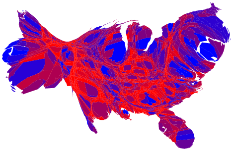
Another election map. This is not your country on drugs; it's what it really looks like. From Maps and cartograms of 2004 US presidential election results (hat tip to dave)
And this interesting factoid, from the DailyKos site: More people (56 million) voted against this president than any other in history. And this, also from Kos: Bush got the smallest percentage incumbent win since Woodrow Wilson in 1916.
My first compositional efforts using the SidStation synth, playing the notes in a notation program I downloaded called Harmony Assistant. I'm having fun, don't kid me too much.
"Funky Mountain Lake" [mp3 removed] The SidStation played "acappella," using the Lillhagen patch. I like the way the patch never seems to do the same thing twice--it always seems on the verge of breaking down or going seriously out of tune. And that it can add syncopation to a fairly clinical series of notes (see below) is amazing.
"Mountain Lake (Not Funky)" [mp3 removed] This is sort of a bonus track. It's the exact same sequence of notes used for "Funky Mountain Lake." The "lead" is the SidStation using the Autorepeat patch. I added another staff below it playing the same tune, using a kind of cheesy Harmony Assistant sound called Synthpad/Fantasia. This is unabashed Tangerine Dream/Phil Glass stuff, thrown in mainly to show how the Lillhagen patch utterly transforms the notes.
My complete musical works in .mp3 form are here.
