View current page
...more recent posts
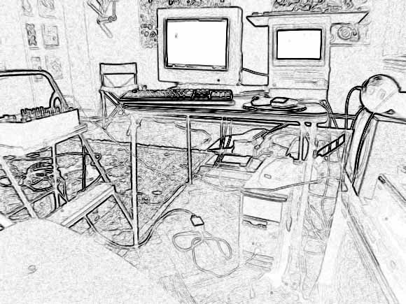
My music studio setup from a few months ago. I got the idea of using this particular Photoshop filter for a studio photo from a prog rock musician I admire, whose site is no longer online apparently. A line out from the Mac SE (the screen on the right) goes to the mixing board on the left (note improvised gear rack). Another line out from the PC (floor) also feeds into the mixer, and the audio is then routed back into the PC through the LP recorder box on the floor. The audio out from the PC was the voice of Microsoft Sam reciting numbers in German, gradually slowing down and changing pitch because there wasn't enough memory in the text reader. Beats came off a DIY drum program streaming off the internet. The SE, running MusicWorks, supplied a background jingle. I've recently started using off-the-shelf software and felt I needed to post this to establish my street (Povera) cred. I consider all this visual art, for any curator who thinks I've stopped working. This is why I probably won't apply for a Creative Capital grant: they'd never understand. I'm not sure I do.
Speaking of poor quality jpegs, Michael Bell-Smith steers us towards this page at a site called "fake is the new real." I've been enjoying the random collection of fey, twee, transmedial-type things on that site but one point of clarification should be that the jpegs assembled there (and sampled here) are good (as in beautiful) bad jpegs as opposed to good-bad (as in pathetic/funny) bad jpegs.

Bill saw a girl in Jersey City wearing a T-shirt that says "Von Bitch." More on the Von guy here.

Surfing around electronic music links yesterday. Throb.com has vanished. That was the site for a great record store where I bought a lot of vinyl from '99 - '03. Somewhere owner Load Rezenhand has a shop's worth of amazing inventory in storage--if I was rich I'd track him down and buy it all. One of the most helpful people at the store that I found early on was DJ Prozac. Incredibly knowledgeable, with discriminating taste and a strong point of view (until I found this Discogs link I didn't know his name or that he'd made these tracks). His taste was consistently harder, harsher, and more experimental than what I liked but he took pity on me and recommended more of the "beautiful" or seductive electro and tech-house I was looking for. He is friends with artist Meredith Danluck and through her he briefly became electronic music maven of the art stars. (Well, I'm told one relatively famous artist who used a Wolfgang Voigt composition in his work learned about him through Zach.)
Some survivors (more on all this later):
http://www.selwaymusic.net/
http://www.satamile.com/label.jsp
http://www.satelliterecords.com/live/index.php
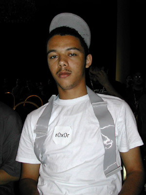
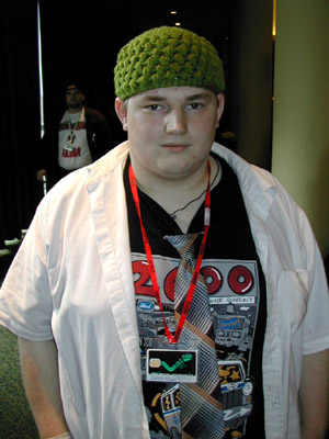
Excerpts from "TEMP IS #173083.844NUTS ON YOUR NECK, or, Hacker Fashion: a Photo Essay," from the BEIGE Multimedia Gallery.
|  |
 |
|
| 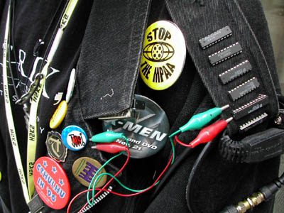 |
Images from "H2K2 - The Fourth Hackers on Planet Earth [H.O.P.E] Conference," July 12-14, 2002, New York City. Text by Paul B.Davis, photos by Cory Arcangel, fashion terminology and editing by Lauren Viera. More here.
Edward B. Rackley has been traveling in the Congo and has a report and some photos in the Old Town Review.
The human catastrophe of Eastern Congo is, for visitors, a bundle of numbness and raw nerves. In September, at the invitation of a British think-tank, I visited the unstable region to assess the causes of ongoing violence against civilians. With close to 15,000 peacekeepers on the ground, a transitional government anticipating national elections in six months, and well-funded efforts to disarm, demobilize and reintegrate combatants into civilian lifethe DDR processwhy are civilians still being killed with such impunity? Scores of interviews with humanitarian actors, UN staff, and Congolese revealed the usual suspects: predatory governance, uncontrolled armed groups, endemic impunity, and the inaccessibility of civilian populations due to ongoing combat.Read the rest here.
None of these factors is particularly well understood by outsiders; this opacity keeps the heart of darkness myth alive. For insiders, Africa remains a Dark Continent by sole virtue of its ability to generate degrees of suffering that surpass human comprehension. Unfettered anarchy it is not. Recent African crises have birthed a new truism: If it looks like anarchy, then you dont understand what you see. Eastern Congo fits the adage well: chaos and senseless tragedy are the inevitable, indelible impressions etched on any visitors memory. But behind the barrage of extreme scarcity, mute agony, and feverish suspicion is a clear pursuit of economic interest, a highly dexterous application of disorder as political instrument.

Here's what Paul Slocum's bad jpeg (see below) looks like as a cross stitch pattern, after running it through knitPro. Pretty good--I mean, bad. This works, no? Now, who's going to sew this?
UPDATE: From the comments: "The problem might be finding all those colors of thread. How many blues are in there?" One answer would be first to ascertain that all the blues could be reproduced using cyan, magenta, black, and yellow, and then to break open some Epson cartridges and use the pigments to make dyes for the thread. Just a thought.
Paul Slocum suggests using knitPro to upload bad JPEG images so they could be rendered as cross stitch or needlepoint projects. Good idea, but man, that would be difficult to pull off. My sense is the stitched piece would have to be both enormous and extremely detailed to show the horrible "bicubic mush" that results from poor compression (which only the extremely perverse are apt to find funny anyway). Nevertheless, I have a candidate: it's a late Op Art piece by Julian Stanczak on the Stefan Stux website [Since removed]. In real life those stripes are super hard-edged, but on the Web, well...
UPDATE: Here's Paul's draft of a proposed "bad JPEG" fiber art project. He has more to say about it in the comments. I'll be away from the computer for a while but the obvious next step is to run this through knitPro.

More opinions on what the Stanczak image suffers from would be welcome--Paul pegs it as a bad resolution issue rather than a too much compression issue. I realize it's hard if you haven't seen the actual painting, but assume it's a black and white image with razor sharp lines. The whole thing is out of focus but mushy spots with added color at regular intervals look like the type of thing you see when saving something too many times at the "low quality" setting. It's important to know why things are an utter failure at communicating.
UPDATE 2: Another comment, from Dan, persuasively identifies the problem with the Stanczak image as one of bad resolution, not bad compression, but it's academic now because Stux has removed the murky black and white pic from its website. A new show of Stanczak work opens soon so I'm sure it was because of that. For bad jpegs of famous Canadian paintings, please see this post on Sally McKay's weblog, which she explains was inspired by a now somewhat quaint 1953 article by George Elliot warning that art should not be shown on television. " A painting needs an intellectual presence before it can work its magic. Placing anything between the viewer and the painting kills the viewer ."
