View current page
...more recent posts
Bill found this wikipedia entry on fictional chemical substances. Everything you need to know about Adamantium, Balthorium, Cavorite, Dilithium, Illudium Phosdex, Kryptonite, Mithril, Upsidaisium, Vibranium, Thorium, Corbomite, Ferrocrete, Flubber, Herculite, Ice-9, Imipolex G, Plasteel, Puppeteer Hull Material, Scrith, Vespene Gas, and much, much more.
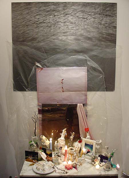
Leif Ritchey, ATM Gallery, 170 Avenue B, NYC, through Feb. 13. This work is probably the antithesis of what this page is into--it's in the vein of assemblage, expressionism, Rauschenberg, Cornell & combing through trashbins and thriftstores, as opposed to Minimalism, pop, artificiality, and the questionably sincere. Nevertheless one can't help but respond to many of the elegant, intimate aspects of Ritchey's installations and sculptures, which were described earlier here and which can be found lurking in crevices or down near the baseboards of this ATM show--abstract tangles of ripped and resewn bricabrac, accumulations of costume jewelry as intricate as Peter Greenaway place settings, a strip of fabric painted with a skunk stripe of plaster and curled inside a striped plastic box. The show could have been edited drastically, but again, that might be missing the point. A running theme of dresses hanging on hangars and wadded female apparel stuffed in boxes added a kink factor, or at the very least a Miss Havisham factor of faded, disappointed sexuality.* Dense accumulations of fetishistic found and altered objects invoke Michael Tracy, an ur-Catholic artist from the Texas border briefly in vogue in the 80s, and at worst, Arman's stuffing of detritus into Plexi cubes.
Insider detail: one might recognize the black and white photo in the piece above as the Felix Gonzales-Torres edition offered as a takeaway at the MOMA-Q(uee)NS opening a couple of years ago, still bearing traces of being rolled up and flattened, as most were.** The soul of Chelsea minimalism meets the essence of East Village maximalism, with the shrine of plaster-smeared objects providing an elegiac link.
Ritchey's video and music may actually be his most successful form of urban collage: the "Flatbush Windows" VHS described in the earlier post still haunts, and this track [mp3 removed] from a recent 4-song CD-R takes the noise jam into the realm of strolling big city cool. Think detuned portable radio, where every station plays house or funk.
*UPDATE: Learned on a return visit that Ritchey makes the clothing himself, and the show somewhat indiscriminately mingles his fashion work (which is quite good) with his assemblage work, hence my confusion. More on my second visit soon.
**UPDATE 2: A Major Art Personage visiting the gallery today didn't recognize the Gonzales-Torres until I dweebily pointed it out.
More pics, commentary, and discussion here and here.
Photo of the surface of Saturn's moon Titan, from the probe that (obviously) successfully penetrated the dense "smoggy" atmosphere today. I'm amazed--didn't expect to see anything that looked like a "surface." Not pictured is the alien from Tralfamadore who has been waiting centuries for his spare part to arrive (Vonnegut in-joke.)

Just a few notes on Cory Arcangel's show "Welcome 2 my
The show includes a number of new hacked Nintendo game cartridges - the work that Arcangel has become known for - and a number of new works in the medium of video. In the former group are a fully interactive Ipod® programmed for the Nintendo® system and an absurdly slowed down version of Tetris®. ["Slow Tetris" is one of those instantly funny titles--you pretty much get the piece in 3 syllables. It...is...very...slow. In the existential angst category are "Japanese Racing Game," which removes the racecar and obstacles and leaves only the pulsing white highway divider receding to infinity, and "Space Invader," which subtracts all the invaders except one pitiful, descending combatant.] In the latter group are "Sans Simon," a video of Simon and Garfunkel in which the artist uses his hand to hide Simon's presence [actually it's both hands in silhouette, cast by an unseen, insane person struggling to keep Simon's face blacked out as the camera changes angles and switches from closeup to long shot of the singing duo. Always one beat behind the cut and only marginally successful as censorship, these desperate moves were hilarious--everyone in the room was laughing, probably trying to envision the guy who hated Paul (or loved Art?) to this degree.] and "Geto Boys/Beach Boys" in which videos by the two eponymous bands are played side by side creating an oddly harmonic synchronicity.Good show--highly recommended. Arcangel has another exhibit opening Saturday night, a collaboration with Paper Rad at Jeffrey Deitch called "Super Mario Movie." (The old Super Mario, I gather, as opposed to 64.) The poster is here and Alex Galloway's text is here.
[...] Arcangel is interested in keeping the possibilities of collaboration open, as well as in continuing to reach out to other cultural fields for inspiration, fusing autonomous artworks with temporary and net-based actions. The show at Team, for example, marks the launch of Dooogle.com, a search engine which only yields results about Doogie Howser, M.D. [More "no exit" angst--no matter what you punch in the same 15,900 results for Doogie come up.] Also available is a new piece of software called T.A.C. (Total Asshole Compression), a program which increases the size of any file passed through it.
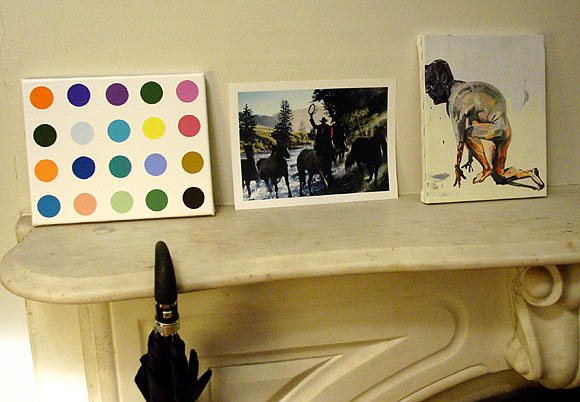
One should have no shame about buying bootlegs of art, if good ones are available. Eric Doeringer makes some of the best souvenirs of art world brand names: these above are all well crafted objets (respectively a painting, ink jet print and combo print & painting). Normally he sells them from a table out on 24th Street, but I acquired this group from his studio, where I got the added pleasure of seeing grids of almost-identical Currins, Yuskavages, and Peytons arranged as if on a production line, being readied to go with him to the next art fair. Most artists have been good sports about seeing their masterpieces hawked on the street like CDs or handbags. The exceptions are Sean Landers and Takashi Murakami, who told the artist not to peddle knockoffs of their work. See the removed Landers on Doeringer's website.
Over Christmas I watched my nephews explore every crook and nanny of the evil Super Mario 64. Evil because it may be the closest thing you'll experience to the waking nightmare of a paranoid schizoprenic, outside a clinical setting or bad drug experience. It's even worse because everything's so happy. Giant colorful blockheads materialize smiling out of nowhere to crush you, holes open up suddenly in the ground and dump you down zany slides into oppressive dungeons, slippery creatures who must be caught to restore "health" endlessly evade capture, and in each horrific, logically inverted world--Lethal Lava Land, Dire Dire Docks, and perhaps trickiest of all, the dreaded Shifting Sand Land--you are confronted with a twisted, barely comprehensible system of rules you must master to become "normalized."* I found the changing point of view fascinating, as the plucky plumber delved through deep 3-D space, with the camera acting as both player and narrator, a la Brian De Palma. One reviewer derides the camera work despite its innovation for 1996:
The biggest flaw in the gameplay is the camera angles from which you view the action. Nintendo obviously spent some time developing a 'smart-cam' to follow the action from useful angles, but it doesn't work as well as it should. Often your view of Mario is blocked by large objects. If you have the time you can usually rotate the camera manually, but that doesn't help when the thing blocking your view is the boss that you're fighting. There is a camera mode that follows directly behind Mario (the Mario butt-cam) but it's generally not a very good perspective. Jumping Flash solved this problem by relying on a 1st person perspective (and sky-high jumps), but that still wouldn't be a very useful angle for Mario. Unfortunately, the camera really just needs to be even smarter.Picky, picky gamers. I also found it intriguing that my nephews gravitated to this game released when they were toddlers. Just entering their teens (or 10s) now and accomplished Warcrafters, they have already cultivated a refined retro sensibility.
*In Shifting Sand Land I saw Mario "die" about 20 times as the players tried to master a particular trick--each time he clung futilely to the base of a pyramid before being swallowed by deadly quicksand.
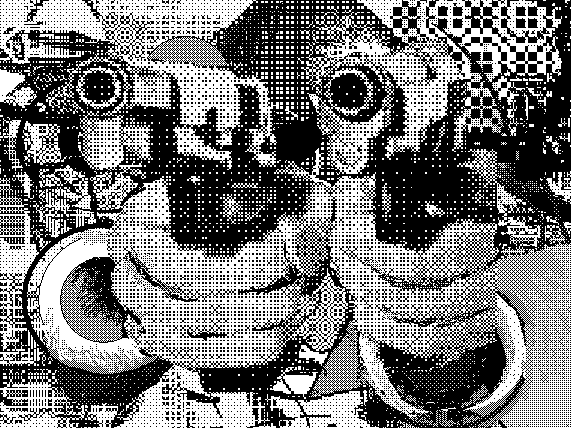
Thanks to jimpunk for adding to this, the pacifist version.
Also, see SCREENFULL's remix of a Duncan Hannah, returning the image to its original milieu plus more up-to-date cyber-abstract blowing up.
Tyler Green twits New York bloggers for not responding to these paragraphs from a Peter Plagens Los Angeles Times article:
L.A.'s contemporary art world is younger and hipper than New York's. [....] In L.A., the big competition seems to be among graduate-school studio programs rather than galleries; some students are scouted for gallery recruitment even before their master of fine arts theses shows have gone up. The ratio of big-time contemporary collector dollars to working young artists is greater in L.A. than anywhere else, including New York. Whenever I'm asked, I tell ambitious art students in the heartland to head west, not east, to try to get noticed.One West Coast blogger takes this as proof that L.A. has replaced NY as the center of the art world, something I wish I had a quarter for every time I'd read in an L.A. based publication. This business of evaluating a scene based on the energy of its graduate schools seems to me not very healthy, wherever the locale. The gauge should be not who produces the best work under faculty supervision but who stays with it over the years, and what they produce, rubbing shoulders with the largest number of fellow perserverers.
But many young L.A. artists also experience the career arcs of top models or fruit flies: about one season, if that. And nowhere in the country -- maybe the world -- is popular culture more expertly conceived, technologically amped, attractively packaged, and overwhelmingly pervasive -- even unto gallery art -- as in Southern California. A few weeks ago, I prowled around Otis College of Art and Design and thought that if they'd just present the sketchbooks and mock-ups from the toy design department as the fine arts theses shows, Santa Monica galleries would snap 'em up whole.
As for the alternative/rival/fellow traveler to New York in visual art--I believe that's Europe. An Atlantic (Euro-New York-Caribbean-African) vs Pacific (Cal-Asian) dialectic might be more interesting than the tired U.S. coastal rivalries.
