View current page
...more recent posts
I cut another minute out of "Blues for DG" [mp3 removed], and it's better now, I think. Also, the piano version of "Reel for Omniverters" ain't half bad for a guy playing with three arms: [mp3 removed]. The synth version is here, possibly to be revised with better synths.
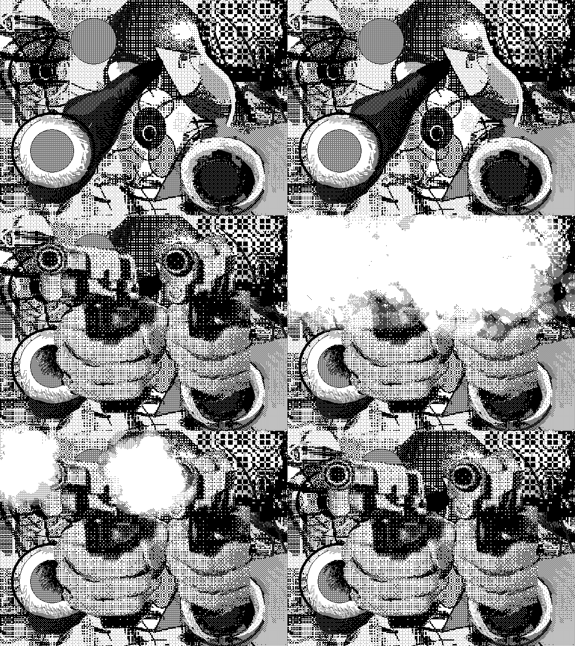
moody + jimpunk + rosenquist = cubism, large bits, violence
I received the following email about Jude Tallichet's upcoming show at Sara Meltzer and it's so brilliantly concise I present it intact:
Dear Friends,In the past Tallichet has done perfectly crafted models of historically resonant architecture--such as knee-high versions of the main Brasilia buildings painted jet black--with her own electronic music playing inside of them. For this show, the email above rather gets it across: Ezra Pound couldn't have done a better job of conjuring an art experience with a few well chosen words (on second thought, Donald Judd's straightforward descriptions are probably more on point). Linguists talk of "performatives," which, according to wikipedia are expressions such as 'I nominate John to be President', 'I sentence you to ten years imprisonment' or 'I promise to pay you back,' where the action the sentence describes is performed by the sentence itself. The paragraphs above almost transparently "perform" the art because you can see and hear it so clearly. Now to measure the show against the words.
January 20, a day that will live in infamy (2nd inauguration of youknowwho), also happens to be the opening date of my exhibition "Hiding in Plain Sight" at the Sara Meltzer Gallery. 516 West 20th Street, from 6-8pm. The show will run until February 19.
"Hiding in Plain Sight" will occupy Room 01, Room 02 and the Video Wall, and will feature four sculptures: a bear rug cast in aluminum, a bale of hay cast in bronze, a wagon wheel made of mirrors, and a campfire made of neon lights and plastic. I have also composed a sound track featuring the merged sounds of auctions and gregorian chants, and a video wall featuring "westerns" shot in Fort Lee, New Jersey during the early 20th century by Thomas Edison.
I hope you can see the show!
UPDATE, Jan. 20: Tallichet's art is carefully made and impressive to behold, so as well as you can visualize the above description, that's what the show looks like. We are somewhat in Koonsian scuba tank territory here, only with a theme of ersatz Americana perfectly timed for the swearing-in of an ersatz President. The essential fraud of westerns filmed in New Jersey combines with the PT Barnum curio in a series of deadpan surrealist audio, video, and sculptural works. Through the visual rhetoric of late Minimalism (in the exhibit's spare presentation and determined craftmanship), the art world is also implicated in this scheme of bogus experience. Excellent, thoughtful show.
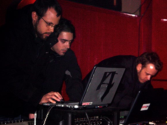
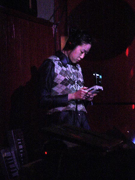
Photos from the Wrecking Ball [dead link], a twice-monthly "Evening of Electronic Musical Debauchery and Mayhem" in Brooklyn. Top, Heat Sensor, three intense guys with laptops, who've gotten some ink recently working with hiphoppers MF Doom and King Ghidra. All glitchy texture and monotonously elegant looped beats, this was hard to stay focused on, except for occasionally ear-tickling Kruder & Dorfmeisterish atmospherics. Middle photo, Bubblyfish, incorporating 8-bit/gameboy [dead link] sounds organically into danceable techno. This could be pop music in Europe, and that's meant as a compliment (because I hear they have techno on the radio over there, and not just in car commercials). Her final number--begun and ended with a childlike pecking out of "Good King Wenceslas"--especially shined. Not pictured because the photo was overexposed: Man From Planet Risk's jenghizkhan, the most dissonant and "art," as opposed to arty, entry in the program. He had beats, but also skronky sounds resembling giant uncoiling springs overlapping in reverberating, Stockhausenlike crescendos. Also, like Bubblyfish, some pretty melodies wafting into the mix.
Heat Sensor
Bubblyfish (and speckly texture on the photo--sorry)
"Reel for Omniverters" [mp3 removed]
A friend commented that he likes the music I wrote for the Macintosh SE better than what I'm doing now, because what I'm doing now is "dance music." I disagree that anything written in the last six months is particularly danceable, although I use a lot of dance tropes because I love it. FWIW, "Reel for Omniverters" is more in the old style of writing, just with newer instruments.
Technical crap: this piece uses Cubase to control three synths, one "outboard" and two virtual. I spent a frustrating week trying to adapt my writing method to the Cubase environment and finally gave up. In Cubase, staff notes are contained within "parts" on a timeline, and you can't cut and paste notes, only parts. Which means constantly moving in and out of the parts to write. So what I did here was write the whole thing for piano in my notation program, which allows one to easily move notes around on any number of staffs, and then saved it as a MIDI file, which I imported into Cubase and used to play the instruments. So, why not just use the notation program to play the synths? Because it's limited to its own (conventional sounding) virtual instruments and its MIDI control isn't very good. Cubase is more compatible with the virtual instrument environment. Because the next step is to eliminate the use of Cubase's "house synths" and import (or control) better sounding ones.
UPDATE: Bonus--piano version [mp3 removed]
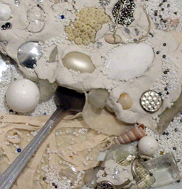
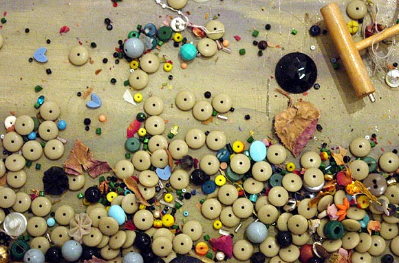
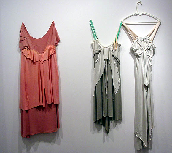
Went back in to look at Leif Ritchey's show today. The show is indeed overhung. Ritchey has one foot in the fashion world and his dresses are dresses, not sculptures. And beautiful, no? That's not to say they shouldn't be shown in a gallery, only that some effort should be made to establish a context. They lost oomph packed into a crowded room with the artist's paintings (not his strongest work) and assemblage sculptures. The sculptures, too, needed breathing room and context. These photos are my attempt to present the work in a more minimal way, at least as minimal as a blog page can be. The top two images are details, aiming the camera straight down at the horizontal surfaces of two different pieces. They are severely cropped, speaking of no context, but it was these areas that haunted me after the opening and this is my way of getting a good look at them. The image of the dresses is how I would present the dresses: Soho style, with a lot of white space around them so you can see them. I thought it was old or scavenged material but the gallery says no--it's just the way the artist handles and distresses the fabric(s).
A few quick movie notes. The Missouri Breaks ran on AMC last night. Marlon Brando in the granny dress yelling out "Smoked meat!" after he has torched the horse thieves' shack and burned a couple of them up is one of the stranger movie moments. His stalking and creative murder of the thieves (and his own eventual throat-slitting at the hands of good bad guy Jack Nicholson) looks back to the "weird late '60s/early '70s Western" tradition of Greaser's Palace and forward to the Jason Vorhees, Freddy Krueger school of meaningless '80s mayhem. Forgot that this was a Thomas McGuane script. God, he had good, short run in moviedom.
Watched The Aviator on the big screen yesterday looking for the tedg independent roving camera eye. You notice it in the scene where Howard Hughes and Katherine Hepburn first have sex. The camera precedes them into the study, has a look around, then turns back to find them already on the sofa langorously making out. The movie could be pitched as "The Carpetbaggers meets A Beautiful Mind." It's folded in the sense that we compare it to those other films and also complete it with our knowledge that Hughes will end as he does in James Ellroy's American Tabloid, an evil behind-the-scenes web spinner. (Webs literally begin appearing in the room in this movie.) Nauseating Hollywood mythmaking mingles with psycho soap opera throughout, but the flying scenes are bravura, especially the one where Hughes crashes the test plane into an upscale Hollywood neighborhood. Spoiler: the last lines--Hughes in a sweaty obsessive/compulsive fugue state, involuntarily mouthing the words "The Wave of the Future...The Wave of the Future..." do much to rescue the film from reassuring Ron Howard Land.
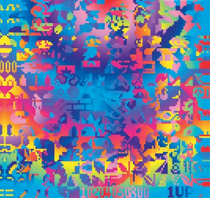
The previous post on the Arcangel + Paper Rad Super Mario Movie has been updated with some background info and technical detail. Above is the poster, compressed down to 66KB and stripped of the exhibit info and Deitch logo. This Flash-flavored image is more Paper Rad doing Beige, while the movie is more Beige doing Paper Rad. (Nerdy fan parsing.)
