View current page
...more recent posts
mbs asked about the rave video stills (here and here, and thanks to Maciej for reBlogging them). Studio !K7 marketed the X-MIX tapes as veejay tools, I'm guessing, as well as for home consumption. Not all of the ones I photographed are !K7--for a while I was collecting "home trip tapes" so there are others sprinkled in--but the X-MIX vids are indisputably the most creative. They started out fairly primitive (visually) in the early 90s and as the label got more established as a techno hub they grew more elaborate. The computer videos augment what are basically mixtapes by famous DJs. An audio track crossfades into another track and an accompanying visual also fades. Each vid goes with a particular song and they don't recur elsewhere in the mix.
As I mentioned, some of it's cheesy and some brilliant. The level of technology closely tracks the movement from flatness to realistic rendering in the gaming world--I suspect the (mostly European) video producers worked in both worlds. So one finds much wireframe modeling--bugs, babes, robots--mixed in with shimmery, vertiginous psychedelic effects. And cartoon characters with glowsticks and pacifiers. The best vids are the most layered: where you sense the artist trying to work like a drum and bass musician, really mixing stuff up. If only more computer art was this conscientiously mashed up and wild. SCREENFULL comes close to this sensibility--although jimpunk and Linkoln are more art aware and less about fast-lane club kid sensation.
From my neat, gallery oriented presentation it might look like I'm selling these appropriation photos. That's not really my objective. I'd want to get clearance from the artists and labels before I make a buck off them, so as a practical matter I'd say it's a private project published on the net that puts "art brackets" around works for popular consumption. The photos are pretty dry and "connoisseur-y" compared to the videos.
"Guitar Solo" [4.5 MB .mp4 video]
A lot of nice, very up to date music can be heard on cuechamp's .mp3 blog. I miss his blog-blog, where he always had a knack for finding pop culture new media cross disciplinary post studio post human digital mutant artstuff, but having just the music is good, too. Attuned to the realities of the intellectual property vultures who shape our culture and put us in the poor farm in the name of "protecting the artist," he does the snake eating its tail thing and deletes old mp3s as he adds new ones. So, I just noticed "paul revere 04," by Busta Rhymes and DJ Green Lantern feat. Labba, is about to drop off the list. Go check out this potty mouth drug non-condemning revisitation of the Beastie Boys classic. (Also interesting: Golden Shower's digital electro "New York Groove," Nina Gordon's singer songwriter rendition of "Straight Outta Compton," AC/3p's weird AC DC cover, and assorted other oddities.) Speaking of the Beasties, they were in their heyday around 1987, which this blog (mine, that is) has recently adopted as its foster year--it seems like a good stupid one to keep alive through occasional references, research and in-jokes. Perhaps the most recent date that many of us lived through that suddenly seems really really old. One post has already been done. More will come.
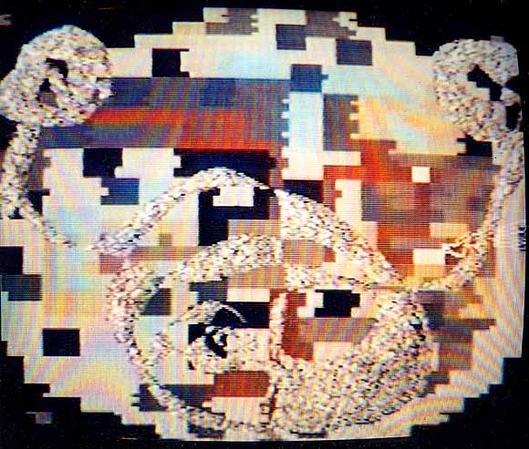
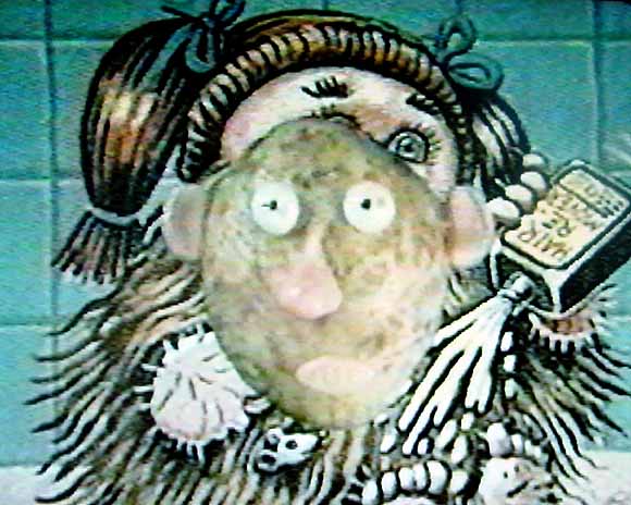
Another detail from what I'm calling the "rave video" stills. This is from Studio !K7's X-MIX series. A lot of cheese in those VHS tapes, since reissued on DVD (not this one though, for some reason) but also some good video/computer/painting hybrid stuff. I mean really good, as in some guy's entire Garbage Pail Kids collection flickering by at several frames per second--and that's just in the background of some other morphy thing or other. The image above was photographed off the TV in pause mode, with a film camera, a few years ago, then scanned; maybe I'll try some stills of the Garbage Pail vid, since I have a digital camera now and don't have to get off my ass to go to the one hour photomat. And no, I will not get a life.
UPDATE: The "morphy thing" was a spinning stop-motion Mr. Potato Head. The collection is 3LUX-2. The artist is either K-OZ or Stalin Retina.
Some impressions of Christo World in Central Park. Walking briskly under the nylon-draped "gates" gives you the feeling you are under a low canopy or awning. The indoor experience of walking through tunnels and hallways morphs strangely with the outdoor experience of walking through open greenery (or brownery, since it's winter now). This is actually not a good thing. Because of the gates' slick fabrication, you feel as if the park had been rented to demonstrate some newfangled, all terrain, corporate convention habitrail system (shades of George Bush's request for a special platform so his feet would never have to touch the dirt of another New York park--Eisenhower, in Nassau County). This might work if the Christos had any sense of irony or self-awareness, but from their interviews they, or at least J-C, the mouthpiece, are tres earnest that it's all about "feeling." Also, the concept of an artificial second layer hovering over the park's rustic walkways fails due to compromises with the Park board. You're walking through an orange tunnel and it suddenly sputters out to accommodate a series of trees that couldn't be trimmed, or abruptly dumps you into one of Olmsted's large open, rock strewn spaces where a bunch of loose gates stand around without any sense of rhythm, solidity, or purpose. The Christos weren't allowed to dig post holes for the gates, and the concrete "feet" that anchor them are an awkward solution. One has to laugh (good naturedly, of course) at the discretely-inserted shims propping them up to adjust for a path's natural slope. But at the end of the day, bad and corporate-looking as the project is, ya gotta say, "damn, they did a lot of work!"
Below is a sculpture by Ross Knight, the "Un-Christo," at the Sculpture Center last year. Knight was allowed to dig into the earth, paradoxically making his work both more ephemeral and more integrated with its surroundings (see link for how all this worked), and his project succeeds, at least in part, because he accepts the modest scale and doesn't succumb to any urges to sit heavily and selfishly on his fellow humans. He also has a sense of humor.
More discussion of the evil Christo and Jeanne-Claude on this ridiculously long (but not ridiculous) thread on Sally McKay's page. Surprisingly many people have stepped forward both here and there to defend the Christos! (This post has been edited slightly.)
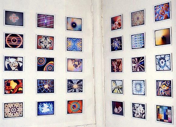
rave video stills - details / more details
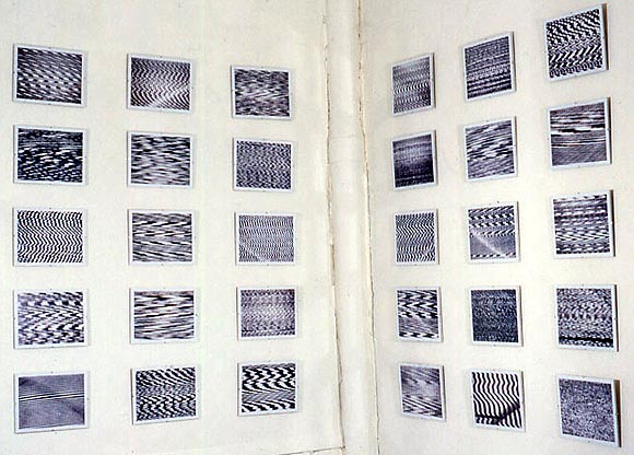
tv static photos (w/ Ray Rapp) - details / more details
One way the Christos' latest work might be successful: If each of those proscenium/gate things placed at regular intervals along Central Park walkways served as an obstacle to movement rather than something you walk through. In other words, if instead of flapping aesthetically over parkgoers' heads, the nylon curtains hanging from the gates were lowered completely, anchored to the ground, forcing people to walk around them or physically rip through them to traverse the park. Thus you would have the pure, condensed hostility of Richard Serra's Tilted Arc, which hampered movement across a public plaza, but with the irony of a bright "joyous" color and billowy nylon fabric. People would be angry, the park would be in turmoil until the piece could be removed, and everyone would be talking about it for years, instead of the Christos getting a mere two weeks of ego-gratification and the big Michael Kimmelman thumbs-up.
UPDATE: The nylon "Gates" swatches selling on eBay originally had some "authorized by the Christos" language that has since been removed, so I took out a parenthetical about the couple selling their wares online. Should have known that was too good to be true. In the comments to this post we're discussing what they're actually going to do with all that fabric.
UPDATE 2: This is one of those rare instances where the kneejerk philistinism of the New York Post converges with the highfalutin' critical opinion (mine--but I'm sure there are others) that the Christos are phony or dumbed down conceptualists. They are really the ultimate middlebrow art. From Andrea Peyser's column:
The artists seemed cute and quirky enough. And the mayor was positively giddy about it. That should have been the kiss of doom.UPDATE 3: Hate to keep harping on those fools in the park, but the Christos' arguable past contribution to the history of art is the extension of conceptual (specifically earthwork) practice to include negotiation and logistics, and navigating local bureaucracies and landowners as art. The running fence itself wasn't very interesting--it was the point of what the artist had to do vis a vis obstinate property rights to make art happen that was a new concept 30 years ago. But to go from all the work Christo did to get the fence built to "convincing Mayor Bloomberg" is just a serious fall from grace.
Now I realize we all were pulled into a kind of mass hysteria orchestrated by a couple of charismatic snake-oil salesmen--also known as the artists Christo and Jeanne-Claude--and their pretentious booster, Mayor Bloomberg.
"The Gates" is an abomination. Call me a Philistine, but how can one improve on trees, lakes and rocky outcroppings with miles of plastic-treated cloth?
It's enough of a sin that "The Gates" overpowers Central Park's soaring, hypnotic beauty. But the color of these bed sheets, plunked down on metal frames every 12 feet throughout the park, is so atrocious that the project's creators ought to be charged with assault.
Christo and Jeanne-Claude claim that the hue of the weirdly pleated cloth is "saffron." But, as any American junior-high-school kid will tell you, the precise shade is "vomit orange."
"I can't get over how much it looks like an advertisement for Home Depot," said a laughing auxiliary cop I ran into.
And he said he actually liked them.
