View current page
...more recent posts
"Greater New York 2005" to Revisit Previous Group of Artists
The Museum of Modern Art's alternative space, PS1 in Queens, announced today that "Greater New York 2005" will consist entirely of artists from the 2000 exhibition "Greater New York." "We wanted to see what all our artists were doing five years later," said PS1 director Alanna Heiss, "and frankly we're sick of this 'fresh young talent' paradigm." She says she fears that New York is "becoming like LA, where the scene is centered around artists still in grad school" and protested the "increasing infantilization trend" of the rival 2004 Whitney Biennial. At an impromptu press conference, she read the following quote from a 1987 Dan Graham essay as further justification for the Museum's somewhat unexpected and daring project:
According to [Walter] Benjamin, "progress," the 19th-century scientific and ultimately capitalist myth, is expressed in commodities, fashion goods which "produce a sense of eternal newness." This makes progress a mythical goal, never to be reached, for there is always the new and it is always superseded by the next new. For Benjamin, then, progress is actually a state of stasis. And yet it is this very stasis that makes the recovery of the just-past potentially subversive.Below, images by "Greater New York" artist Michael Phelan, then and now:

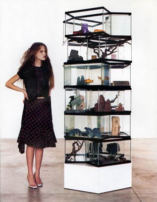
Michael Phelan, from the "Driftwood and Dried Arrangements" series shown in "Greater New York" (2000)

Michael Phelan, from the "Bears" series, to be shown in "Greater New York" (2005)
I'm wondering if there is some immutable law that the size of political demonstrations increases with the distance from the reporting country. A New York Times headline today announces that "Hundreds of Thousands of Lebanese Rally Against Syria"--apparently affirming the White House propaganda that the US slaughter of Iraqis somehow caused democracy to bust out all over the Middle East. Yet when hundreds of thousands rallied in Washington and New York against Bush's planned aggression, it was reported as "tens of thousands." Also missing from the headline, but included in the body of the article, was the fact that the week before in Lebanon, a "pro-Syrian march ... also filled the downtown with hundreds of thousands of mostly Shiite demonstrators." Yet when hundreds of thousands rallied in Washington and New York for Bush's planned aggression--oh, wait, there were no such demonstrations.
UPDATE (as I'm writing this). Since it might be less than clear from the opposed nature of the huge Lebanese demonstrations that the most recent protest is a victory for Bush, the Times just changed its headline to the more helpful "Rally Against Syria Appears to Be Largest Yet in Lebanon." O-kay.
From MTAA: PS1s website redesign sucks
How does PS1s web site bite? Let me count the ways rudely.Originally from MTAA Reference Resource, ReBlogged by francis on Mar 12, 2005 at 04:02 PM, Apologetic disclaimer removed by tom.
1. Splash page (need I say more?)
2. Cheese ball flash animation announcing GNY2005 [Greater New York is a kind of Whitney Biennial for New York artists, held at PS1 in Queens, the Museum of Modern Art's "alternative space." This is the second; the first, a perceived "career launcher," took place in 2000. --tm]
3. Evil pop-up from cheese ball flash animation announcing GNY2005
4. The artist list in the stupid pop-up from the cheese ball flash animation doesnt do anything! Yes you can rollover an artists name and it lights up, but a click does nothing!
5. The exhibition section just has the stinking press release? How about some friendly copy (and larger text). PLUS, the navigation of stinking press release is too small and too confusing (the page youre on should be highlighted not the page youre not on, duh!).
6. Why is there a press section when the exhibition section already has the press release? Oh, I see, so you could put a really big dumb graphic that says Press, Greater New York 2005, which clicks off to MOMAs site.
7. At least make the friggin top-left logo clickable back to the homepage for chrissakes! This has been web-site navigation convention from before the turn of the century!
8. It dont validate. (snigger, snigger) And its so fd up, it would be hard to figure out where to start.
9. Change your meta-tags now! NOW! NOW! NOW! (Its a shame to see the free and open-source Mambo put to such wicked uses.)
Ahhhh. That felt good.

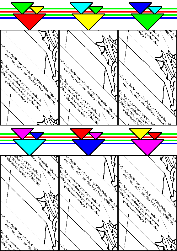
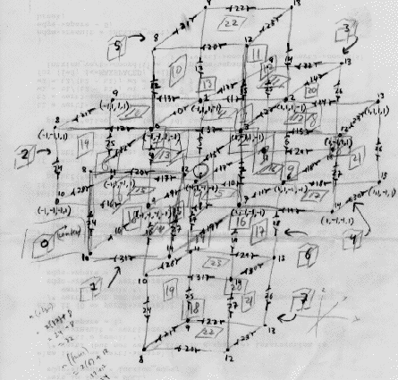
More imagery lifted (or re-lifted) from http://castlezzt.net, which Michael Bell-Smith found and which Paul Slocum describes as an "amazing mile long webzine thing" with the caveat that it's "probably not good for weak of computer or slow of internet." Go experience it yourself, it definitely poses a challenge to Abe Linkoln's complex net art diagram in the browser-busting department and is chockablock with interesting found (?) and concocted (?) imagery. (And did I mention that it's also juvenile and incoherent?) Rather than trying to recreate the experience here, I've just plucked out a couple of nuggets from the original maximalist context. Some nice new animations have recently been posted.

A few posts back I wrote:
Dedication to old gear and pure hacking vis a vis current proprietary software systems in some ways recalls the rock purists of yore who insisted that only black Delta blues musicians had integrity relative to British cover bands, or that 3-chord garage bands always had the edge over prog rock & fusion. This kind of essentialism has Occam's razor logic on its side but can also grow stuffy and cult-like.Modern Kicks replies here:
Point taken, and I generally agree. But with two caveats: (1) the part about 3-chord garage bands isn't really analogous to the first example, and (2) it happens to be correct. As the Mad Peck [in Creem magazine] taught us all long ago.Then I said:
Thanks for the feedback on those posts. Regarding your earlier comment, I added a parenthetical ("Was it really necessary to throw out the baby of Canterbury and electric Miles with the bilge of Kansas and Spyro Gyra?") re: the prog and fusion (or proto-fusion) I think holds up against the Pistols, etc. By "Canterbury and electric Miles" I mean Soft Machine, Tony Williams Lifetime, Can, Faust, John Cale, "Thrust"-era Herbie Hancock, Larry Coryell ca. "Live at the Village Gate," early Mothers, Fred Frith, etc etc. Also, you didn't explain what makes 3-chord rock purists different from Delta blues purists.Then MK said:
I guess my point was that prizing the integrity of black Delta blues over the British bands that covered them is to make a distinction between an original and a copy. But preferring 3-chord garage rock to prog isn't a matter of original and copy, it's choosing between two competing aesthetics. So the two comparisons work in different ways. The garage rocker doesn't dislike prog because it's a distortion of his aeshetic (as the blues aficionado does feel about, say, Led Zeppelin); he hates it because it opposes what he values.My reply to that:
I suppose one could argue that there is a similarity on the basis of a demand for some idea of authenticity on the part of the Delta blues and garage rock fan. But I'm not sure that works either. After all, many British bands insisted on attempting to maintain as high a degree of blues authenticity as possible (obviously a limited one, but nevertheless.) And garage, rather than the spontaneous expression of rock and roll it claims to be, is almost always an intellectualized, even mannered aesthetic. Not that there's anything wrong with that.
Yes, the point of similarity was (presumed) authenticity but more particularly--in the context of hackers making music vs. musicians using off-the-shelf software--the quest for a kind of musical sine qua non. Thus the reference to Occam's razor: Which is the most economical musical expression? The original or the copy? The basic or the hyper-elaborated? 1s and 0s or unnecessary proprietary code? It still seems all of a piece to me. More important, all three (blues, garage, the command line) can be cults demanding adherence to the divine orthodoxy of reduction, as against the possibility that there might actually be good British blues, good use of Reaktor, or (gasp) good prog. And the Mad Peck was wrong about Kraftwerk, they were robotoid but also funky, which is why they were playing in boomboxes all over NYC in '78, and their audiovisual minimalism was admired by many punkers.
"Groove-stricken" [mp3 removed]
[Update: Increased the volume slightly so one might be better stricken by the groove.]
"Reel for Omniverters (Final)" [mp3 removed]
"Reel for Omniverters (Beat)" [mp3 removed]
I know I keep posting this song but I'm following my original plan of adding softsynths. The so-called final version is run through an analog filter; the "beat version" is mostly a triphop-style beat with omniverter themes swirling in the background.
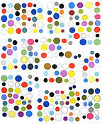
Double Alpen, 1995, acrylic on cereal boxes, 10" X 13" X 3"
