View current page
...more recent posts
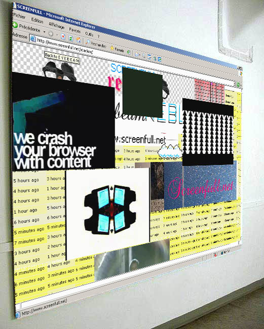
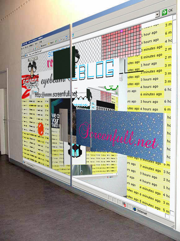
The images I posted earlier of wallpaper paintings evoking HTML frames have gotten the SCREENFULL treatment. Just in case your life wasn't "meta" enough.
"Calypsum 2" (formerly "Theme from PLUTE") [6.1 MB .mp3]
The volume level is a tad lower than other pieces: I discovered I was recording them too loud and they were clipping at high volume. This is my first work using "continuous controllers"--the filter sweeps aren't actually live. Why tire your hand turning knobs when you can draw a controller curve and let the machine do the work?
After putting up a "plute"-related graphic and adding a back story I changed the name of this piece. It sounds too dreamy and smeary to me to have such an obnoxious word in the title. "Ploot" is supposedly what atomic industry workers call plutonium; I was spelling it differently and may use it again, just not in this piece.
HTML Frame Paintings, etc.

From Olia Lialina's A Vernacular Web: The Indigenous and the Barbarians: "In 2003 the students of the Merz Akademie celebrated the First Ten Years of the WWW by creating an exhibition of objects that symbolized the landmarks of the web's history. The tribute to wallpapers consisted of a huge board of real wallpaper, (from OBI), arranged in a frame style layout. Even in this simple construction it was clearly the skeleton of a web page."

Lialina's article, which is highly recommended reading, covers many elements of early, DIY web design, such as "under construction" pages, homemade buttons, and collections of backgrounds, always in the context of how they've been replaced in a second wave of web practice, dominated by blogs and search engines. Here is a particularly funny comment on MIDI:
As all the instruments were standardized in 1983 the sound effectively goes no further than Italo Disco. There will never be any new and exciting sounds, only updated versions of old sounds. New sounds would only break the compatibility with all the existing MIDI files. Software vendors can't change the "trumpet" to a "Neptune's kinda honkashizzle" because, on the web, you can find all kinds of MIDI files that use the trumpet in many different ways. In this case the only solution is the lowest common denominator. The trumpet sound must fit into James Brown's "Sex Machine" in the same way it fits into "Ride of the Valkyries" by Richard Wagner. It does this by not really fitting into either. At least that's equality.[via]
The result is that most of the time MIDI files give the impression of somebody playing hit music on an electronic organ in the privacy of their own home. In reality this happens at village weddings or the annual gathering of a rabbit breeder's association.

From Brian Turner's posts at WFMU's Beware of the Blog (originally from Stay Free! Daily). His caption is "McMother." Stay Free! says it's a real European McD0nald's ad and not a parody and I guess I believe it but yeesh.
Recipes
Lately I've been cable-surfing the Food Network and digging its sundry cooking "how-to" shows, especially the Japanese version of Iron Chef. [insert long-winded exegesis of show.] Technologically based arts need their equivalent; in fact visual artists lag behind chefs in the eclectic "mixing it up" aesthetic of current haute food prep. Musicians fare somewhat better in this regard because music software and gear matured sooner than imaging software and gear (i.e., it's been "there" longer to jack with), but both music and art improve when practitioners think outside the (software) box, that is, think like Iron Chef Sakai. I'm not saying I do this all the time, but certainly my instincts are to mix media and in the spirit of the food shows, I offer the following recipes for a recent animation (top) and musical effort (bottom). Eventually I'll write a Dogma-like manifesto that codifies these practices as the only right way to make art, but right now I'm still exploring and I haven't reached the really pedantic stage yet.
Example 1
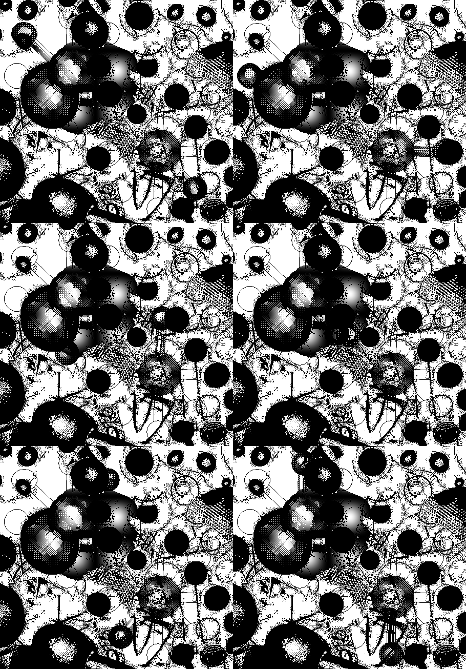
"Abstraction with Two Centrifuges" (2004), animated GIF
Drawings in MSPaintbrush are printed out at different sizes (100% to 600%), cut up with (real) scissors, taped back together in a scrambled collage.Example 2
That piece is finished. The GIF above is a spinoff work, no pun intended.
Collage is photographed with digital camera, detail is cropped and enlarged in Photoshop, converted to greyscale, run through the threshold filter.
In MSPaint, photoshopped image is converted to black and white fill patterns under "image attributes." (MSPaintbrush won't do this without destroying the original image). New fill patterns and the "centrifuge molecules" are added in MSPaintbrush. Saved 8 times, each save becomes a frame, with a different stage of the spinning molecules.
Frames are animated in a GIF building program. Uploaded to web, border is added in html.
"One to Thirty" [6.8 MB .mp3]. The following discussion is pretty brand-intensive, and I apologize for that, but one point I guess I'm trying to convey is that no one piece of software or hardware "makes" the piece; it's mostly in the process.
A factory-programmed tune from the Korg Electribe Amkii (B04 "Techno 12") is slowed down from 125 to 99 bpm. Audio is run through a standard hardware mixing board at low volume. The MIDI out is played by another synth, the Sidstation (a factory preset patch called P73 "Pyramid"), also plugged into the board.The common point of both works is using a combination of programs, effects, changes in resolution, etc. to build up some kind of credible texture. The overall goal is to give sound and image creative integrity beyond their source programming. These recipes are mostly technical. There are content issues arising at various stages of the process, verbalized internally but ultimately best left for the individual to articulate (or not).
The Sid basically only reads one sustained note and some noise, everything else is filtered out.
That note plays over and over as pattern B04 cycles, and is bent in real time with a variety of knobs: (i) the Sid's continuous controllers, changing the cutoff filter and pitch, and (ii) the dials on an analog filter called the Mutator (see below).
All of the above sounds are recorded into the computer through the mixer. But first, the board sends and returns audio from both synths to the Mutator, which uses some sophisticated envelope controls to twist and interweave the two instruments in real time.
An audio part is recorded using an analog to digital recorder (I forget which): about a 7-minute .wav file of the knob-twiddling performance. The file is then edited down to 4.5 minutes in a .wav editor called GoldWave: redundant and/or out-of-tune parts are snipped out.
The .wav file is imported into Cubase, a sequencer program. The tempo track is set at 99 bpm.
The drum riff is a sample that ships with Beatburner, a (virtual) rhythm module plugged into Cubase. Several were tried before I arrived at this one--I may have added some effects processing to it, but probably not. I also tried a MIDI drum part playing various samples. Beatburner plays this drum and bass riff at 99 bpm and it's a decent fit with the existing audio.
Content-wise, what I had in mind was a contradiction between the one, bent note, which is sort of airy Steve Reich minimalism, and the "slammin'" forward movement of that dancefloor beat. No dropouts, crescendos or other dancefloor tricks were used. The piece is still pretty energetic, and might pass for drum and bass, although most of these dance tropes are pretty cliche at this point. [skip long-winded exegesis]
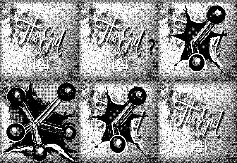
This is my defacement of jimpunk's "the end" still, from back when he and Linkoln were doing (ending?) 544x378(WebTV). Orson only knows what screen gem supplied the still. I posted it on my animation log a while back but never put it up here. It gets a fair amount of traffic from google images.
The New York Times ran two articles on Takashi Murakami this week, Roberta Smith's review of the show he organized at the Japan Society, which I quibbled about here and here, and a magazine profile by Arthur Lubow, which I've only skimmed. The musician Momus writes about the latter piece on his weblog, from the angle that he's glad the Times has discovered post-Modernity and recognizes that the Japanese have long been living what the West mostly theorizes about. That is an interesting thing about them--especially the degree to which their popular culture explores the post-human melding of people and machines in the tropes of the cyborg, the giant robot, artificial environments, etc.
Still, do we need the extra loop of pop culture --> Murakami's traveling museum road show --> NY art dealers --> NY Times --> pop culture or do these ideas disseminate to the West just fine through your local video and comic book stores? In other words, if the Japanese have no "high-low" distinction (as these articles are saying) and if Murakami's art and Japanese pop culture are one and the same, why do we need Murakami making this culture available at a higher price level? I maintain his main function is to make Western curators feel better about themselves that they have multicultural content and are "down with the whole Japanese postmodern thing," and once he's in an institution then Chip and Muffy just have to have one. But his work is thin compared to the real thing.
On the high-low dichotomy, I said earlier the Japanese have no Romantic, starving-in-a-garret tradition, before reading in the Lubow article that Murakami famously sleeps on the floor of his studio. But hey, we all know some of the richest people in the world are some of the cheapest, bringing lunch to work in a brown bag, driving a beat up car, paying their employees nothing. That's how they got rich--by keeping their overhead down. In the Lubow piece a curator mentions the sleeping bag factoid, dutifully building the Zen monk artist hype around Murakami. Yet it's hard to square the image of this dude walking the earth like Caine in Kung Fu also licensing his designs for Vuitton handbags and going after a younger artist like Eric Doeringer who dares to appropriate his precious work. PT Barnum had a phrase that applies to many working in US art institutions.

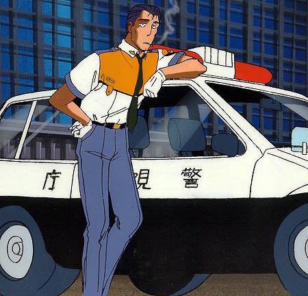
Top: Kaba Kick, a Japanese game of russian roulette for kids (I forget where I found this). If you lose, a pair of feet kicks out of the gun, which is shaped like a pink hippo. Artist Takashi Murakami, who has made himself a market force in the West selling to curators and art critics the easily-digestible idea that Japanese pop culture is about that nation's "impotence," would no doubt have a field day with this. In the interests of giving equal time to an opposing meme, the bottom image is Captain Goto, from the long-running TV adventure series Patlabor. "Patlabor" is short for "patrol labor"; a "labor" is an oversized robot that, in the near-future sci fi world of the series, is used primarily for construction work. Occasionally the stressed-out drivers of these powerful contraptions go berserk and the "mobile police" (also driving labors) have to be called in to restore order. The show somewhat resembles Taxi in being centered around a daily, humdrum work environment and follows a group of regular characters, the overworked, underpaid cops of Division Two, which Goto commands.
Goto's much like Humphrey Bogart in looks and demeanor--a supersmart, supercool guy who never lets on he's figured out a solution to a complex problem until time to put the plan into action. The show's juice is the contrast between his staff's daily bickering and the absolutely harrowing situations the job puts them in. Driving the monster robots is treated like a 9 to 5 gig but requires lightning reflexes, aggressive fighting skills, and a tolerance for hastily improvised solutions. As boss, Goto deals stoically with equipment shortages, departmental infighting, and short-fused subordinates and almost invariably thinks his way to a solution. In other words, the show has universal, positive appeal, and the "impotence" of Japanese society is the impotence of any other society (like, say, watching the slow motion train wreck of Bush's Iraq war and not being able to do a goddamn thing about it). It is uniquely Japanese in its focus on the "how-to" of the robots and the group energy devoted to their maintenance, and in showing how Division Two's sharp idiosyncratic personalities eventually reach consensus: even with Goto's guidance it is usually teamwork that wins the day.
This makes the series sound earnest but it is in fact fairly subtle in balancing the difficulties of life in a complex urban/industrial society with an upbeat story line. The cops have a knack for arriving late and operating in a state of crisis, but they do their jobs and mechanized society grinds on.
