View current page
...more recent posts
"Drum Machine" [Quicktime removed -- see embedded .mp4 version]
Regarding my artwork in the previous post, Kara had these questions:
--Have you photographed the backs of any of these? I'd be curious to see this nest of webs.On pieces of this type, I'm using lightfast inks (pigments as opposed to dyes) and framing the work behind UV-resistant plexiGlas. No fading has occurred. I like having them around to look at.
--BTW, how light safe or fade-proof is the ink you're using?
This is the back of a similar piece I posted a while back:
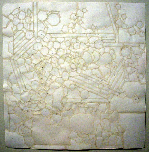
She also wondered what one might be missing by seeing my object-type artwork on the Internet. I'd say what you're getting is about 60% of the experience. But it sure beats mailing f*ing slides.
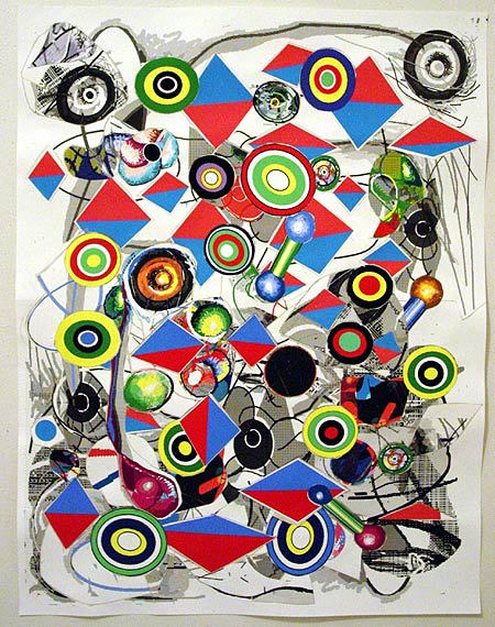
Cannibalized some older pieces to make this. Lots of scissoring and X-acto knifing. Dimensions are 24 1/2 X 19 inches; it's ink on paper--all rendered with the "vintage" program MSPaintbrush, printed, cut into pieces (repeatedly), and linen-taped on the back in a network resembling a nest of bricolage spiderwebs.
Adrien75, a West Coast turned East Coast turned West Coast musician who has been written about a number of times on this page (glowingly), has posted some new .mp3s. Nice to hear some of that experimental breaks influence come back in from the old days ('99) with "January's Tributaries," along with a dollop of Michael Karoli-like dreamy acid guitar. The pieces are all excellent: atmospheric, catchy, unpredictable, accomplished. If you like the Feelies, Krautrock, the Canterbury scene, and/or The Black Dog this is music you should be listening to. (Those are personal benchmarks anyway--my etymological way of saying "really good.")
Update, Jan 17, holy shit, I forgot to post a link to Adrien75's mp3 page. My five readers (Digby's phrase) need to help me out here a little bit.
Aeon Flux Geek Musings
Started doing some research on writer Mark Mars, an entertaining, somewhat Kim Fowleyesque black leather-clad wild man who livens up the Aeon Flux DVD interviews and commentaries. A friend of series creator Peter Chung's from CalArts in the early '80s, he wrote several key Flux episodes. Found this message board [dead link], where Chung and Mars both post. Which led to a very thoughtful interview with Chung on the Livejournal fan site Monican Spies. And this earlier interview [wayback], given before the Charlize Theron movie came out. Chung had practically nothing to do with the feature film and dislikes it, for its "failure of nerve" in not testing the audience the way the series did--lots of back story and character motivations were added, the usual Hollywood efforts were made to "humanize" the property.
Other things I learned from the Monican Spies interview:
1. Chung revised some of the Aeon episodes for the new DVD because he disagreed with how other directors or writers interpreted the characters, such as an "evil" Trevor Goodchild in the episode "End Sinister"--Chung doesn't see the Breen dictator as evil, just power mad. My earlier question about whether the pool of blood Aeon keeps waking up in in "Chronophasia," tinted grey by MTV, was restored was answered in the negative from the DVD. Chung talks about it quite a bit on the commentary track but for some reason didn't change it. Too bad, as long as things were being revised--would have made the episode more cohesive and even scarier.
2. Chung also went to CalArts with '80s art star Ashley Bickerton. Trevor Goodchild's face is loosely based on a sketch of Bickerton's.
3. One of three admired filmmakers Chung lists is Koji Morimoto, who directed the "Beyond" episode of the Animatrix. In a review posted of that film here, Morimoto's and Chung's were my two favorite shorts.
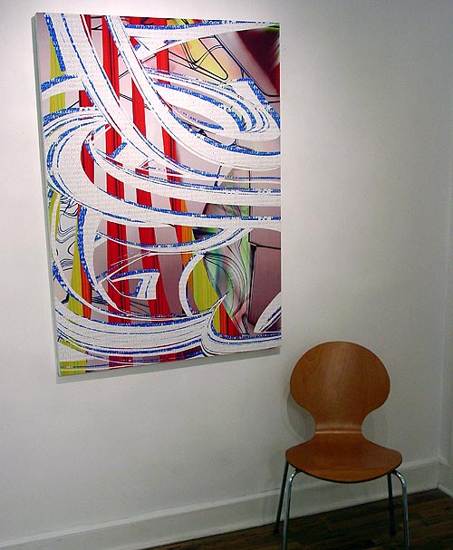
This stylish work on canvas, by Claire Corey was made with a, um, er, computer. The canvas is canvas, but the brushwork is virtual and the paint is Iris. Corey is showing with a couple of galleries in Europe but her New York space recently closed. Why an artist this good, whose work pushes all kinds of interesting buttons about painting supposedly being the last refuge of authenticity in a synthetic world, was not instantly snapped up in her home town is quite mysterious. But it might have something to do with...the work pushing all kinds of interesting buttons about painting supposedly being the last refuge of authenticity in a synthetic world. Also, because New York is having a "head up its ass moment," with nouveau riche collectors buying art that as January blog has noted reminds them of work by their kids, or the kids they never had:
That last post of mine was pretty cheeky. I dont think I wanted to critique Zak Smiths work as much as I wanted to critique the Chelsea/Grad School scene that puts so much machinery behind young artists. It is like collectors want to buy the work that reminds them of their children. The effects are not devastating to art you cant kill that. The effects are devastating for individual artists. Zak Smith is already a brand name his future potential limited by this fact. Those gallery lights are pretty bright and wont mind burning him and several hundred other kids to a crisp.(Zak Smith replies to that, by the way, and while you would never expect him to agree that maybe he wasn't ready to join the stream of canonical art history [via the Whitney Biennial] on the strength of his illustrations of pages from Gravity's Rainbow, which lots of people have read, by the way, although not me, I only read V and The Crying of Lot 49, it would be nice to hear a stronger self defense based on something other than enjoying the freedom to make tons of paintings and not have to work a day job. What's really at stake in this blotchy, "maximalist" work? What's its theory, not in the sense of regurgitated late 70s French philosophy but in the sense of what does it intend to add to, or change in, the culture and the visual landscape? Are "innovations in the field of rendering or paint-handling" enough now? Are "fascinating women?" OK, well maybe the latter.)
www(dot)pulp(dot)href
Briefly noted, this excellent video/Net DIY collage piece by jimpunk. You need Quicktime 7 to view. The elements of the grid, the composite, and short loops could all be seen in an earlier work, Michael Ensdorf's Momentary Distractions. What jimpunk adds is the ability to mix and match clips, a slew of pop culture and historical references (a pistol-wagging Benicio Del Toro, Flight 93, Jodie Foster panicking), ambitious graphic design in the more psychedelic patterns, snippets of found and/or industrial style music, and an overall sense of anarchic humor. Net Art seems to be evolving here, or perhaps a better metaphor would be morphing into an explosively violent alien entity, like Natasha Henstridge in Species.
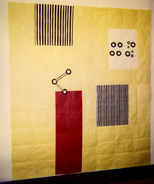
Scan of polaroid. Untitled artwork circa 1996, photocopies and linen tape, 88" x 78". Made when I was living in a closet (practically) in Tribeca. Too obvious a Peter Halley reference to show at the time, I always liked it, even though few others did. Ten years later, it seems more in step with the current videogame-as-potholder discourse. Wait, did I just coin something? (See comments.) Eventually I'll get this old work out of my system.
