View current page
...more recent posts

Continuing the thread about interactivity... The 1995 interactive movie Mr. Payback, in which audiences voted with buttons on their chairs to determine the outcome of various plot points, flopped big time. As an IMDb commenter described it: "Like when someone is being tortured--you have three options to pick from on HOW he was to be tortured." Another IMDb scribe reports: "Half of the fun was everyone shouting at the screen how to vote when it came up, and using joystick fingers to machine-gun press the buttons to vote for your choice. It only gave you a couple of seconds to vote for your favorites, and it would tally the votes in real time on the screen."
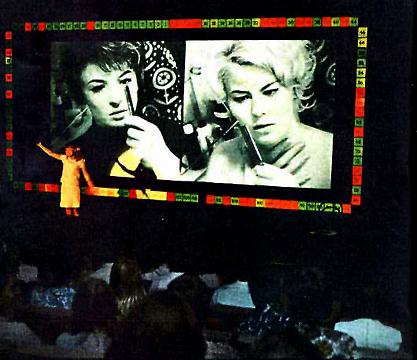
The concept harked back to a Czech experiment/goof from the '60s, the Kinoautomat, which had more subversive things on its mind than just deciding how someone was going to be tortured:
Raduz CinceraI actually saw the Kinoautomat as a kid and it was the most fun I ever had in a theatre (next to The Fearless Vampire Killers).
Kinoautomat: One Man and his Jury
At the Expo of 1967 in Montreal, Raduz Cincera presented for the first time to a larger audience the Kinoautomat (movie vending-machine) he developed together with the directors Jan Rohac and Vladimir Svitacek, scenographer Josef Svoboda, and Jaroslav Fric and Bohumil Mika. It involved the worlds first interactive movie theater. In the movie theaters seating, viewers found two buttons necessary for making selections; they were confronted with a film whose action could always be stopped. At one point, two principal actors from the screened film appeared onstage and asked the audience how they thought the scene should be continued. The viewers decided; afterwards, the [desired] film version, arrived at by public vote, was then screened. The film One Man and his Jury told the story of an "average apartment house," with turbulent goings-on between tenants. In one scene, a young woman [locks herself out of her apartment] after checking to see who rang her doorbell. Since she was in the shower, nothing covers her body except a towel. In her panic she rings her neighbors door and asks for help. Here the film is stopped. The audience is asked whether the neighbor should let her in or not. In almost every case the majority of the viewers answered yes. Only once, at the Expo, did the viewers vote nowhen the scene involved a large group of nuns.
"The branching structure wasn't tree-like, doubling the number of scenes needed at each choice, but rather always remained only two. They did this by carefully crafting a story such that no matter which of the two options were chosen, it would end up back at the same next choice. The vote was executed by the projectionist switching one lens cap between the two synchronized projectors. The artfulness, ultimately, was not in the interaction but in the illusion of interaction. The film's director, Raduz Cincera, made it as a satire of democracy, where everyone votes but it doesn't make any difference." (Quote from: Michael Naimark, Interactive Art - Maybe It's a Bad Idea, 1997)
Rudolf Frieling

Jim Finn, Chicago: "This is a needlepoint recreation of a spacesuit patch for the international communist space program based in the former USSR. The Interkosmos program began in the 1970s as a way to integrate socialist and non-aligned nations into the Soviet space program; it brought cosmonauts from Cuba, Mongolia, Hungary, Vietnam, East Germany and Syria among others into space. I used this patch in my film Interkosmos, about an East German space colonization mission to the moons of Jupiter and Saturn. The needlepoint patch is featured in the Amber space capsule headed for Ganymede, one of the four Galilean satellites of Jupiter. The writing on the patch is the Russian name for Interkosmos."
From an online exhibit of objects made using the microRevolt website's software, which converts jpegs and other image files into stitchable patterns. This patch is considerably more detailed than the PDF of the pattern linked to on this page, it should be noted--it appears the PDF was only used as a rough guide. See Paul Slocum's "bad jpeg" microRevolt cross-stitch pattern and my cowbug.

Daniel Gottin (umlaut over the o not reading in RSS): "I am interested in a work that makes the site visible through the art work, and the site makes the art work visible at the same time. It is about the consciousness of perceiving something. It is a communication, a give and take between equal parts creating a new, balanced entity."

Update: The link to these images is dead. Way to go, Minus Space!
"Prophet and Lossy" [mp3 removed]. I did this in 3/4 rather than the usual 4/4 and added some exciting key changes in the second dropout! I might snip out a bar or two at the beginning; still thinking about that.
Mailbox
Hey Tom,
I've been thinking about interactivity in art lately, which I think is a bit of a divider into two camps of new media artists. Seems like most of the artists I'm into don't use interactivity that much. But there are some artists who always do and almost seem to consider "interactive" and "new media" to be synonymous. But a lot of the interactive stuff I see, I don't totally get why it's interactive. Seems like if it is interactive, there should be some really compelling reason to make it so, and the interface is extremely important. Otherwise it starts to feel like it fits better in the Museum of Science and History than the art museum.
My main question is: where do I look for a history of interactive art? Any particular artists to check out? Surely there was interactive work before computers, and maybe even an early interactive "movement"? Or maybe it is relatively new? --PS
Dear PS,
"Interactive" is one of those buzzwords like "multidisciplinary" that grant panels love. I've always been critical of art that feels like it belongs in the Exploratorium. (Until 20 years later, when it becomes great kitsch.) Agreed, some (most?) new media artists require interactivity, no matter how dumb or pointless, for admittance to the Club. One computer gallerist calls me a Modernist because I believe in "stand alone" art. It's not so much a belief system as feeling that certain things are right for certain venues. I'll sit at home and click a mouse surfing for hours but resent it when someone puts a mouse on a ledge in a gallery and expects me to start navigating something to "get" the art. The gallery is better for a "heads up," moving around experience, movies are better for long narratives, and your computer at home is best for "net art." The art should fit the physical environment and the expectations of that environment.
Historically interactivity started in the '60s with kinetic art and holography, and the "anti-object" ideas of conceptualism. Michael Fried's famous essay "Art and Objecthood" was one of the first to identify what he called "theatricality" in art. But there's a big difference between the theatricality of moving around a Minimalist sculpture and thinking about how your body and the room define the experience--which was a good thing to learn--and the obligatory joystick with a sign that says "Join me in 'making' the art according to 7 preset menu choices!" After the '60s, computer science departments started grafting half-baked versions of conceptualist and minimalist concepts onto the emerging net art and robotics art fields. Thus, what we have today. I try to be open about stuff, but always ask "What purpose does this interactivity serve?"
--Tom
(I dodged the question about specific artists practicing interactivity--any contributions to an etymology of the term would be welcome.)
More Mailbox
Hey, Tom,
I've been meaning to ask you about your RSS feed. In my news reader (bloglines) your blog almost always shows new content, even when I've already read the posts. After I read them they show they've been read, then the next hour they show up as new again...I'm wondering whether your RSS feed has some strange autonewness feature, or whether it's just that you go in and change a typo or something and the old post inadvertently gets tagged as a new post.
[N]o big deal either way, but your blog is the only one I monitor that does this. --DR
Dear DR,
I rewrite the posts a lot. Sometimes the meaning changes as I rewrite and refine what I originally posted. Sometimes I find egregious, embarrassing typos. I don't always write "updated" at the bottom so it may seem Orwellian to some that the content changes. One person was slightly shocked to learn about this tinkering but said it was "between me and my conscience." Where's the rule book exactly?
Anyway, if the RSS is showing those revisions--or at least flagging that revisions have occurred--that's actually a true reflection of how the page evolves.
If other bloggers don't do this it's entirely possible they never revise their pages. God knows I see a lot of pages that need to be revised. --Tom
Dear DR (followup email),
I have another site--tommoody.us--which is a Word Press blog unaffiliated with the Tree. I just revised a post there as well as on my Tree page. Bloglines showed both as "new posts." So it's not the Tree's /xml feed. I wonder if it's configurable on the bloglines side--that is, if you could tell it not to notify you of updated posts?
Thanks for bringing it to my attention--people are probably irked by my constant revision. I think this proves that no one else is revising their text, that's why you don't see it.
Amazing blog slobs.
--Tom
Dear DR (second followup),
Just looked more closely at my own bloglines subscription. Under "edit subscription" there is an option "Ignore Updated Items." For mine I had evidently chosen "Updated Items--Display as New" at some point (don't remember doing it). If anyone chose "Ignore" and is getting new post notifications, please let me know.
--Tom
Onion interview with director Whit Stillman: he's dry, self-effacing, and funny, just like his movies:
AVC: To extend the Citizen Kane analogy, you were nominated for a Best Screenplay Oscar [for Metropolitan] on your first try, just like Welles.Or later:
WS: I like these analogies. [Laughs.] But my idea was that The Last Days Of Disco was going to be the Citizen Kane of romantic comedies. [Laughs.] I like to defend Disco because it got a beating in some corners.
AVC: Why do you think that was? Why didn't people respond to it?
WS: I think I touched the third rail of popular culture, which one should never do. The third rail of cliche. A lot of people had very firm ideas of what disco was. They weren't my ideas, nor what I wanted to show. And then I later found out that many of the people who were so authoritative about how our disco period wasn't "real" disco had no information of their own. They were just going from having seen Saturday Night Fever or something. I imagined these journalists lambasting us for inaccuracy to all be habitues of Studio 54. No, not at all. [Laughs.] They would all preface their comments with, "Well, in that period, I only liked punk music. I hated disco. But this film is not..." Whatever. Anyway. For me, it was exactly as it was in my head.
AVC: Those scenes in The Last Days Of Disco work a lot like the closing scenes in Metropolitan and the closing scenes in Barcelona, in that they all introduce a note of hope into movies that are about a golden era coming to an end.
WS: For me, the present is a golden era that's ending too. That's the greatest golden era. Right now. [Laughs.] I just like pining for lost times. I can pine for this morning.

This lovely bear in the woods image was made with MSPaintbrush--the old one, pre-Paint, the one I use, but never this lyrically. Travis found it in this gallery (I couldn't view it in Firefox, had to switch to IE). He's been digging up some great drawings made with these simple paint programs.
On the opposite end of the Internet art content spectrum, check out Karl Klomp's glitch videos ("It seems much of his glitch output, and very tasteful it is too, comes via repurposing video mixers or even burning DVDs with 'impossible bitrates' for challenged DVD players to read," says dataisnature) and prints.
Meanwhile, back in the real world, looks like the Whitney is rehashing Gordon Matta Clark and the spirit of '68 again, based on this Times review of the 2006 Biennial and other reports. I promise to keep my mouth shut and mind open till I see it, but till then, I'm groovin' on that bear.
