View current page
...more recent posts
Updated: "Blues Vector" [3.6 MB .mp3]. The tune formerly called "Two Minute Drum Solo"--I thought it needed a slightly sylvan, deconstructed blues riff wafting in over the top, so I added that. "Vektor" is the preset on the Reaktor instrument Subharmonic used to play it. Changing the subject somewhat--finally learned how to make that "drill and bass" drum sound--it's just MIDI notes playing one sample many times in rapid succession--so now I don't need to do it any more.
"Blues Vector (Drums)" [mp3 removed]. What I originally posted.
I may change the title yet again: "Blues Vector" gets at what I am trying to accomplish with the piece but maybe is too ordinary, or pretentious.
Update: Reposted "Blues Vector" with volume maximized, 2009

"If you get excited by words such as analog and vintage, look away now. Oki Computer 2 is a compact wavetable synthesizer, a specialist in digital lo-fi sounds that hails back to the 8-bit era of beeps and bleeps... It is also rather capable of creating buzzing leads, rhythmic sequences, and odd tasty bass tones."
Brochure copy for a Reaktor Instrument designed by James Walker-Hall and Timothy Lamb, a kind of softsynth Sidstation with a more up-to-date sound. Music composed (mainly) using the Oki 2 can be heard on the Reaktions website. Some beautiful stuff here. This is the digital bleeding edge and the fact that it's commercial, licensed software is offset by the cultish climate of serious producers pushing each other in a critical environment of chatboards, non-commercial websites, etc. The music is very much a collaborative effort by individuals (artists, designers, preset crafters) trying to pull unique sounds out of that everyday, chip-laden plastic box sitting on your lap or under your desk. My favorite piece is "Progression 7819" by spr: one reviewer compares it to the Akira soundtrack, to which I would add it's doomy and Ryuichi Sakamoto-ish, with sputtering human beatbox-style (but still subtly digital) percussion. More on the abstract side but still lyrical are ZooTooK's Brian Enoid "Oki Compis 2," ElektrikZen's "Okiko," and Dongle Doc's "OKOK." I like the slowed-down psy-trance of Jason Wolford's "Systoric," and Damon Vallero's "Oki the Rainbow" has some nice chords reminiscent of Larry Heard sans the house thump. And lest this sound too much like a Native Instruments infomercial, I do find Oki (and Reaktor in general) more convincing as a flavor than a universe unto itself. On many of these pieces one yearns to hear some "bottom," something more "phat," not because the analog purist position is superior but because stronger pieces spring from contrasts and tensions.
This is from Matthew Barganier at antiwar.com. Quoted in its entirety because it's a great takedown of a pompous, war crime-enabling ass:
Andrew Sullivan's Song of HimselfAndrew Sullivan for whom every topic is ultimately just another opportunity for navel-gazing offers his mea sorta culpa. Let's have a mercifully abridged look:
In retrospect, neoconservatives (and I fully include myself [We know, Andrew, we know - Ed.]) made three huge errors. The first was to overestimate the competence of government, especially in very tricky areas like WMD intelligence. The shock of 9/11 provoked an overestimation of the risks we faced. And our fear forced errors into a deeply fallible system.
I was too trusting, too shocked, too afraid too, in a word, human. Uh huh.When doubts were raised, they were far too swiftly dismissed.
Were raised? Did they just wash ashore at high tide, or were they raised by the very people Sullivan has been calling traitors and dupes for the past four years?[T]he miraculously peaceful end of the cold war lulled many of us into overconfidence about the inevitability of democratic change, and its ease. We got cocky. We should have known better. The second error was narcissism. America's power blinded many of us to the resentments that hegemony always provokes.
Ah, now we're getting somewhere. Could this be some sort of epiphany about empire and intervention? Get real:Sometimes the right thing to do will spawn backlash, and we should do it anyway. But that makes it all the more imperative that when we do go out on a limb, we get things right. In those instances, we need to make our margin of error as small as humanly possible. Too many in the Bush Administration, alas, did the opposite. They sent far too few troops, were reckless in postinvasion planning and turned a deaf ear to constructive criticism, even from within their own ranks.
Like from me, Andrew Sullivan! I always said we should get things right!The final error was not taking culture seriously enough. There is a large discrepancy between neoconservatism's skepticism of government's ability to change culture at home and its naivete when it comes to complex, tribal, sectarian cultures abroad.
I'll give Andy a congratulatory "duh" on that one.We have learned a tough lesson, and it has been a lot tougher for those tens of thousands of dead, innocent Iraqis and several thousand killed and injured American soldiers than for a few humiliated pundits.
But this self-effacing essay for Time magazine will help to even the score.The correct response to that is not more spin but a real sense of shame and sorrow that so many have died because of errors made by their superiors, and by writers like me.
First rule of neocon punditry: by taking meaningless "responsibility" for the bad consequences, you can logically take credit for the allegedly good ones. But you must first remind the audience that there was really no better choice than the one you advocated:All this is true, and it needs to be faced. But it is also true that we are where we are. And true that there was no easy alternative three years ago. You'd like Saddam still in power, with our sanctions starving millions while U.N. funds lined the pockets of crooks and criminals? At some point the wreckage that is and was Iraq would have had to be dealt with. If we hadn't invaded, at some point in the death spiral of Saddam's disintegrating Iraq, others would. It is also true that it is far too soon to know the ultimate outcome of our gamble.
Yeah, those goddamn French were probably just pissed at us because they wanted to invade Iraq, but we beat them to it. And this too-soon-to-know-the-ultimate-outcome bit is a moral monstrosity cloaked in banality. It's NOT too soon to know the ultimate outcome of "our gamble" (what did Sullivan put on the table?) for the scores of thousands already dead. What Sullivan is saying is that if the Iraqis ever manage to overcome the suffering inflicted on them by the War Party (including its years of supporting Saddam), then Sullivan will accept their humble thanks. Think I'm being too harsh? Well, here comes, as Andy might say, the money shot:What we do know is that for all our mistakes, free elections have been held in a largely Arab Muslim country. We know that the Kurds in the north enjoy freedoms and a nascent civil society that is a huge improvement on the past. We know that the culture of the marsh Arabs in the south is beginning to revive.
Blah, blah, blah. But, in conclusion, how does Andrew Sullivan feel about all of this?Regrets? [Cue Sinatra. - Ed.] Yes. But the certainty of some today that we have failed is as dubious as the callow triumphalism of yesterday. War is always, in the end, a matter of flexibility and will. And sometimes the darkest days are inevitable--even necessary--before the sky ultimately clears.
What a friggin' hack.

Continuing the thread about interactivity... The 1995 interactive movie Mr. Payback, in which audiences voted with buttons on their chairs to determine the outcome of various plot points, flopped big time. As an IMDb commenter described it: "Like when someone is being tortured--you have three options to pick from on HOW he was to be tortured." Another IMDb scribe reports: "Half of the fun was everyone shouting at the screen how to vote when it came up, and using joystick fingers to machine-gun press the buttons to vote for your choice. It only gave you a couple of seconds to vote for your favorites, and it would tally the votes in real time on the screen."
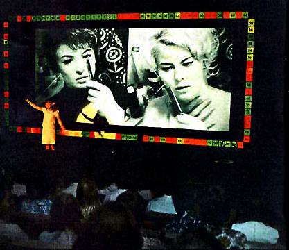
The concept harked back to a Czech experiment/goof from the '60s, the Kinoautomat, which had more subversive things on its mind than just deciding how someone was going to be tortured:
Raduz CinceraI actually saw the Kinoautomat as a kid and it was the most fun I ever had in a theatre (next to The Fearless Vampire Killers).
Kinoautomat: One Man and his Jury
At the Expo of 1967 in Montreal, Raduz Cincera presented for the first time to a larger audience the Kinoautomat (movie vending-machine) he developed together with the directors Jan Rohac and Vladimir Svitacek, scenographer Josef Svoboda, and Jaroslav Fric and Bohumil Mika. It involved the worlds first interactive movie theater. In the movie theaters seating, viewers found two buttons necessary for making selections; they were confronted with a film whose action could always be stopped. At one point, two principal actors from the screened film appeared onstage and asked the audience how they thought the scene should be continued. The viewers decided; afterwards, the [desired] film version, arrived at by public vote, was then screened. The film One Man and his Jury told the story of an "average apartment house," with turbulent goings-on between tenants. In one scene, a young woman [locks herself out of her apartment] after checking to see who rang her doorbell. Since she was in the shower, nothing covers her body except a towel. In her panic she rings her neighbors door and asks for help. Here the film is stopped. The audience is asked whether the neighbor should let her in or not. In almost every case the majority of the viewers answered yes. Only once, at the Expo, did the viewers vote nowhen the scene involved a large group of nuns.
"The branching structure wasn't tree-like, doubling the number of scenes needed at each choice, but rather always remained only two. They did this by carefully crafting a story such that no matter which of the two options were chosen, it would end up back at the same next choice. The vote was executed by the projectionist switching one lens cap between the two synchronized projectors. The artfulness, ultimately, was not in the interaction but in the illusion of interaction. The film's director, Raduz Cincera, made it as a satire of democracy, where everyone votes but it doesn't make any difference." (Quote from: Michael Naimark, Interactive Art - Maybe It's a Bad Idea, 1997)
Rudolf Frieling

Jim Finn, Chicago: "This is a needlepoint recreation of a spacesuit patch for the international communist space program based in the former USSR. The Interkosmos program began in the 1970s as a way to integrate socialist and non-aligned nations into the Soviet space program; it brought cosmonauts from Cuba, Mongolia, Hungary, Vietnam, East Germany and Syria among others into space. I used this patch in my film Interkosmos, about an East German space colonization mission to the moons of Jupiter and Saturn. The needlepoint patch is featured in the Amber space capsule headed for Ganymede, one of the four Galilean satellites of Jupiter. The writing on the patch is the Russian name for Interkosmos."
From an online exhibit of objects made using the microRevolt website's software, which converts jpegs and other image files into stitchable patterns. This patch is considerably more detailed than the PDF of the pattern linked to on this page, it should be noted--it appears the PDF was only used as a rough guide. See Paul Slocum's "bad jpeg" microRevolt cross-stitch pattern and my cowbug.

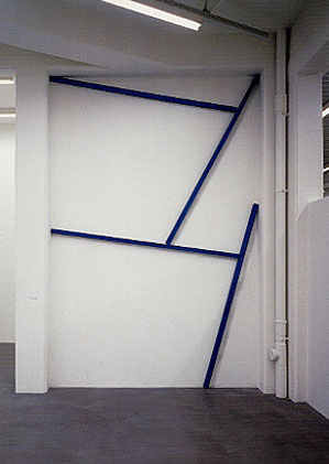
Daniel Gottin (umlaut over the o not reading in RSS): "I am interested in a work that makes the site visible through the art work, and the site makes the art work visible at the same time. It is about the consciousness of perceiving something. It is a communication, a give and take between equal parts creating a new, balanced entity."

Update: The link to these images is dead. Way to go, Minus Space!
"Prophet and Lossy" [mp3 removed]. I did this in 3/4 rather than the usual 4/4 and added some exciting key changes in the second dropout! I might snip out a bar or two at the beginning; still thinking about that.
Mailbox
Hey Tom,
I've been thinking about interactivity in art lately, which I think is a bit of a divider into two camps of new media artists. Seems like most of the artists I'm into don't use interactivity that much. But there are some artists who always do and almost seem to consider "interactive" and "new media" to be synonymous. But a lot of the interactive stuff I see, I don't totally get why it's interactive. Seems like if it is interactive, there should be some really compelling reason to make it so, and the interface is extremely important. Otherwise it starts to feel like it fits better in the Museum of Science and History than the art museum.
My main question is: where do I look for a history of interactive art? Any particular artists to check out? Surely there was interactive work before computers, and maybe even an early interactive "movement"? Or maybe it is relatively new? --PS
Dear PS,
"Interactive" is one of those buzzwords like "multidisciplinary" that grant panels love. I've always been critical of art that feels like it belongs in the Exploratorium. (Until 20 years later, when it becomes great kitsch.) Agreed, some (most?) new media artists require interactivity, no matter how dumb or pointless, for admittance to the Club. One computer gallerist calls me a Modernist because I believe in "stand alone" art. It's not so much a belief system as feeling that certain things are right for certain venues. I'll sit at home and click a mouse surfing for hours but resent it when someone puts a mouse on a ledge in a gallery and expects me to start navigating something to "get" the art. The gallery is better for a "heads up," moving around experience, movies are better for long narratives, and your computer at home is best for "net art." The art should fit the physical environment and the expectations of that environment.
Historically interactivity started in the '60s with kinetic art and holography, and the "anti-object" ideas of conceptualism. Michael Fried's famous essay "Art and Objecthood" was one of the first to identify what he called "theatricality" in art. But there's a big difference between the theatricality of moving around a Minimalist sculpture and thinking about how your body and the room define the experience--which was a good thing to learn--and the obligatory joystick with a sign that says "Join me in 'making' the art according to 7 preset menu choices!" After the '60s, computer science departments started grafting half-baked versions of conceptualist and minimalist concepts onto the emerging net art and robotics art fields. Thus, what we have today. I try to be open about stuff, but always ask "What purpose does this interactivity serve?"
--Tom
(I dodged the question about specific artists practicing interactivity--any contributions to an etymology of the term would be welcome.)
