View current page
...more recent posts
"Showing new media work in the gallery": what's at stake.
I have been working on a marathon interview that will be posted on the interviewer's site soon. The subject, more or less, is "showing new media work in the gallery," centering on my and another artist's current shows, and the interview has become like this insane Fluxus event where new information keeps surfacing and the dialogue goes on and on. I think it will be enjoyable to read, for all that.
I was talking to the interviewer yesterday and we uncovered more broad swaths of things that could have been said. Here's a summary of some of those items, before I forget, plus some stuff I just thought of.
1. The "tech discussion" is boring but there are some fundamental things that need to be covered. Specifically, what similarities exist between art and design in the web/computer environment and aesthetic principles of the art world. In the interview we talked some about the differences between the remixology/upload/download culture of the internet and the art world's need for defined, specific objects that can be shown in real space. My comments below are mostly about the similarities in the form of "minimalist" sensibilities common to the art and geek worlds.
2. Design consultant/philosopher/guru Edward Tufte talks about the need to reduce elements (in charts, etc) for maximum clarity and information flow. The minimalist sensibility in the art world talks about unnecessary gestures and ornamentation and "truth to materials" used to make art.
3. Software (e.g. Windows, Adobe) that is cluttered with unnecessary bells and whistles and extraneous lines of code is not beautiful or good. The "hacker aesthetic" seeks to remove this clutter (in Linux, Firefox, etc) so that users have more control over their lives.
4. Conceptualism in art also seeks to peel back the control mechanisms, to dismantle or parse the aura of the white cube and the mercantile systems underlying art (and therefore information) exchange.
5. In my case, my art is made in the simplest paint and GIF programs so I can eliminate some of the superfluous or overly controlling features of more "state of the art" software. Cory Arcangel and others have hacked even deeper--trusting only the numbers themselves under the graphic interfaces.
6. By putting the GIFs in the gallery (as videos), I'm making an immaterial art that is highly context dependent--depending on the shape of the room, lightness or darkness of walls and floor, and acoustics (for pieces with sound). I want the viewer to recognize the almost joke-like simplicity of the imagery (but not "overly simple," that's where the interviewer and I initially disagreed) and reflect on the mechanisms of the GIFs as well as the mechanisms of the white cube.
7. The other artist in the interview had similar goals but a very different approach, in that his presentation is more high tech and memory-intensive (even though his imagery is videogame-clunky), and the work is more absorbable into the gallery-collector-museum commodity stream by virtue of consisting of easily dispersable, physically portable pieces, with current hard drives, nice flat screen monitors etc..These "video-objects" will look pretty consistent everywhere they're shown, whereas mine change with the vagaries of available equipment and will be reconfigured on the fly for every space and hardware configuration. (Even though the underlying DVDs are offered for sale.) We never had a chance to really debate our different approaches, and I'm not sure we wanted to. Suffice it to say he has a better shot at posterity by meeting the commodity system halfway (as opposed to my quarter-way).
8. To sum up, the common (mostly unspoken) points of inquiry in the interview were: (i) what is the hacker aesthetic? (ii) what is the "gallery aesthetic"? (iii) how can these aesthetics be commingled? and most importantly, (iv) how can the viewer be made to understand these ideas just from viewing the work itself, without a podcast to explain it?
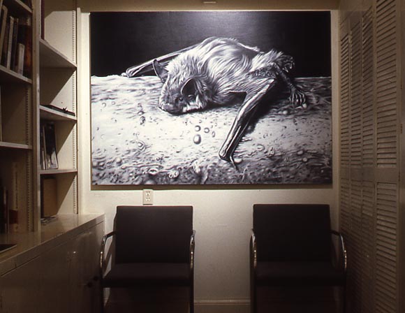
Large Bat, 1990, oil on canvas. The person who owned the gallery where I showed this was grossed out by it, but the gallery director liked it, so we hung it in her office during my show. I used to do a lot of photoreal-style paintings, many based on a book of copyright-free images called North American Mammals. (photo by Harrison Evans)
Cory Arcangel has created a web page with Kurt Cobain's suicide note that, when refreshed, pulls up different sets of Google Ads based on "keywords" in the letter. Pretty droll, and about says it all about our ad-annotated culture. I should say, so-called suicide note because, this being the first time I've read it, it sure didn't sound like he was planning to kill himself. More like, explaining why he was going to stop touring. As Paul notes, there is a conspiracy theory about the "suicide" that this note certain lends credence to.
"Piano Three Hands" [mp3 removed]. This will most likely be the first part of a longer work, posted in installments as I did with the string quartet piece a while back. The intro repeats at the end now, but I will probably take that out and add new material.
Update: Added an 18-second "middle section."
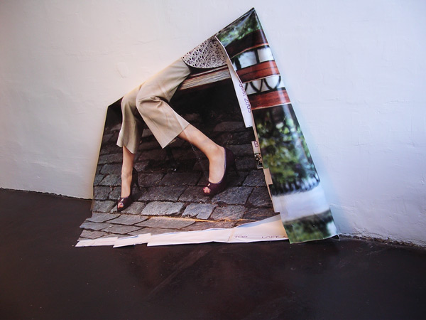
Bill Schwarz's 99 Bottles of Beer on the Wall begat Cady Noland, and Cady Noland begat...
Brooklyn-based artist Roy Stanfield, who has the most persuasive website of almost any artist whose work I've never seen, and whose drawings based on random Google image searches I posted about here. He's having a show at And/Or Gallery in Dallas, with Wendy Red Star.
Some photos of the show are here; the statement at the bottom of the page is very helpful.
The gallery's page documenting the show is here.
I'm being a bit cheeky about the website and all, but seriously, that is an inspiring series of photos documenting the artist's work. Almost no text is needed--with such a range of amusing, perplexing, and drop dead pretty installation shots (see the photos of skateboard ramps/swimming pools) the viewer supplies the back story and imagines radical exhibition scenarios that may or may not have happened. With its seamless mix of "exhibition space" and "environment" it is a thesis for an excellent career. Maybe I'll get to see the work in a New York gallery eventually.
I know a lot of people watched CNN during the First Gulf War (the "good gulf war") and came to love the network's exciting style of round the clock reporting and showing that same clip of Saddam brandishing the shotgun over and over. I thought the network was just the lyin' propaganda arm of the government and I couldn't stand to watch it. Nothing's changed in 15 years. Here's a report from Salon's Tim Grieve:
Wait, you mean we didn't find any WMD?
From the "Earth to CNN" Department comes this Media Matters report on an otherworldly on-air exchange Thursday between CNN senior national correspondent John Roberts and CNN anchor Wolf Blitzer.
The subject was sanctions against Iran, and Roberts began by saying that the United States and its allies might not be able to get them through the U.N. Security Council. Fair enough. Then he said that sanctions don't always work. That's fair, too, and it might have been a good place to stop. Roberts kept going. "Don't forget," he said, "Iraq endured 11 years of sanctions, and, you know, we still had to go to war to get rid of what it was that they had."
Blitzer, who knows a thing or two about Iraq, immediately set Roberts straight, reminding him that the U.S. war against Iraq didn't, in fact "get rid of what it was that they had" because, as it turns out, they didn't have anything at all.
No, wait. That's not what Blitzer actually said.
What Blitzer actually said was, "Good point, John. Thank you very much."
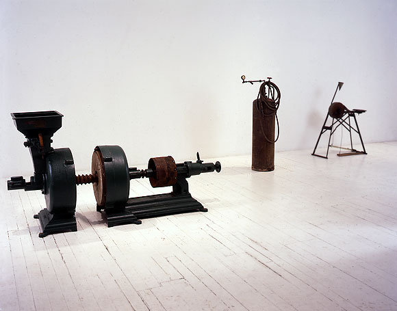
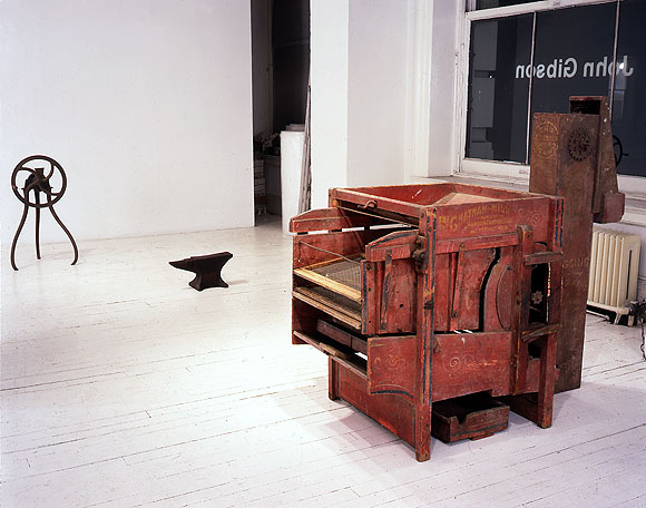
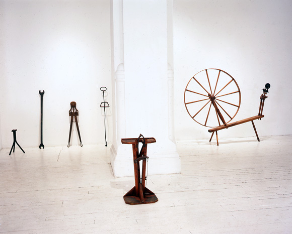
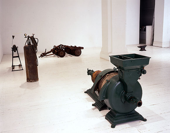
Bill Schwarz, installation views of solo show at John Gibson gallery, New York, 1995 (photos by Sylvie Ball). While the artist Cady Noland made urban detritus (machine parts, flags, key chains, beer cans) the focus of her found object/scatter installations, her contemporary Bill Schwarz, who was included in a number of Robert Nickas-curated shows around the time she was coming to prominence, took the more radical and I would say Robert Smithsonesque step of looking to the American heartland for appropriation subject matter. For this show at Gibson he trucked a selection of rusty, not-quite-obsolescent farm machinery into the white cube of the gallery and arranged it tastefully, a la MOMA curator Alfred Barr's "art of design" shows.
I say radical for a couple of reasons. In a way there's nothing more alien to a cosmopolitan New Yorker than these implements from red states, as we now call l them. Much of the equipment is obscure to the urbanite and seems completely divorced from function, yet is a matter of life and death to the (pre-agribusiness) farmer hacking a living out of the land. The exhibit follows the core principles of what Smithson called the "non-site"--a real place in the world transplanted into the white cube. The show is also "difficult" because of flirtation with kitsch far more threatening to refined urban sensibilities than Noland's Canal Street, dollar store ephemera: these battered, time-patinaed harrows and spinning wheels can be found all over the heartland tucked away in antique stores, used as flower pots, and so forth. The difference is the "Barr treatment" Schwarz gives them; the objects are arranged for maximum formal elegance, so that they resemble shows of mid-20th Century modernist sculpture, much as Barr arranged tools and machine parts, deliberately pointing up their affinities to Brancusi, the Cubists, et al.
The price of radicalism can be obscurity. The Gibson show was reviewed in Artforum and other publications but the work is not in museum collections. Now that we have the Net, it's possible for shows to be seen in a fleshed-out way that a back-of-the-mag Artforum review accompanied a single tiny picture could never convey. These images are completely relevant with Cady Noland back in the news, with the media attacking the "appropriators of the appropriator."
