View current page
...more recent posts
I had a table (html) art piece here that I took down. It worked fine in Firefox and IE but once again Apple's Safari hates my art. A friend with that browser said that the table was too wide, forcing him to side to side scroll to read my page. That should never happen (I design this for an 800 x 600 screen), and if it does, please tell me. While I'm crying about Safari, please take a look at this blog from the jodi.org blogroll.
"Hiphop Snares" [mp3 removed]
An extended drum solo, with lots of filtering and EQ.
Update: added a couple of keyboard parts at the two "crescendos."
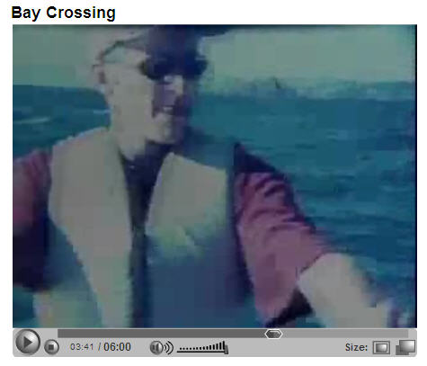
"Bay Crossing" - a film about crossing the San Francisco bay in a homemade rowboat, by Steve MacDonald. The voiceover consists of droll recordings of MacDonald calling around to various public safety officials trying to figure out what permits he needs and "how safe it is." [YouTube] |

Chris Ashley has been posting scans of old children's book covers amid his regular weblog entries. More intriguing design ideas than you can shake a frisket at. The hand-rendered photographic style of A Pony for Linda, above, resembles the high contrast still images of the Cartoon Network show Tom Goes to the Mayor. What doesn't work in an animated cartoon looks great on a kid's book. Also in Ashley's compendium, be sure to check out the endearingly Henry Darger-ish What's Inside of Me?
The image below just hit my email inbox, from Marvelli Gallery in Chelsea. Haven't seen the work in person and know nothing about the artist, but this jpeg, at least, strikes a good bad painting chord. Paging through other work we see a distinct Dana Schutz vibe, but also Judith Linhares with a bit lighter touch, or Laura Owens, if the latter had an ounce of finesse as a painter. Anyway, I'm getting my virtual tasty brushstroke (and nature panic) fixes for the day: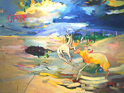 Janine Iversen, "Open Longer," 2006, Oil on Canvas, 60 X 78 inches |
Two posts from libertarian blogger Jim Henley crack me up. First, about the Iranian surprise attacks the scaremongers were predicting for August 22, he writes:
And earlier, about ex-CIA analyst Kenneth Pollack, author of the unfortunately influential 2002 book The Threatening Storm: The Case for Invading Iraq:As you know, today was the day that, as predicted by respected Muslim World Experts TM, the apocalyptic regime of Iranian terror masters attacked the West in the name of hastening the coming of the Twelfth Imam. I experienced the carnage first-hand. This morning on the Washington Beltway a guy drove really slow in the left lane - right in front of me. Couldnt have been going over 50.
I was as resolute in refusing to be cowed by this unprovoked Iranian aggression as I was enraged at the fecklessness of our leaders, who failed to preempt the outrage by launching a major and of course purely defensive war on the Islamic Republic.
But where the craven Bush Administration and its puppeteers on the decadent Left fail America, the blogosphere can fill the void. We are fighting this war too, no less than the meeting planners at the think tanks and the guests on talk shows and the dumpers of fluids into airport bins. So Im offering this blog item as a sharing - and yes, healing - place. Each of you, please tell us how you coped with the Day of Dodecahedral Doom. Whether acolytes of the Twelfth Imam cut in front of you at Au Bon Pain or put you on hold without asking or failed to note that your blog linked something before any other blogs you happened to notice, no enormity is too, well, enormous, for us to bear, together.
Great stuff.Kenneth Fucking Pollack writes to tell us that civil war in Iraq is a very bad thing. Honest to god, this kind of thing is all the explanation this blogs frequent resort to profanity requires. Ken baby, its your civil war as much as anyones. Pollack did more than anyone to encourage the famous liberal hawks to provide the bipartisan patina so useful in getting the Iraq invasion started. In the Army, someone would have long since left him alone in the study with a pistol and the discreet interval required to make the only appropriate gesture of regret, genuine atonement being impossible under the circumstances. In Japan hed be a picture of the different ways light reflects off entrails and cutlery. In Washington, he gets to write new articles, as if he were an epidemiologist and not Typhoid Mary.
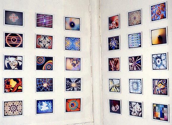
rave video stills - details / more details
Many of the "rave video still" photos above (discussed here, here, and here), which I made around 2000 with a 35 mm camera and a VCR pause button, came from "X-Mix" series of videotapes (see relevant disclaimers at the third link above). These were never shown, I was mostly just interested in them as "found abstraction"--there's some beautiful stuff on those tapes amid a lot of junk.
Cory Arcangel has made a YouTube sighting of one of the tapes. It is a computer animated version of an intense Plastikman track, from the "X-Mix 3" comp. As Cory says, "in the future when we try to describe the 1990s to people, we just need to show them this..."
Update, May 2008: Of course Arcangel's find has been removed from YouTube "at the request of Viacom."
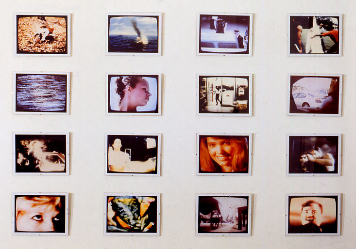
The photos above (that's Set 1, Set 2 is here) elicited some discussion that explained them a bit, and I found out about some other people's tv documentation projects. Everyone's coming at this in a slightly different way--I like that there could be a micro-genre, like monochrome painting. Here is the relevant comment thread, hope you can follow it:
1. detail?
- paul (guest) 8-21-2006 1:12 pm2. You can click on the image and get a bigger view of the group. They're not particularly significant images individually. These are ink jet-prints from the original snapshots I made off the TV (videotapes). The idea was to freeze the frame on "transitional" shots that were never meant to be stills, with an emphasis on picking the most banal subject matter, then thinking about how they did or didn't relate in a grid.
There's really no good way to get this across on the web. And I've never had much response to them in person. But I remain stubbornly attached to the concept and my choices.
- tom moody 8-21-2006 2:28 pm3. cool. I think they're nice. just curious how the grain looks up close.
- paul (guest) 8-21-2006 3:39 pm4. They're pretty TV-grainy, but the prints have a nice quality--semi gloss finish photo paper.
- tom moody 8-21-2006 4:05 pm5. cool. along the same line, one still from each dvd i have rented so far in 06. i've been thinking of how to print it when i'm done. http://www.tinjail.com/tintype/?cat=18
- m.river 8-21-2006 6:53 pm6. we have this blog, we hope you like it..... tvontv.blogspot.com/
- Book House Boys (guest) 8-22-2006 8:10 am7. I suppose I should add that the first steps of my photos were analog. The TV was a CRT. The VCR was paused, I shot the photo with a 35 mm camera, and then took the film to a 24-hour lab. The resulting snapshots were then scanned and printed on nice paper with an Epson 2000P. The result is, I guess, "warmer"--although ideally the negatives would be printed the old way, with an enlarger, chemicals, etc., since the digital part of the process makes the work "colder."
- tom moody 8-22-2006 1:15 pm
