View current page
...more recent posts
|
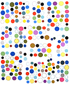
Chris Ashley, Untitled, 20060906, HTML, 250 x 200 pixels
After a run of "auto-pixelated" media imagery combined with abstraction that I wasn't too wild about, Ashley is making pixel art-sized abstractions that are rather tasty. This is one. Minimalism is not dead, it just got smaller. You should peep the code on this one if you can, it goes on forever.Heh, on the Bloglines RSS reader, which consistently makes hash of this page, Ashley's piece reads as...invisible. The caption reads "Very Small Abstractions." Not that small. Bloglines, kindly eat me.
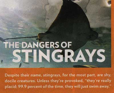
People magazine weighs in on stingrays, post-Irwin.
Thank heavens the 9/11 anniversary is over. "A wounded but resilient America paused to remember a calamitous day," says the New York Times. Oh, poor pitiful us. In the name of "9/11" we invaded and essentially destroyed an entire Mideast country that had nothing to do with the attacks, but it's important that we spend time reflecting and obsessing over our own wounds. The best course now for citizens who really want to respond to that day is to hand Bush his ass on a platter in the next election. No, we don't get to vote against him personally, as if we ever did, but returning the House and Senate to the opposition party at least creates the possibility of putting some brakes on this maniac. Two years of Congressional investigations of various White House misdeeds, hauling one functionary after another from this secretive Administration before righteous Senators and Congressmen to explain their misdeeds, would be delightful. I think we could handle the resulting "paralysis" of our ability to wage elective wars. I know the rest of the world would like a breather from us.
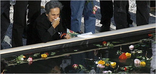
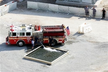
The image at the top was on the front page of the New York Times online edition. I hate to further exploit this woman's grief, but it bugs me that the "pool" in the photo is just a temporary prop assembled for a photo-op, because five years after 9/11/2001 no memorial exists. The photographer who took this picture, and/or the editor(s) who cropped it, are, in effect, liars. The bottom photo is from a series of wide angle shots on the DailyKos website showing the pool without the cropping.
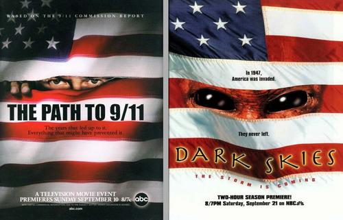
The Huffington Post notes the similarity between the poster for Disney/ABC's pro-Bush propaganda movie, The Path to 9/11, about America's inability to root out the terrorists among us (lurking behind the flag) and the poster for the 1996 TV series Dark Skies, which depicts those terrorists as they really are: lemur-eyed extraterrestrials. Slightly off topic, I was almost late for w*rk today because my train, which enters Manhattan through the gaping hole formerly known as the World Trade Center, was cancelled from 3:30 to 5:00 for a Bush-and-wife wreath-laying photo-op at the former base of the former tower(s). He never misses an opportunity to milk tragedy for political gain. No ill respect meant to the dead--here's hoping that the truth will come out eventually about the events of that horrible day--as opposed to the Administration whitewash and exploitation we've had so far.
Momenta Art, celebrating its 20th anniversary this year, recently moved to a new location at 359 Bedford Ave., between S. 4th and S. 5th in Williamsburg. The gallery consistently serves up engaged, political (or politically-tinged) art and introduces many artists who go on to be exploited by the system, I mean, become stars. One of the great things about New York is there are pockets of cultural life here that resist the prevailing "happy talk" that started with '70s news media and gradually spread to every facet of our society. Momenta is such a pocket. Consider this press release for "The Unhumane Society," opening Friday, September 15, from 6-8 pm:
The work of each of the artists in this exhibition slides easily between the human and the animal world. In a video by Daniel Herskowitz, the artist eavesdrops upon conversations among primatologists. As they discuss group behaviors of lower primates, the group dynamics of the scientists seem not so distant. In Stefaan Dheedenes video an African hunter methodically describes his process of trapping and killing animals. Our attention is displaced by his clinical description of his work punctuated by the diminishing screams of a baby antelope as he clubs it to death. Similarly, in a video by David Burns, a farm family considers the interpersonal relations of their chickens and discuss which chicken must die as the video presents the loser chicken, beheaded and plucked in reverse. In a video by Liselot van der Heijden, the viewer is left alone to commune with the endlessly looping final breath of a dying zebra. Tom Moore also offers a kind of quiet communion. His photographs of primate cages from the Berlin Zoo, also empty of humans (and of animals) document a frighteningly perfect animal habitat that fulfills every need. And Mark Dion's natural history photographs offer the disquietude of our animal curiosity.One is tempted to say, lighten up, guys. For sure no Chelsea gallery would ever send out a press release that disturbingly bleak. (A member of the patron class might get "bummed out" and stop coming in.) But I happen to believe that humanity will have much to answer for vis a vis the rest of nature when we stand before the Immortal Aliens for cosmic judgment, so kudos to Momenta--this sounds great.
The other works in the show slip more precipitously between the human and the animal. Rachel Lowther offers us a sculpture representing the glistening inflated-to-bursting obscene reality that is a rat urinary and genital system after said rat has 'received' excess amounts of testosterone in the form of Perandren. Breyer/P-Orridges absurd, fetishistic sculptural object of a wheeled gumball machine filled with used tampons and topped with a wolfs head suggests the machinistic fetishization of a feminine primal order. Human/animal hybrids are more directly represented in the works of Rita Ackerman and Jason Fox with his painting of a pathetic creature separated from the viewer by a chain-link barrier and her charming, brutal, doe-like vampires. All pretense falls away with the work of Grace Roselli. In her classically rendered painting, a pregnant woman hunches over skeletal human remains in a post apocalyptic sewage-scape; unable to cope with the human world she becomes subsumed in an idealized nightmare of our animal side taking over. As pathological as it is clinical, it is a nightmare that we all share.
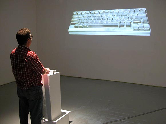
Opening tonight at artMovingProjects, 166 N. 12 Street in Williamsburg from 7 to 9 pm, an exhibit by Marcin Ramocki, an artist previously discussed here. He directed the 8 BIT movie that is opening next month at the Museum of Modern Art. Aiming to "sabotage and displace the familiar context of the software interface," the exhibit includes Torcito Portraits, digital animations based on re-purposing the old Macintosh musical program Virtual Drummer, and Anti-Pharmakon, pictured above (photo courtesy artMovingProjects), an interactive installation composed of a treated computer keyboard, CPU and a wall projection. Further explanation will be forthcoming, once I actually see the work.
Also showing in the Project Space is Jillian McDonald's Zombie Makeup, a video documenting the day the artist rode the L train from one end to the other applying George Romero-ish zombie makeup to her face. As the artist says, "Instead of improving my features, like the woman who steadily applies makeup en route to work or play, I become gruesome."
Update: Anti-Pharmakon is an interactive sound piece. When you press a key on the actual keyboard, the corresponding key moves on the projected one, and a recorded sound issues from speakers in the gallery. The "sound bites" are single words or phrases uttered by popular or historical figures, listed here (scroll down)--for example, significant progress (Dick Cheney); Arabs and Israelis (Anwar Sadat); the white men (Malcolm X); and life (George W. Bush). The sounds overlap when multiple keys are pressed, created intermittent cacophony in the gallery, depending on how many are clicked at once.
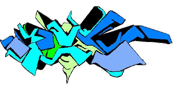
My MSPaintbrush version of the Dex graffiti mural I posted earlier--drawn freehand from the photo. I tried to compensate for the steep angle of the wall in the original shot, but as you can see it still recedes on the left. Oh, well, regardless, I'm bad. Unfortunately I don't know what the tag signified originally and I guarantee I don't now.
