View current page
...more recent posts
Equinox trailer [YouTube]
On IMDb, the link to the trailer for this 1970 horror film takes you to a trailer for the 1992 Alan Rudolph film of the same name. Good as Rudolph is, his trailer is no match for this. Trivia: in the horror film the word "equinox" is spoken in the 1967 student-made original (it refers to a boundary between good and evil, living and dead) but is never uttered in the 1970 recut.
More on the 1970 Equinox here.
Below are three songs that I'm reposting because all were changed--fleshed out or tightened up--since I first put them up. I'm also listing the software and gear I used, to be ultimately self-indulgent. All were produced in Cubase SE.
"Un-tribal" [mp3 removed] Kontakt 2, Battery, Reaktor Subharmonic, self-sampled Vermona DRM MKII drum machine, Spektral Delay (malfunctioning), LinPlug Alpha
"Anthropos Essentia" [4.8 MB .mp3] Absynth, Spektral Delay, Kontakt 2, DRM MKII, Battery
"Hiphop Snares" [mp3 removed] Miscellaneous drum loops, Waves Enigma, Reaktor Carbon 2, FM7

Above is an image I created using a Flash "make your own Jackson Pollock" program created by Miltos Manetas. He didn't design the software, completely--the code is from a downloadable web toy called "splatter" that he appropriated, customized to allow the application of multiple colors, and renamed "jacksonpollock.org." The idea is you can make drippy "Pollocks" by moving your mouse around.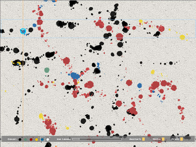
This is a screen shot from another make-your-own Pollock utility, currently on view at vertexList, by C.J. Yeh. Instead of cursor sweeps, you play notes on a keyboard, and Yeh's software translates the tune into Pollockesque colors and drip spacings. These "Pollocks" are more naturalistic than the output from Manetas' repurposed splatter device, reproducing canvas weave texture and avoiding the obnoxious secondary colors.
Pollock is a perennial target for computer geeks. Besides these DIY-Pollock programs (the former insider-ironically smartass, the latter insider-sincerely "deconstructive"), we were recently subjected to a barrage of hype about the computer science prof who could purportedly identify fake Pollocks by measuring drip sizes, fling rates, and so forth. And a few years before that, critic Pepe Karmel used computer analysis of Hans Namuth's studio photos of Pollocks-in-progress* to determine that beneath the convoluted abstraction lay images of the human figure, which Pollock "always drew first."
At the core of this all this computation--cheeky, earnest, or pseudoscientific--lies the assumption, essentially, that Pollock is stupid, and that his art, far from being the "difficult" thing art mavens have built careers defending, is really rather simple. See, you can do one. He's just another "brand." His dripping was so predictable that a machine can recognize it and simulate it. When you get past all the art-crit theory positing the work as "industrial," "oceanic," and "decentralizing," it turns out that deep down Pollock just loved people. In theory circles this is known as "recuperation." You'd have thought it would have happened already with Pollock, but apparently it's still ongoing. Is it possible that computer nerds (including computer nerd artists) are 40 years behind interior decorators? Or--gasp--that there's something about Pollock that's still getting under people's skin?
*see, e.g., Francis V. O'Connor, Ph.D., writing about Karmel's analyis of Number 27, 1950:
Pollock began the work, as Karmel documents, at the bottom left corner of the narrow end of the long canvas, in the area just above where the present signature is, with a drawing in black paint of a large-headed, childlike, striding, humanoid figure. He then filled in the rest of the canvas with other humanoid and animal figures until he had an overall structure of line-drawings on the blank canvas. He used these forms to create a web of hubs radiating black lines, and then covered them with the colors and forms now visible on the surface, with a few of the black lines visible around the edges. It is these black forms around the periphery of the painting that now "work" when the painting is viewed as a vertical composition -- which it was to begin with. I suspect that Pollock thought of the whole enterprise in respect to the little figure with which he began it -- and that determined the greater coherence of the vertical composition. Since he also had a tendency to want to obscure recognizable images with which he probably identified (see Supplement to the JPCR, p. 79), he may have signed it near the figure to accomplish this. Whatever the unknowable inner motivations, the painting self-evidently works best as a vertical, and it ought to be hung that way at the Whitney from now on, along with Namuth's photo proving the precedent.
In fairness to geeks, the Karmel analysis only used a computer technician as a hired gun. The "search for the figure" beneath the paintings' actual stated (surface) premises had more to do with critical conservatism than geeky reduction. If Pollock had drawn an engorged penis before covering it up with abstract patterns, would that have made the work sexual? The point is, he covered it up. The "research" was spurious and ultimately soothing to bourgeois anxieties about art with "no subject." It's mentioned in this post because the computer--which Karmel & Co. used to rectify canvases seen at odd angles in the photographs, the better to perceive those hidden stick men--gave the enterprise a patina of scientific rationality.
Updated after I learned the Manetas piece was a goof on a designer's work--I didn't know the source, but do wish we could get past "canonical artist" jokes.
Updated again Sept. 30 with minor edits and a more Pollocklike Pollock from jacksonpollock.org.




a quick surf around the deviantart.com Pixel Art archive--image filenames contain artists and titles
Ethan Mahmeinntow, "Symbiont" [4.95 MB .mp3] [via] '60s-style harpsichord arpeggio workout with mashed up beats, time and space folding, culminating with backwards drohcisprah.
cato_six, "Little hopin Jam" [2.6 MB .mp3] [via] Explosive, nimble, slighty insane drill and bass rhythms over eerie panning "organ" notes.
Two nice pieces from the Reaktions site. I'm linking directly to the site--don't know if that's considered hotlinking, but I'll keep doing it till someone squawks.
Most meaningless use of a religious icon reference in a press photo: Chip Somodevilla/Getty Images (front page of the New York Times online edition today, a story about Congress's current session concluding without getting much done).
Handlers position these functionaries hoping photographers will grab the bait--in this case making Bush stooge Bill Frist look holy--and they do it every time. "Honey, can you believe I got his head in the dome? I'll win a Pulitzer for this!" "You're a great photographer, Chip."
A memorable moment in Jim Jarmusch's film Dead Man occurs when a bounty hunter falls dead on top of a pattern of concentric sticks from a burned-out campfire, which appear as rays emanating from his head. Just as you're thinking he looks like a religious icon, cannibal desperado Lance Henricksen says "Looks like a goddamned religious icon," and puts his boot down on the bounty hunter's skull, improbably crushing it like a canteloupe.
From WorldChanging:
The media is buzzing over the spinach crisis, caused by an outbreak of the potentially lethal bacterium E. coli O157:H7. A curious yet widespread claim is that, because some of the spinach so far identified as contaminated came from organic farms, organic farming is unsafe. It's a curious claim, because scientists understand pretty well where the O157:H7 is coming from: the bellies of factory-farmed cows. Their manure, as it turns out, is now crawling with the critters. As this New York Times op-ed puts it:The same newspaper that published that editorial has a story today titled "As Children Suffer, Parents Agonize Over Spinach," the purpose of which seems to be scare the living daylights out of anyone with a small child.Where does this particularly virulent strain come from? It's not found in the intestinal tracts of cattle raised on their natural diet of grass, hay and other fibrous forage. No, O157 thrives in a new--that is, recent in the history of animal diets--biological niche: the unnaturally acidic stomachs of beef and dairy cattle fed on grain, the typical ration on most industrial farms. It's the infected manure from these grain-fed cattle that contaminates the groundwater and spreads the bacteria to produce, like spinach, growing on neighboring farms.
In many cases, it crept up with frightening force after what had seemed a harmless, even healthful meal--a spinach salad with walnuts, a sandwich layered with spinach or, as for the Krause family, a baked, boneless, skinless piece of chicken on a small bed of spinach. Then what had seemed a simple bout of diarrhea in the morning often led to a harrowing, bloody race to the emergency room by midnight.This melodramatic article by Monica Davey serves up abundant, clinical, sickening detail about the effects of E Coli, without mentioning anything about causes. ("'In the course of one week, he went from this healthy, lively little boy to a boy in a hospital bed fighting for his life...he turned yellow and gray, literally. It was shocking and terrifying and unbelievable to watch.'") Aside from ghoulish exploitation and a good rubberneck at others' misery, Davey appears, with this contextless story, to want parents to switch their children's diets to Keebler cookies, frozen pizza, and other "safe" foods.
And around the country, some families still wait by bedsides, wondering which foods they could ever again feel safe giving their children, what the government or the spinach industry could have done to protect them, and, most of all, whether their loved ones will ever fully recover.
"Here you think youre feeding your child a great, healthy meal," Dennis Krause said sadly. "But here I was, poisoning him."
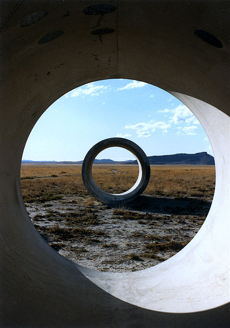
Tyler Green of Modern Art Notes recently reported on his trip to Sun Tunnels, Nancy Holt's earthwork in northern Utah. Sounds like he had a so-so time. Green thinks the work hasn't aged well, and I can't comment on that but am posting these snapshots from a trip my brother and I took there in the '80s, to show the magic Holt's piece is (or was) capable of. I'd be surprised if you couldn't get similar views now, but here's what Green says: "They never came to life, they never became exciting. They seemed too self-consciously monumental, too interested in being pagan totems to artisanal existence. Sun Tunnels is too much a post-industrial Stonehenge-like gesture to succeed as an engaging artwork. While the greatest pieces of land art exist within nature and bring their environment into the artwork--think how the Jetty and the Great Salt Lake co-exist or how Lightning Field is placed within its space--Sun Tunnels rejects its own landscape. Each tunnel looks like it had started to erode (Sun Tunnels was built in 1976) and was later patched so as to maintain its shape. While the Jetty basks in its location, Sun Tunnels seems to fight its off. The Tunnels' roundness is just too jarring, too inappropriate for this landscape. Sun Tunnels is funky cool in an I-was-there kind of way. But that's as far as they get."


Turning to my pics from the '80s, that's me in the middle photo, wearing my high desert button-down shirt, with my brother holding the camera. That's him off in the distance in the third shot. The bottom pic also shows some unfortunate cow pies around the piece at that time. I wrote Holt a letter after our visit and she wasn't too happy to hear about the cattle, but said that unless she fenced the area there was no guarantee the livestock would stay out. In the middle photo, you can see ricochet marks of bullets fired off by local art lovers inside the tubes. ("It blowed up good." "It blowed up real good.") Small wonder Holt has to keep them patched.
Some earthworks, notably Michael Heizer's, are jarring interventions in the landscape, and I'm really not sure what Green means when he says Sun Tunnels fails to "bring the environment within the artwork." Holt positioned the tunnels on the desert flatness so that one sees a different, exquisite mountain vista from each of the four possible vantage points. These distant geologic bulges are framed within the near-mystical concentric circles that appear when you view the tunnels head on--the top photo conveys some of the Magrittean effect. The choice of where to place them wasn't arbitrarily aesthetic, though: the cylinders are aligned with the positions where the sun rises and sets at the solstices (hence the piece's name). She cut smaller rounded holes in the tunnel walls, corresponding to the shapes of stellar constellations, which cast circles of sunlight or moonlight within the darkened tubes. Much like the work of Holt's husband Robert Smithson (this was her first piece after his death, I believe) Sun Tunnels combines analytical modernism--a costly desert construction project the purpose of which is to optically slice and contain the landscape--and pre-scientific, ritual channeling of light from heavenly bodies. Green's phrase "post-industrial Stonehenge" captures the essence but not the excitement. We spent about fourteen hours at the tunnel site, and watched the landscape (and skyscapes) change from afternoon to dusk to darkest night, leaving about 3 am to catch an early morning flight from Salt Lake City. The experience was rich and unforgettable.
