View current page
...more recent posts
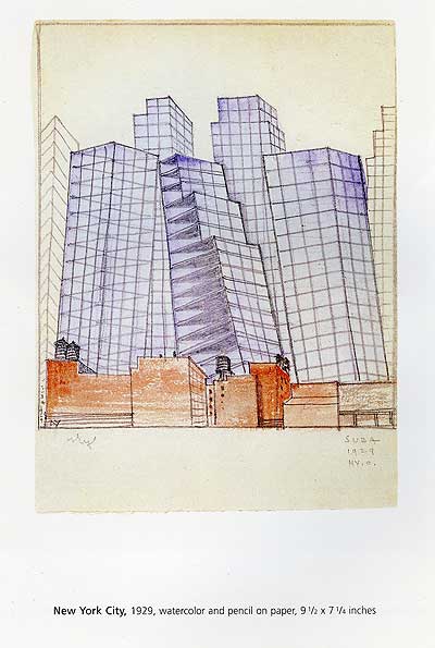
According to Grace Glueck (recently departed the Times because...why again, exactly?), Miklos Suba was a minor Precisionist whose specialty was Brooklyn cityscapes rendered fairly scrupulously. He wasn't a fantasist by any means. So what could have been happening in this picture, which will be shown at James Graham & Sons next month? Did buildings like this exist in 1929? Was the artist clairvoyant? These purplish towers could be the monster glass vanity projects lumbering into present-day Brooklyn.
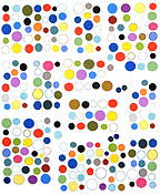
A 2 MB GIF built from screen-captured stills of the image in the previous post is here. It's only 16 frames so not as complex, but it moves faster and might give Safari users an idea of what the grid looks like in Firefox/Netscape/IE. As I understand it Safari, alone among browsers, does not load animated GIFs in sync, so you get random clumps of synchronization depending on which GIFs load first. This would not be a desirable effect here. Safari also fuzzes out GIFs when you use HTML to scale them up, under the assumption that the only imagery ever used on the Web is photography, which benefits from smoothing. Why do Steve Jobs' designers hate lo-fi artists?
not intended for RSS readers
Update: A 2 MB GIF of this grid is here. See next post or comments.
Cat Bus YouTubes by Anthony Leslie (aka CatBus4U):
#1
#2
#3
#4
All are great--my neighbor Totoro meets Paper Rad meets your 3rd grade nephew with compression-mushed MSPaint pixels in lieu of vector graphics. And great sound. YouTube commenter Chuck2dun is stingy in his praise, however: "At second 'three' [of vid #4] where you have the cat turn its head INSIDE the unchanging head shape is very good. The effect is arresting. I also prefer the black and white to the color. Have you thought about using lower chroma colors?" (hat tip guthrie)
"Tesseract Ranch" [mp3 removed]
My contribution to the tech house genre. This is all live hardware sequenced (no overdubbing) with some EQ and reverb added after the fact.
Update: I substituted the "dry" mix of this--no EQ or reverb. The effects were "bodying up" the sound at the expense of some of the DSP nuances.
1987 - Chris Burden's All the Submarines of the United States of America
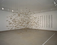
2006 - Fiona Banner's Parade
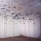
Thanks to Sally McKay for making me aware of Banner's collection of modeled fighter aircraft from all over the world, which will be shown soon in Toronto. It's the latest in our ongoing "attack of the clones" series.
Updated re: installation schedule.
"Tesseract Farm" [mp3 removed]
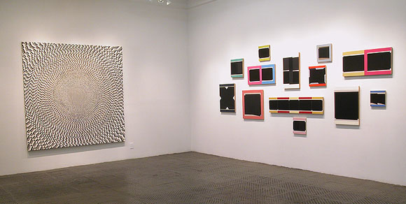
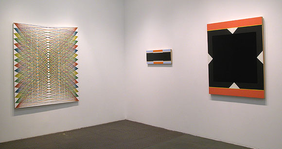
I am going to see this show later today--Mark Dagley (left images) and Don Voisine (right images) at McKenzie Fine Art, 511 West 25th Street in Chelsea. It's the last day of the exhibit, sad to say. An earlier post on Dagley is here. This current show with Voisine is reviewed in the New York Sun--nice, but I wouldn't stop with physical analysis of the work. Doesn't it look like Voisine is censoring his own paintings?
Update: one invigorating thing about the Dagleys in person is the Stella-esque what-you-see-is-what-you-see quality. The bottom one has a white ground and each line is a thick painted stripe connecting two points. The top one is thousands of circles drawn by hand in pencil and then filled in. It's a weird combination of cabalistic arcana, prison art, and the Bauhaus. As much as I enjoyed Marc Handelman's show at Sikkema Jenkins (a Bleckneresque young Turk out of Columbia who has all the advantages of art world virginity) it seemed flashy and overeager to please compared to Dagley's work, which is dazzling yet unassuming, and not as conservative as our two world weary critics might consider it (you know who I mean). As for the Voisine, Mark used the word redaction in the comments and that is the first thing the black bars bring to mind, even though in person you see a play of edges and surfaces in all those blacks. I'm personally not uncomfortable with references to office/bureaucratic culture in art and feel like the self-cancellation of those Xs and black bars gives the work an interesting psychological edge, though it was probably not intended--the paintings are handsome and thoughtful but serious about the rhetoric of painting.
