View current page
...more recent posts
ArtKrush has published a second installment of its "art online" series. (The first was here.) This blog is on the link list as a "new media blog." I'm down with that as long as new media means "the ism that follows and subsumes conceptualism in the history of art" but I do consider this an art blog. Art made with a PC, blog-in-a-gallery, and computercentric reviews notwithstanding, during the last six months the following have been discussed, depicted, or parodied on this page: Charles Ray, Judy Pfaff, Cindy Sherman, Ludwig Schwarz, Roxy Paine, Ryan McGinness, Sol LeWitt, Richard Woods, Kelley Walker, Klaus Mossetig, Allison Smith, David Moreno, Vincent Van Gogh, Triple Candie's "Limelight" exhibit, Miklos Suba, Chris Burden, Fiona Banner, Mark Dagley, Don Voisine, Marc Handelman, The Art Guys, Gary Hill, Doug Aitken, Elaine Sturtevant, Salvador Dali, Claes Oldenburg & Coosje Van Bruggen, Tony Conrad, Ralston Crawford, Ken Lum, Ivan Albright, John Pomara, Jackson Pollock, Matthew Geller.

Comic book movies suck because the writers "humanize" the stories. That's screenwriter code for "take properties originally written for alienated adolescent males and turn them into chick flicks." Marvel in the '60s had heroes with "hang ups" but rarely villains. We never got any back story on what a nice guy Dr. Octopus was before he acquired extra arms. And every Spider-Man fan from the comix days knows the Sandman was a pure crook, a hard case, bad to the bone (or the grain) but listen to what they've done to him. Stephanie Zacharek, in Salon:
And there's a new villain in town, a grown-up Dead End Kid in a stripey jersey named Flint Marko (Thomas Haden Church, in a soulful, solid performance), who has just escaped from prison, motivated solely by his wish to see, and help, his young daughter, who's suffering from a serious illness. While on the run from the police, he stumbles into the center of a particle-physics experiment, which gives him the power to transform himself into a colossus of sand: Sandman.In the comic book a mishap on a beach near a nuke test site turned prison escapee Flint Marko from an asshole into an asshole who could smother you in the quicksand of his own body. Scary! Not anymore:
[Director Sam] Raimi at least manages to make [Spider-Man 3] both huge and human. He also pulls off one of the most beautiful special effects I've ever seen, in any movie, a testament to the ways in which CGI, used right, can actually humanize a film. After Flint Marko -- a criminal who's done all the wrong things for the right reasons -- steps into that whirling particle-physics blender, he's no longer himself: He's a mound of sand, a one-man desert, and before our eyes he tries to re-form himself into some semblance of the man he used to be. As he tries to stand, rivers of sand run from his muscles. His contours take shape, fall away, and then stubbornly rebuild themselves: He's a piece of sculptural poetry, a song of being and becoming, a living, moving Henry Moore statue.That's nicely written (except for the cliches), but it's not the Sandman she's describing. He didn't clutch lockets, he killed your ass.
Eventually, a bigger-than-life creature, an anguished giant, emerges from this hill of sand. He's clutching a locket containing a photo of his little girl, and as he surveys this tiny picture, we know that he's remembering not just the man he used to be, but the man he failed to be. In this one astonishing scene, Raimi and his special-effects artists give us an image redolent of the great beauty, and the gravity, of silent film. Without a word, they sing the ballad of the disappearing man.
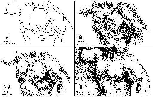
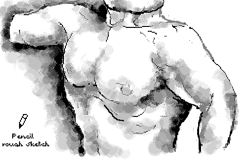
the top image Guthrie found and posted to Nasty Nets. The bottom is a panel I redrew in MSPaintbrush (Paint's more sophisticated ancestor). I mean, kitsch is kitsch but anyplace to show off some Paintbrush "skillz."
Thanks much to imagineering for the commentary on the post here comparing Cindy Sherman film stills with webcammer T-shirt ninjas. She (Kristin Posehn) says she realized she "actually spent more time looking at the ninjas." Awesome!
There is a free-form use of text in the ninja pix that is almost like folk art. Even the most flippant text in contemporary art feels heavy in comparison, loaded with significance.Some of my own ruminations on the comparison are here and here. I like imagineering's take on the text part of the campics, which I didn't talk about at all. I may have something to add when I get a minute.
The ninjas are borrowing from print and television marketing models, which almost always have text together with imagery. The ninjas naturally include their own strap lines and slogans. Their pictures are participatory advertisements, not film stills. Maybe this subtly suggests a blurring: to communicate is now to publicize.
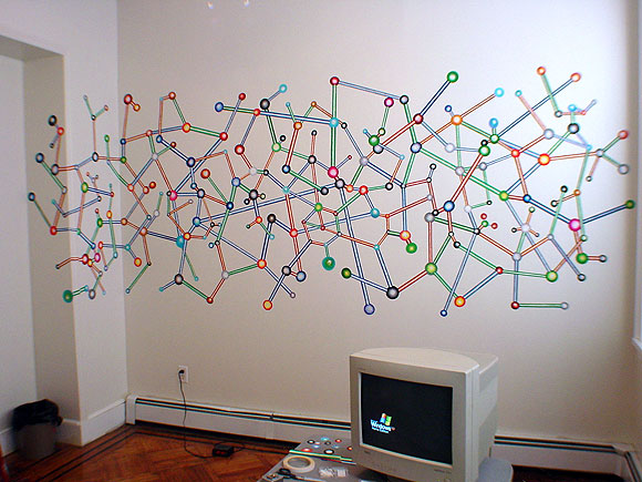
larger (2048 pixels wide - 200 KB)
from 2002, when I still used a CRT
Update: detail below added to show the materials:
